Coloring Tutorial.
this is my first tutorial so please bare with me. Pearldrop Suggest I make a tutorial for this icon, so here it is. If there's something you don't understand just let me know! This tutorial was made using PS CS2 but should be pretty translatable. No Selective Coloring.

alright. first and formost this is a basic guide. Please fiddle with the settings, find what works best for you. ALSO this works best on dark images. Lighter ones ... just no.
Step 1.
Make your base. Find an image. Crop it. and resize to 100 x 100. Here's what I started with.

Step 2.
Duplicate your base and set it to screen opacity 100%

--
at this point I go back to my base and sharpen it. Don't sharpen the rest of the layers just the base. But this is personal preference.
Step 3.
Add Adjustment Layer --> Levels.
RGB - Input Levels
33
1.15
250

--
Step 4.
Add Adjustment Layer --> Hue/ Saturation
Saturation - +41

--
Step 5.
Add Adjustment Layer --> Brightness/Contrast
Brightness:+7
Contrast:+19

--
Step 6.
Add Adjustment Layer --> Color Balance
Shadows:
-18
-9
+14
Midtones:
-27
+33
+32
Highlights:
-19
-16
+25

--
Step 7.
New Fill Layer --> Solid Color
add
#ffe6b6 set to multiply 63%

--
Step 8. (OPTIONAL)
At this point I decided that the icon was still too dark. So I went back and duplicated my screen level. and set it to 34% opacity

--
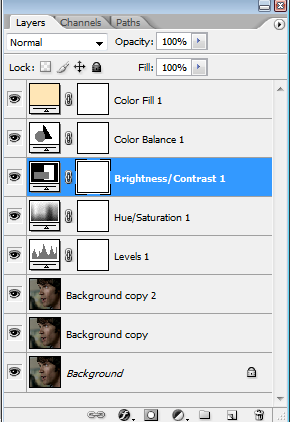
this is how your layers should look in the end.

and that's it! Here are a few more icons made with this technique.


so that's all! I hope this was useful at all.
feel free to watch
this community for more interesting things
and check out fringe_icons100 for a challenge!

alright. first and formost this is a basic guide. Please fiddle with the settings, find what works best for you. ALSO this works best on dark images. Lighter ones ... just no.
Step 1.
Make your base. Find an image. Crop it. and resize to 100 x 100. Here's what I started with.

Step 2.
Duplicate your base and set it to screen opacity 100%

--

at this point I go back to my base and sharpen it. Don't sharpen the rest of the layers just the base. But this is personal preference.
Step 3.
Add Adjustment Layer --> Levels.
RGB - Input Levels
33
1.15
250

--

Step 4.
Add Adjustment Layer --> Hue/ Saturation
Saturation - +41

--

Step 5.
Add Adjustment Layer --> Brightness/Contrast
Brightness:+7
Contrast:+19

--

Step 6.
Add Adjustment Layer --> Color Balance
Shadows:
-18
-9
+14
Midtones:
-27
+33
+32
Highlights:
-19
-16
+25

--

Step 7.
New Fill Layer --> Solid Color
add

#ffe6b6 set to multiply 63%

--

Step 8. (OPTIONAL)
At this point I decided that the icon was still too dark. So I went back and duplicated my screen level. and set it to 34% opacity

--

this is how your layers should look in the end.

and that's it! Here are a few more icons made with this technique.


so that's all! I hope this was useful at all.
feel free to watch
this community for more interesting things
and check out fringe_icons100 for a challenge!