(no subject)
Juuust doing an icon tutorial for Machika, because I am the laziest castmate.
For the record, I really run off of an old style that Watanuki's player used to do. It suits my need to not actually color-color icons, since I am not an artist extraordinaire, like AJ and Link.
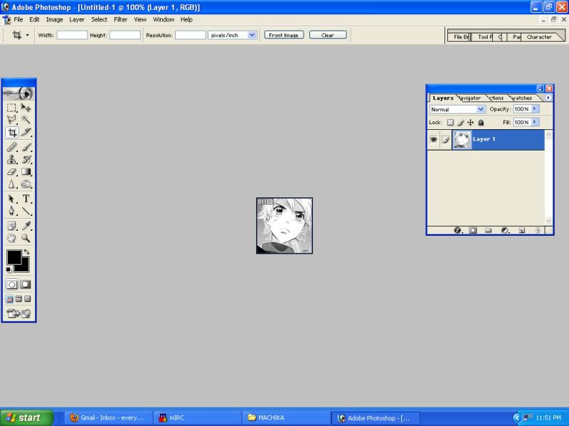
OKAY, HERE IS OUR LOVELY BASE! Already leveled and ready to be colored! Pro-tip: If you are going to level anything, zoom in extra hard and make sure your blacks are black. This and getting your tones to stay pretty are my biggest pet peeves. If you can't find the most excellent scan quality, then you better sit down to play with this big time.
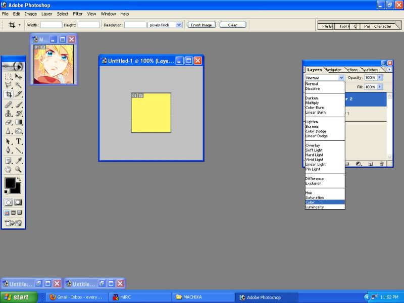
Click on these pictures for larger ones, fyi. Anyway, it's time to color line art! As you will discover, I like to over-color the lineart, so it makes the whole icon pop before I even lay down actual fill-in-the-blank colors. Color is the layer style of choice for your first layer or getting your tones to change color. :|b
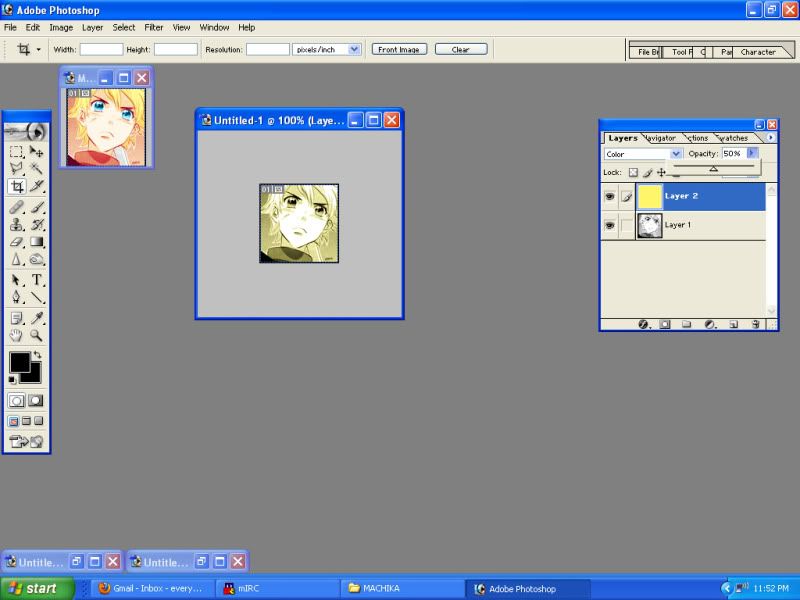
Then, we knock the opacity down, so we don't burn our retinas! Playing with opacity is probably the biggest issue when trying to come up with a color scheme. It's how you get bad colors, like yellow and red together, to mix and make pretty things.
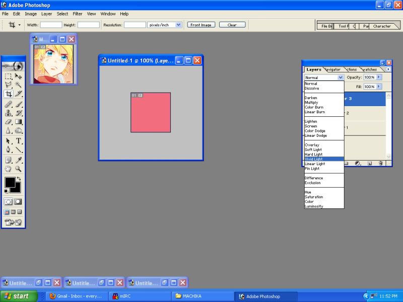
More lineart coloring! This layer may look silly, but generally, I need some kind of layer in-between my coloring tones and coloring the black of a picture. It looks really flat and gross if you don't use it. So, while it may look useless . . . It helps!
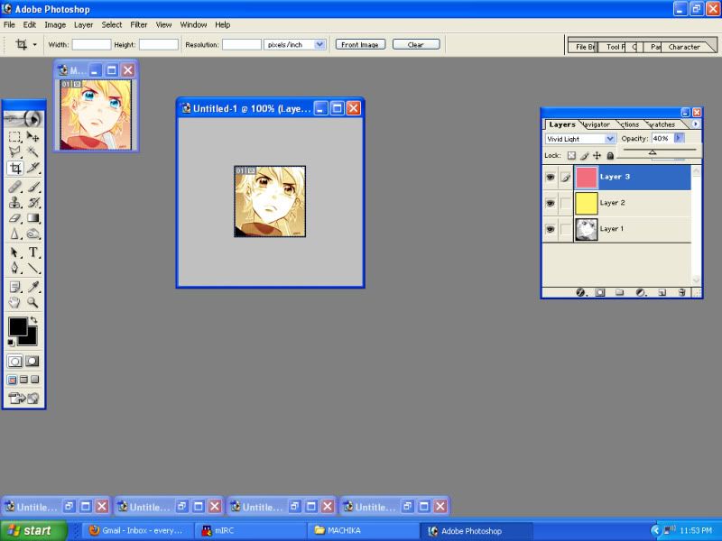
See, it looks super useless and ugly, huh? It helps if you go for this third layer after finding a good balance between the Color layer when creating a scheme.
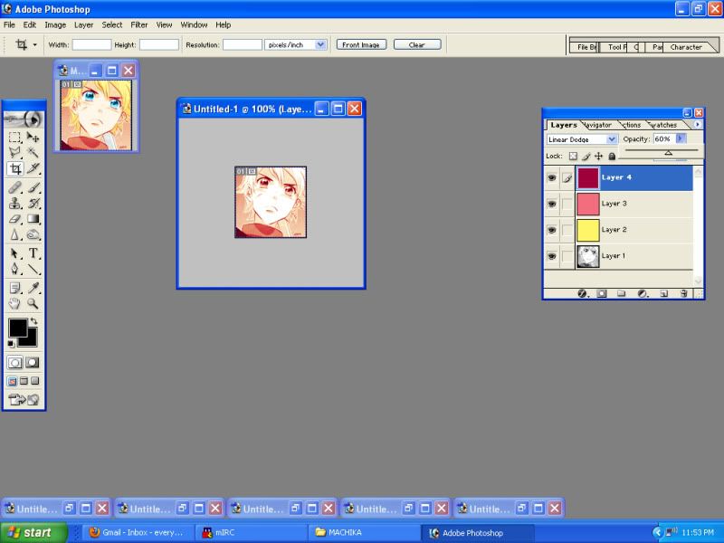
And here is the magic! The Linear Dodge turns your blacks any color that you want, so you can get some extra pop. If you want, you can thrown another layer on top of this to do even more color tomfoolery. It doesn't hurt to play with all your colors to get something unique that matches whatever palette your character may have!
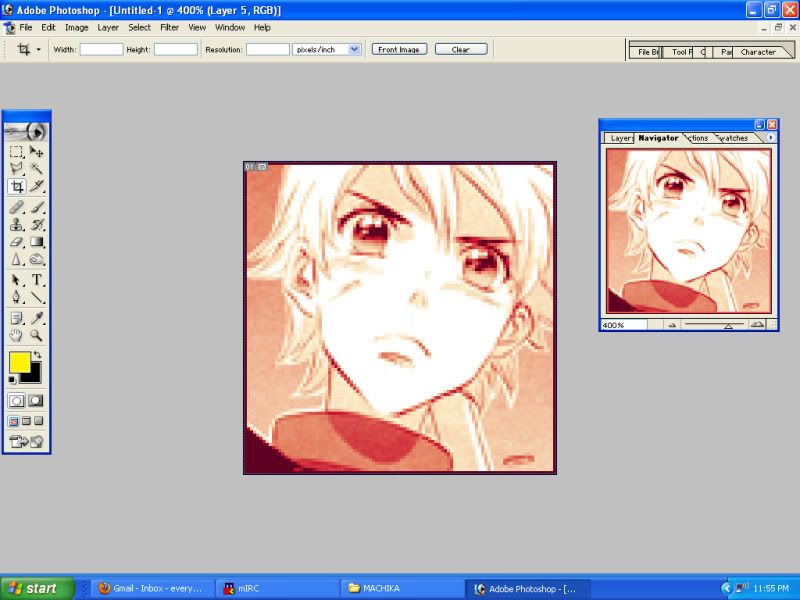
Now, it's time to zoom in . . . Closer the better, so you can use a big 'ol brush in negative spaces.
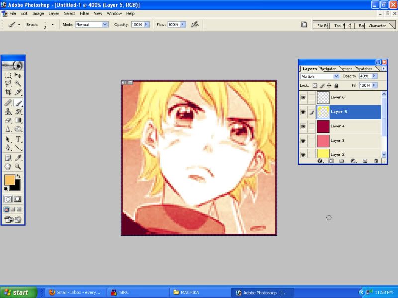
Okay, so, we've got our layers down! From here on out, it will always be a Multiply layer to some opacity. Put all your colors on different layers, so you can play and tweak really easily. Trust me, you will need it. The hair gets colored in with a super-pop yellow that gets dulled down.
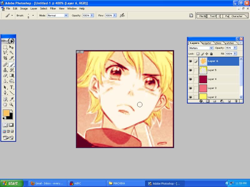
Skin gets the same treat as the hair. Generally, don't let your colors overlap, because they will do weird things. Stay inside the lines, mmkay?
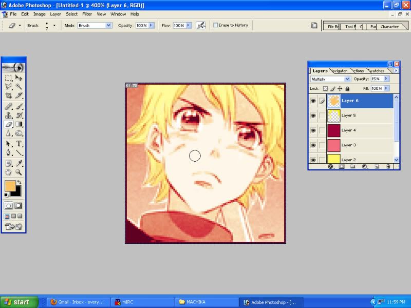
And I'm lazy, so you should make sure to erase the colors over the eyes and so on. Whoops, whoops. As a note, some people turn the eyes back to gray or don't color them in lineart for more pop. But if you are a lazy bastard, like me, you will find a way around it like so!
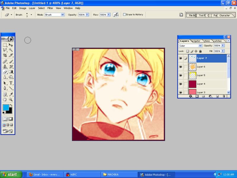
See? Super easy! The Color layer for the eyes helps knock out all the previous colors without catching any of the reds and pinks that we've been using. Eyes are always the super hardest to make work! They are different for every character! Thankfully, Kaori does a lot of work to make depth and light in her eyes, so just highlighting that with a bright color does wonders. As always, play, play, play.
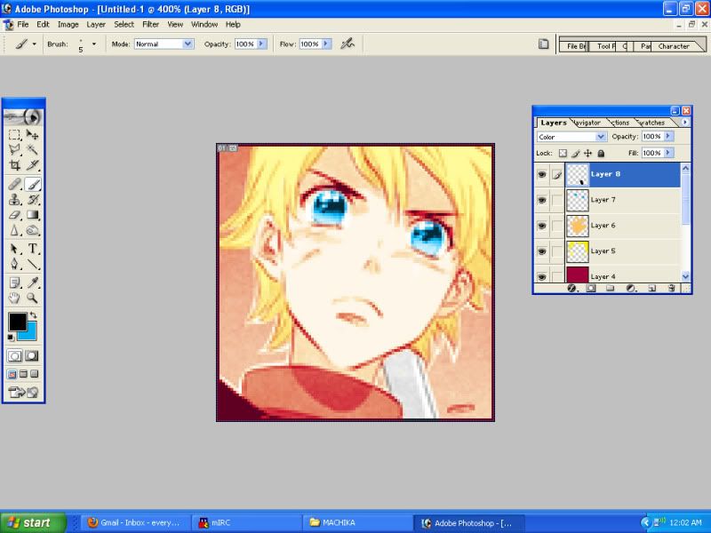
Now, you can use this Color trick for more than one purpose! Here, I don't like the scythe blending into the background, so I color it with black to get it to go gray. Generally, if you want to draw attention to details, you should make sure all your little details go on your top most layer, so it supersedes any of the base coloring you've already done.
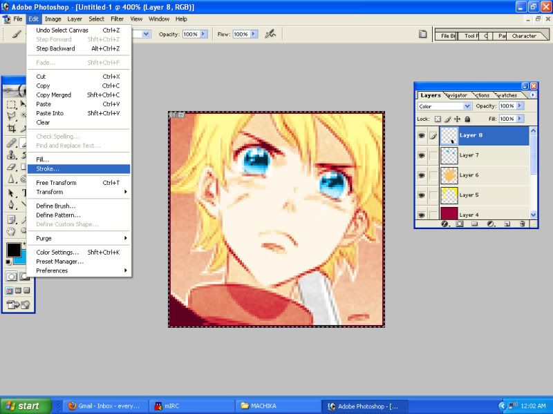
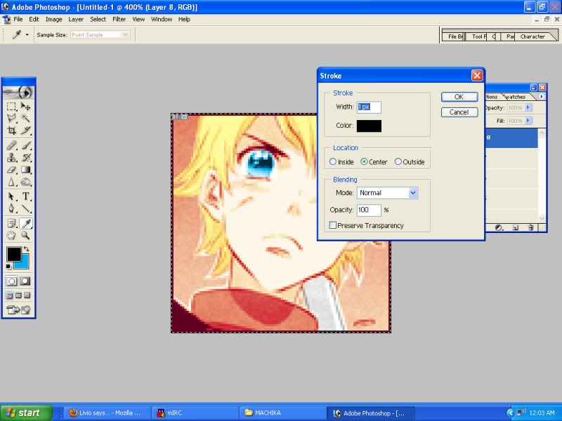
Okay, we're almost done, except the border is all red, because we killed out our blacks! So, we just need to fix that up with a little stroke. Easy!

And here is our final product! If you're creating a new scheme, you should be zooming in and out to get an idea of how it looks in micro, so you can keep your colors blending together nicely. Also, after you lay down your core colors, like skin and hair, you should definitely go back to your multiple lineart color layers and toggle them to see what works best. Skin tends to clash the most with lineart colors, so you get a lot of orange or pink colored skin. Always try to lean against the color of your lineart to get the colors to pop right, rather than the color you would default to.
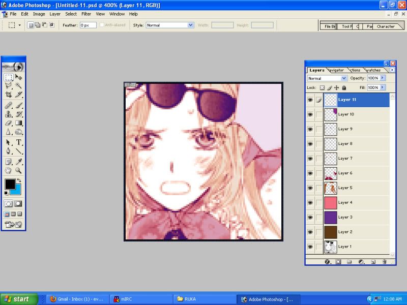
For an extra example, here's what I've done with Ruka's icons! Brown, pink, and purple isn't exactly a winning palette, but if you toggle with color layers enough, they will work. So, here's further proof that you should always play around with it, even if it may look like a bad idea. Also, unlike Machika's icons, I do draw a very small but subtle attention to Ruka's eyes with three different eye color layers as they tend to blend into the icon with her palette. The eye coloring all depends on the case!
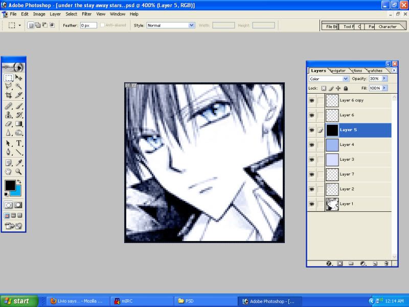
Even with flat, one-color icons . . . I still do a lot of lineart coloring! It helps to smooth out the artwork and really bring the icon into color nicely. To keep the color intact, I color his hair under the lineart in a gray tone. It ends up taking on whatever colors are acting on the lineart. After that, you just toggle the opacity to make it darker or lighter. Once again, eyes are a different story! I use an ice-blue color twice over on soft light to make Takanari's eyes pop.
Guh, and that is it! Ask questions if you've got 'em.
For the record, I really run off of an old style that Watanuki's player used to do. It suits my need to not actually color-color icons, since I am not an artist extraordinaire, like AJ and Link.

OKAY, HERE IS OUR LOVELY BASE! Already leveled and ready to be colored! Pro-tip: If you are going to level anything, zoom in extra hard and make sure your blacks are black. This and getting your tones to stay pretty are my biggest pet peeves. If you can't find the most excellent scan quality, then you better sit down to play with this big time.

Click on these pictures for larger ones, fyi. Anyway, it's time to color line art! As you will discover, I like to over-color the lineart, so it makes the whole icon pop before I even lay down actual fill-in-the-blank colors. Color is the layer style of choice for your first layer or getting your tones to change color. :|b

Then, we knock the opacity down, so we don't burn our retinas! Playing with opacity is probably the biggest issue when trying to come up with a color scheme. It's how you get bad colors, like yellow and red together, to mix and make pretty things.

More lineart coloring! This layer may look silly, but generally, I need some kind of layer in-between my coloring tones and coloring the black of a picture. It looks really flat and gross if you don't use it. So, while it may look useless . . . It helps!

See, it looks super useless and ugly, huh? It helps if you go for this third layer after finding a good balance between the Color layer when creating a scheme.

And here is the magic! The Linear Dodge turns your blacks any color that you want, so you can get some extra pop. If you want, you can thrown another layer on top of this to do even more color tomfoolery. It doesn't hurt to play with all your colors to get something unique that matches whatever palette your character may have!

Now, it's time to zoom in . . . Closer the better, so you can use a big 'ol brush in negative spaces.

Okay, so, we've got our layers down! From here on out, it will always be a Multiply layer to some opacity. Put all your colors on different layers, so you can play and tweak really easily. Trust me, you will need it. The hair gets colored in with a super-pop yellow that gets dulled down.

Skin gets the same treat as the hair. Generally, don't let your colors overlap, because they will do weird things. Stay inside the lines, mmkay?

And I'm lazy, so you should make sure to erase the colors over the eyes and so on. Whoops, whoops. As a note, some people turn the eyes back to gray or don't color them in lineart for more pop. But if you are a lazy bastard, like me, you will find a way around it like so!

See? Super easy! The Color layer for the eyes helps knock out all the previous colors without catching any of the reds and pinks that we've been using. Eyes are always the super hardest to make work! They are different for every character! Thankfully, Kaori does a lot of work to make depth and light in her eyes, so just highlighting that with a bright color does wonders. As always, play, play, play.

Now, you can use this Color trick for more than one purpose! Here, I don't like the scythe blending into the background, so I color it with black to get it to go gray. Generally, if you want to draw attention to details, you should make sure all your little details go on your top most layer, so it supersedes any of the base coloring you've already done.


Okay, we're almost done, except the border is all red, because we killed out our blacks! So, we just need to fix that up with a little stroke. Easy!

And here is our final product! If you're creating a new scheme, you should be zooming in and out to get an idea of how it looks in micro, so you can keep your colors blending together nicely. Also, after you lay down your core colors, like skin and hair, you should definitely go back to your multiple lineart color layers and toggle them to see what works best. Skin tends to clash the most with lineart colors, so you get a lot of orange or pink colored skin. Always try to lean against the color of your lineart to get the colors to pop right, rather than the color you would default to.

For an extra example, here's what I've done with Ruka's icons! Brown, pink, and purple isn't exactly a winning palette, but if you toggle with color layers enough, they will work. So, here's further proof that you should always play around with it, even if it may look like a bad idea. Also, unlike Machika's icons, I do draw a very small but subtle attention to Ruka's eyes with three different eye color layers as they tend to blend into the icon with her palette. The eye coloring all depends on the case!

Even with flat, one-color icons . . . I still do a lot of lineart coloring! It helps to smooth out the artwork and really bring the icon into color nicely. To keep the color intact, I color his hair under the lineart in a gray tone. It ends up taking on whatever colors are acting on the lineart. After that, you just toggle the opacity to make it darker or lighter. Once again, eyes are a different story! I use an ice-blue color twice over on soft light to make Takanari's eyes pop.
Guh, and that is it! Ask questions if you've got 'em.