(no subject)
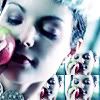
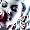
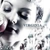
my fifth tutorial -- how to make this icon in 22 steps:

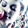
i'm going to make a tutorial on how i created this icon:
this tutorial is designed for use in adobe photoshop 7.0; i'm sure you can, however, use this tutorial in other programs.
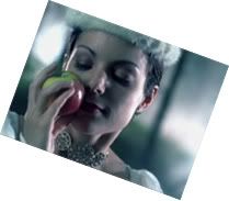
step 01:
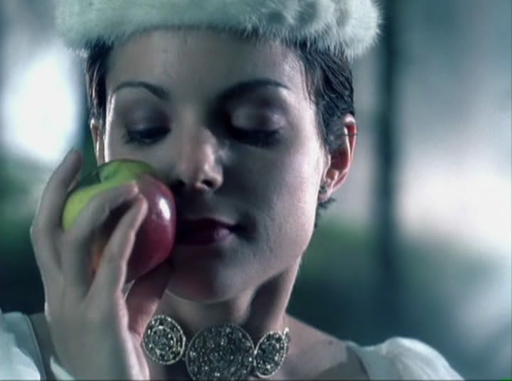
pick the picture that you're going to make your icon out of; i chose this one (capped by me).
step 02:
resize your image to 175px by 130 px. copy and paste the image into a new canvas; go to image >> rotate canvas >> arbitrary >> clockwise, 20 degrees.
step 03:
using your rectangular marquee tool set to fixed size: 100 px by 100 px, select your icon base.
step 04:
go back to the original 175 px by 130 px image; resize to 50 px by 37 px. using your rectangular marquee tool set to 25px by 25 px, select a portion of the picture.

step 05:
copy and paste that image twice on a new canvas. merge the layers on that canvas.

step 06:
copy and paste the 35 px by 50 px image on top of the main icon. i did it twice to cover the gap to the right of virginia's head.
step 07:
erase the bits that are covering the main virginia image. merge the layers.
step 08:
duplicate the layer so that you have 3 additional copies. on the first two layers, set the lighting mode to screen; on the third later, set the mode to soft light. then, go to filter >> sharpen and sharpen twice

step 09:
merge the layers together. then, using the blur tool (size - 5px, strength - 30), smooth out the faces and other pixelated areas. make sure you don't blur out any defining features otherwise it will look weird. we want it smooth not messy.
now we have our base. the next steps will focus on getting the coloring we want.
step 10:
next, go to layer >> new adjustment layer >> hue/saturation; set saturation to -35.

step 11:
then, go to layer >> new adjustment layer >> brightness/contrast; set brightness to +6 & contrast to +7.

step 12:
create a new layer; using the flood fill tool, fill the layer with a pinkish color -- i used #ECD2D4.

step 13:
set the lighting mode on the pink layer to color burn.
step 14:
now, i think that pink doesn't look right -- i want it clear, crisp and dark, not red; go to layer >> new adjustment layer >> hue/saturation; set saturation to -35, again.
step 15:
we want a little light shining on the event in the icon; create another and fill it was a mid-grey color. i used #989898.

step 16:
set that layer to overlay.
step 17:
next we duplicate the first layer (the main image) and place in on top of all of the other layers. set that layer to lighten.
step 18:
now, for this icon, we want a really washed out look; create another layer on top and use the flood fill tool to fill it with black (#000000). set that layer to color, opacity 50%.
step 19:
create another layer on top of that one and, using the same tools, create a layer filled with white (#ffffff). set that layer to color, opacity 25%.

now we have our washed out virginia icon. time for effects and text.
step 20:
like i've said before, text is not my area of expertise. for this icon i used times new roman, on caps, set on font size 6. i also added a drop shadow, opacity 50% to the text.

step 21:
now it's time for a few brushes. using one from teh_indy's scribble/misc brushpack, i added a a few brushes for decoration.
step 22:
lastly, on the top most layer, go to select all >> stroke, and create an 8 px border.
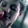
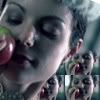
and, there it is. 22 steps to making an icon.
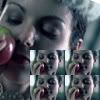
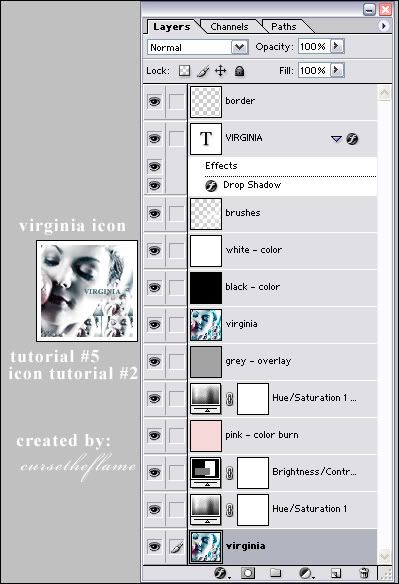
this is what my layers look like:
^^ kudos to you if you made it through all of that ;)
+ comments are appreciated.
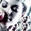
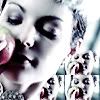
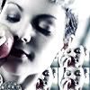
i'm going to make a tutorial on how i created this icon:
this tutorial is designed for use in adobe photoshop 7.0; i'm sure you can, however, use this tutorial in other programs.
step 01:
pick the picture that you're going to make your icon out of; i chose this one (capped by me).
step 02:
resize your image to 175px by 130 px. copy and paste the image into a new canvas; go to image >> rotate canvas >> arbitrary >> clockwise, 20 degrees.
step 03:
using your rectangular marquee tool set to fixed size: 100 px by 100 px, select your icon base.
step 04:
go back to the original 175 px by 130 px image; resize to 50 px by 37 px. using your rectangular marquee tool set to 25px by 25 px, select a portion of the picture.
step 05:
copy and paste that image twice on a new canvas. merge the layers on that canvas.
step 06:
copy and paste the 35 px by 50 px image on top of the main icon. i did it twice to cover the gap to the right of virginia's head.
step 07:
erase the bits that are covering the main virginia image. merge the layers.
step 08:
duplicate the layer so that you have 3 additional copies. on the first two layers, set the lighting mode to screen; on the third later, set the mode to soft light. then, go to filter >> sharpen and sharpen twice
step 09:
merge the layers together. then, using the blur tool (size - 5px, strength - 30), smooth out the faces and other pixelated areas. make sure you don't blur out any defining features otherwise it will look weird. we want it smooth not messy.
now we have our base. the next steps will focus on getting the coloring we want.
step 10:
next, go to layer >> new adjustment layer >> hue/saturation; set saturation to -35.
step 11:
then, go to layer >> new adjustment layer >> brightness/contrast; set brightness to +6 & contrast to +7.
step 12:
create a new layer; using the flood fill tool, fill the layer with a pinkish color -- i used #ECD2D4.
step 13:
set the lighting mode on the pink layer to color burn.
step 14:
now, i think that pink doesn't look right -- i want it clear, crisp and dark, not red; go to layer >> new adjustment layer >> hue/saturation; set saturation to -35, again.
step 15:
we want a little light shining on the event in the icon; create another and fill it was a mid-grey color. i used #989898.
step 16:
set that layer to overlay.
step 17:
next we duplicate the first layer (the main image) and place in on top of all of the other layers. set that layer to lighten.
step 18:
now, for this icon, we want a really washed out look; create another layer on top and use the flood fill tool to fill it with black (#000000). set that layer to color, opacity 50%.
step 19:
create another layer on top of that one and, using the same tools, create a layer filled with white (#ffffff). set that layer to color, opacity 25%.
now we have our washed out virginia icon. time for effects and text.
step 20:
like i've said before, text is not my area of expertise. for this icon i used times new roman, on caps, set on font size 6. i also added a drop shadow, opacity 50% to the text.
step 21:
now it's time for a few brushes. using one from teh_indy's scribble/misc brushpack, i added a a few brushes for decoration.
step 22:
lastly, on the top most layer, go to select all >> stroke, and create an 8 px border.
and, there it is. 22 steps to making an icon.
this is what my layers look like:
^^ kudos to you if you made it through all of that ;)
+ comments are appreciated.