Tutorial!
Oh wow... it's so long ago that I made a Tutorial, but lilkittykat_27 asked me about
the coloring on my Heroes Icons so here you go.
Requested for this Icon: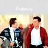
But since I didn't save the .psd file for this one, I simply made a recreation.
we'll be going from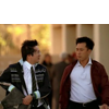
to
Made with PS CS2, uses selective coloring - sorry.
Step 1
Alright starting with our base. The Icon is quite dark so we duplicate it twice and set both to screen. The second screen layer was a little to much so I set the opacity to 50%.
Step 2
Now some Selective coloring (layer >adjustment layer >selective color)
reds: -100 / 20 / 100 / 0
yellows: -100 / 0 / 100 / 0
neutrals: 30 / 15 / 10 / -17

Step 3
I still think the colors are rather dull so layer >adjustment layer >hue/saturation:
saturation: 25

Step 4
However, now the pic is way too yellow, so layer >adjustment layer >selective color
reds: 0 / -7 / -7 / 0
yellows: 0 / 0 / -50 / 0
Step 5
To add a little more contrast I'll add a color balance layer (layer >adjustment layer >color balance):
shadows: -15 / 0 / 21
midtones: 14 / -12 / -14
highlights: -10 / 10 / 27
Step 6
Alright almost done I just wanna add a tiny little bit more contrast and therefore: layer >adjustment layer >levels:
(RGB) 35 / 1.50 / 255
And done! That was easy, wasn't it?
don't copy this exactly! just play around with everything a little 'til your Icon looks nice =)
If you have any questions feel free to ask feel free to show me your results :D
Requested for this Icon:
But since I didn't save the .psd file for this one, I simply made a recreation.
we'll be going from
to
Made with PS CS2, uses selective coloring - sorry.
Step 1
Alright starting with our base. The Icon is quite dark so we duplicate it twice and set both to screen. The second screen layer was a little to much so I set the opacity to 50%.
Step 2
Now some Selective coloring (layer >adjustment layer >selective color)
reds: -100 / 20 / 100 / 0
yellows: -100 / 0 / 100 / 0
neutrals: 30 / 15 / 10 / -17
Step 3
I still think the colors are rather dull so layer >adjustment layer >hue/saturation:
saturation: 25
Step 4
However, now the pic is way too yellow, so layer >adjustment layer >selective color
reds: 0 / -7 / -7 / 0
yellows: 0 / 0 / -50 / 0
Step 5
To add a little more contrast I'll add a color balance layer (layer >adjustment layer >color balance):
shadows: -15 / 0 / 21
midtones: 14 / -12 / -14
highlights: -10 / 10 / 27
Step 6
Alright almost done I just wanna add a tiny little bit more contrast and therefore: layer >adjustment layer >levels:
(RGB) 35 / 1.50 / 255
And done! That was easy, wasn't it?
don't copy this exactly! just play around with everything a little 'til your Icon looks nice =)
If you have any questions feel free to ask feel free to show me your results :D