Results!
- Eliminated!

wildalyss
with -5 votes
Sorry to see you go. Hope you stay around! (:
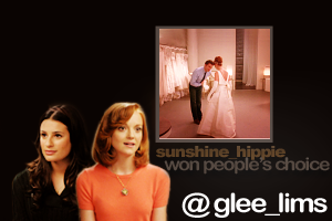
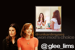
- People's/Mod's Choice!


sunshine_hippie | drunkardmuses
Mod's Choice: The coloring is soft and warm, also good cap choice! ^^
People's Choice Banner: Here.
Mod's Choice Banner: Here.
- Voting Tally!
Voting Results - See your icon number right here.
01. -2 || +0 = - 2
02. -0 || +1 = + 1
03. -5 || +0 = - 5
04. -2 || +4 = + 2
05. -0 || +1 = + 1
06. -3 || +0 = - 3
Negative Votes (-)
#01 - the image itself is really nice, but the text takes away from that enough to make me put it here. the font choice doesn't fit and the bottom text is barely readable.
#01 - the font/text-style/-placement doesn't compliment the rest of the icon
#03 - Her face is a bit too red, and the image is blurry
#03 - her skincolour seems unnaturally red and the image is a bit blurry
#03 - Her face is blurry and the coloring is a bit too yellow.
#03 - the coloring on the image is too bright, and the background too dark. making the overall coloring look off.
#03 - It could be a bit more sharpened. Some kind of text would make the icon more outstanding, because this way it's a bit too plain. You only have the image of Quinn and the blackground which are totally contrary.
#04 - The crop is too far so you can't see any details and the coloring needs to be lightened up.
#04 - the coloring it to over saturated. you can hardly make out facial features.
#06 - The colouring in the background overwhelms the image of Sue
#06 - the text is placed awkwardly and in a position that takes away from the image of sue, the background is also a bit distracting.
#06 - I'm all for different colors, but it's a bit too much in the background. Also, the text is not only oversharpened (maybe you could use a different font with a different outline?)it is also badly placed, because it's just put above Sue and feels out of place and uncreative. The words could've had different sizes or colors.
Positive Votes (+)
#02 - Beautiful coloring and nice use of negative space.
#04 - Amazing colouring! Nice choice of crop, as well.
#04 - good capchoice and crop
#04 - the crop and coloring are excellent, the cap choice was also nice
#04 - The crop and light effect in the middle really focus on Emma and Will.
#05 - the double image is blended well together
The next challenge will be posted in a minute! (Come Back Challenge)