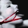
My LJ icons - a progress report
For anyone who's counting, I'd like to track the progress I have made with my icons. You can see that I just get better and better.

First. Simply took a photo of Björk, and shrunk it down.
----------------------------------

Second. Experimenting with text here.
----------------------------------

Third. Now I'm experimenting with ImageReady. Adding text and animations. Actually, a lot went into this one. All of the backgrounds for Vampira, the Grim Reaper, and the skeletal spirit I found and added separately. This was my turning point.
----------------------------------

Fourth. Nothing special. Just a repeat of the last one, just less complex.
----------------------------------

Fifth. Now I started making only certain objects animate.
----------------------------------

Sixth. This was taken from this image.
See how I had to get rid of Simon, and also the clove of garlic. This was a little more difficult, because I had to make it look natural.
----------------------------------

Seventh. This one took even more work. Originally, the pillar on the left was a complete copy of the one on the right, so the shading was on the left side and not the right. So I had to reverse just that pillar. Also, the image began with just Dracula on top of the pedestal in the center. So I had to recreate the top half of it for when Dracula is not standing on it, and then get him to fade over it so he looks substantial. Also, I played around with textured text. I like this one.
----------------------------------

Eighth. This one took some work as well. This is the image I had to start with.
So I had to create a perfect square of stones, get rid of the holy water in the right-hand ones, raise the right-hand corpse, and then get just the corpses to fade in and out with the text. It took some work and experimentation.
----------------------------------

Ninth. This time I played with sequenced text, multiple fonts, and then image effects. Very simple, but very cool looking. And also a GREAT picture of Beth, Portishead's songstress.
----------------------------------

Tenth. This is my favorite one thus far. I experimented with zooming out of the same image, sequencing text, and then making text flash different colors. For those who know how this all works, it's quite simple, but it looks quite complex and cool. And besides, it's fucking AWESOME, because Carrie is a fucking awesome movie.
And there we have it. I've made a lot of progress. Yay! Time to brainstorm some more ideas.

First. Simply took a photo of Björk, and shrunk it down.
----------------------------------

Second. Experimenting with text here.
----------------------------------
Third. Now I'm experimenting with ImageReady. Adding text and animations. Actually, a lot went into this one. All of the backgrounds for Vampira, the Grim Reaper, and the skeletal spirit I found and added separately. This was my turning point.
----------------------------------

Fourth. Nothing special. Just a repeat of the last one, just less complex.
----------------------------------

Fifth. Now I started making only certain objects animate.
----------------------------------
Sixth. This was taken from this image.

See how I had to get rid of Simon, and also the clove of garlic. This was a little more difficult, because I had to make it look natural.
----------------------------------
Seventh. This one took even more work. Originally, the pillar on the left was a complete copy of the one on the right, so the shading was on the left side and not the right. So I had to reverse just that pillar. Also, the image began with just Dracula on top of the pedestal in the center. So I had to recreate the top half of it for when Dracula is not standing on it, and then get him to fade over it so he looks substantial. Also, I played around with textured text. I like this one.
----------------------------------
Eighth. This one took some work as well. This is the image I had to start with.

So I had to create a perfect square of stones, get rid of the holy water in the right-hand ones, raise the right-hand corpse, and then get just the corpses to fade in and out with the text. It took some work and experimentation.
----------------------------------
Ninth. This time I played with sequenced text, multiple fonts, and then image effects. Very simple, but very cool looking. And also a GREAT picture of Beth, Portishead's songstress.
----------------------------------
Tenth. This is my favorite one thus far. I experimented with zooming out of the same image, sequencing text, and then making text flash different colors. For those who know how this all works, it's quite simple, but it looks quite complex and cool. And besides, it's fucking AWESOME, because Carrie is a fucking awesome movie.
And there we have it. I've made a lot of progress. Yay! Time to brainstorm some more ideas.