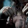
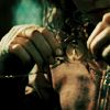
Tutorial #01 - Rachel from "Friends"
I use PS7, but this might be translatable to PSP

>>>
In FOUR layers!
*requires basic knowledge of curves* - but I’ll answer any questions you guys have.
Sooooo. Crop, sharpen, and all that basic icon jazz. If it’s dark, add a Screen layer (I didn’t). Basically, do everything you can to make your base pretty.

Now. New layer, fill with #FFA7BC (a light pink colour) - set to Colour Burn, 20% Opacity

Another new layer, fill with #FFF000 (a bright yellow) - set to Soft Light, 30% Opacity

New curves adjustment layer (click the half black/half white circle in the Layer menu, and go to curves)
RGB:
Input = 44
Output = 90
Green
First Point
Input = 87
Output = 32
Second Point
Input = 167
Output = 150
Blue:
First Point
Input = 55
Output = 30
Second Point
Input = 173
Output = 76
*the values for this curve are by spectacular at 3am_icons*
Set the Curve to Soft Light, 50%

One more Curves adjustment layer
Red
First Point
Input = 99
Output = 61
Second Point
Input = 162
Output = 168
Keep this layer on Normal, 100%

And you’re done!
This technique doesn’t always look so good on very high-contrast images, but try it, and see. If it looks kinda icky, I have a trick to fix it. Take your base, duplicate it, and invert it. Set it to Soft Light (and drop the opacity if you need to). Tada!
Some other icons I used the exact same technique on:

>>>

>>>

>>>
Also posted at icon_tutorial

>>>

In FOUR layers!
*requires basic knowledge of curves* - but I’ll answer any questions you guys have.
Sooooo. Crop, sharpen, and all that basic icon jazz. If it’s dark, add a Screen layer (I didn’t). Basically, do everything you can to make your base pretty.

Now. New layer, fill with #FFA7BC (a light pink colour) - set to Colour Burn, 20% Opacity

Another new layer, fill with #FFF000 (a bright yellow) - set to Soft Light, 30% Opacity

New curves adjustment layer (click the half black/half white circle in the Layer menu, and go to curves)
RGB:
Input = 44
Output = 90
Green
First Point
Input = 87
Output = 32
Second Point
Input = 167
Output = 150
Blue:
First Point
Input = 55
Output = 30
Second Point
Input = 173
Output = 76
*the values for this curve are by spectacular at 3am_icons*
Set the Curve to Soft Light, 50%

One more Curves adjustment layer
Red
First Point
Input = 99
Output = 61
Second Point
Input = 162
Output = 168
Keep this layer on Normal, 100%

And you’re done!
This technique doesn’t always look so good on very high-contrast images, but try it, and see. If it looks kinda icky, I have a trick to fix it. Take your base, duplicate it, and invert it. Set it to Soft Light (and drop the opacity if you need to). Tada!
Some other icons I used the exact same technique on:

>>>


>>>


>>>

Also posted at icon_tutorial