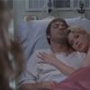
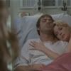
Tutorial #2 - Denny/Izzie from Grey's Anatomy
From this 
to
Done in Photoshop 7. The last two steps involve optional Selective Colouring (without it, this is your final product). So PSP users - feel free to try it out, but be aware that you won’t be able to do the last two steps. Sorry!
Requires knowledge of Colour Balance and Adjustment Layers, and includes a touch of Curves. This was requested by darabelle, who wanted to know the technique behind these icons in my last batch - which I’ve recreated as best as I could.
I’m going to start by saying that most of my icons follow the same general steps. Brighten with Curves, add contrast, fiddle with Colour Balance if needed, up the saturation, then enhance colours with Selective Colouring. It’s not really a complicated method, and you might be better off experimenting on your own before you read this tutorial. Just because…y’know. Experimenting is fun.
Anyway. We’re starting with this image from Striped Wall. Well I am, at least. You’ll probably be starting with a different image. (Or, you know, start with this cap to see if the tutorial works for you, then try another one)
First of all, this cap started out a bit too Magenta-ish. This, I’m going to fix using a Colour Balance adjustment layer. Logically, of course, we’d drag the slid away from Magenta and toward Green - however, if the icon ends up too green, it’s harder to fix (seriously - I don’t know why, though). So. I’m going to add yellow instead. In Colour Balance (only in Midtones) I dragged the Blue/Yellow slider to -17 (click for cap). But this is a judgement call. Don’t just plug in -17 without looking carefully at the main colours in your image. And since you’re using adjustment layers, if your final product turns out too yellow or too magenta, you can go back to this first layer and fiddle some more.

Next I’m going to brighten it with Curves (another adjustment layer). I made it bright enough that it looks a bit washed out. My Curves settings were RGB: 61, 111 (click for a cap of it), but this will be different for every picture. Again, don’t just plug in those numbers. Drag the line around until your icon looks bright enough. And like with the Colour Balance, it’s an adjustment layer - if your icon ends up too bright or too dark at the end, go back to this layer and fix it.

Next we’re going to add some contrast. Make a new Curves adjustment layer but don’t fiddle with the settings at all. Just leave everything as it. Hit okay. Set this layer to Soft Light. This gives you the equivalent of merging all, duplicating, and setting that layer to Soft Light - but I don’t like to merge (again, because then I can’t fiddle after I’m done) so I do this. Am I weird or does anybody else do this too?

The next step is kind of optional. Kind of. When I make brightly coloured icons, I like them to be a little bit yellowish. But anyway, all I did was make a new Colour Balance layer and move the Blue/Yellow slider over to -15. (I like to have a Colour Balance layer above and below my brightening/constrasting layers. It makes the fiddling afterwards easier. Or maybe it’s just me being strange.) If you’re iconing a show like Lost or House where the caps are naturally more yellow, you probably won’t need this step. You might not need to touch Colour Balance. Or maybe you’ll need to play with the Red/Cyan and Green/Magenta settings. Do what you think looks good.

Next we’re going to make the colours brighter. Because that’s kind of the goal of this kind of tutorial. So make a Hue/Saturation adjustment layer and up the saturation to whatever you think looks good. Where is the line drawn between perfect and over-saturated? Well, it depends partially on your taste and a lot on your computer monitor. (In other words, you won’t be able to please everybody, so try and please yourself). In my case, I upped the Saturation to +43. Then (again, the joys of adjustment layers), I realized I might have overdone it just a tad a lowered the Opacity of the layer to 90%. Then I set this layer to Colour. I always set my Saturation layers to Colour actually. It keeps everything its proper brightness in relation to everything else and I’m anal like that.

All of the other steps involve Selective Colouring and are completely optional and depend on your original cap, of course. Stop here if you wish.
Me, though - I wanted to make the background more blue because I thought it would contrast nicely with Izzie’s hair. Telling you what I did probably won’t be any help to you, but I’m going to do it anyway, therefore making this last section of the tutorial less of a ‘tutorial’ and more of a ‘list’.
So make a new Selective Colour layer. The first thing I want to do, since I’m making everything more blue, after all, is go into Neutrals. Upping the Cyan and downing the yellow will make everything more blue. Fiddling is involved, as is guesswork. If you’re not the fiddling type, you can see a cap of my settings here: Selective colour layer 1. Notice that in Reds, I upped the Magenta to try and keep her dress bright. If she had been wearing Yellow, I would have gone into Yellows and upped the Yellow. A fairly basic concept, no? Also - since we added Cyan to the whole thing - when yellows go Cyan, they go ugly. So I went into Yellow and took out the Cyan. That’s the logic behind that.

But anyway. This made everything too yellow. So, it’s more selective colouring time. This time, take out more Yellow and add more Cyan. Logical, yes? Selective colour layer 2.

So that’s essentially it! The final product of this tutorial is snaggable (with credit). Please comment! And if you use this tutorial for anything, I’d love to see your result!

to

Done in Photoshop 7. The last two steps involve optional Selective Colouring (without it, this is your final product). So PSP users - feel free to try it out, but be aware that you won’t be able to do the last two steps. Sorry!
Requires knowledge of Colour Balance and Adjustment Layers, and includes a touch of Curves. This was requested by darabelle, who wanted to know the technique behind these icons in my last batch - which I’ve recreated as best as I could.
I’m going to start by saying that most of my icons follow the same general steps. Brighten with Curves, add contrast, fiddle with Colour Balance if needed, up the saturation, then enhance colours with Selective Colouring. It’s not really a complicated method, and you might be better off experimenting on your own before you read this tutorial. Just because…y’know. Experimenting is fun.
Anyway. We’re starting with this image from Striped Wall. Well I am, at least. You’ll probably be starting with a different image. (Or, you know, start with this cap to see if the tutorial works for you, then try another one)
First of all, this cap started out a bit too Magenta-ish. This, I’m going to fix using a Colour Balance adjustment layer. Logically, of course, we’d drag the slid away from Magenta and toward Green - however, if the icon ends up too green, it’s harder to fix (seriously - I don’t know why, though). So. I’m going to add yellow instead. In Colour Balance (only in Midtones) I dragged the Blue/Yellow slider to -17 (click for cap). But this is a judgement call. Don’t just plug in -17 without looking carefully at the main colours in your image. And since you’re using adjustment layers, if your final product turns out too yellow or too magenta, you can go back to this first layer and fiddle some more.

Next I’m going to brighten it with Curves (another adjustment layer). I made it bright enough that it looks a bit washed out. My Curves settings were RGB: 61, 111 (click for a cap of it), but this will be different for every picture. Again, don’t just plug in those numbers. Drag the line around until your icon looks bright enough. And like with the Colour Balance, it’s an adjustment layer - if your icon ends up too bright or too dark at the end, go back to this layer and fix it.

Next we’re going to add some contrast. Make a new Curves adjustment layer but don’t fiddle with the settings at all. Just leave everything as it. Hit okay. Set this layer to Soft Light. This gives you the equivalent of merging all, duplicating, and setting that layer to Soft Light - but I don’t like to merge (again, because then I can’t fiddle after I’m done) so I do this. Am I weird or does anybody else do this too?

The next step is kind of optional. Kind of. When I make brightly coloured icons, I like them to be a little bit yellowish. But anyway, all I did was make a new Colour Balance layer and move the Blue/Yellow slider over to -15. (I like to have a Colour Balance layer above and below my brightening/constrasting layers. It makes the fiddling afterwards easier. Or maybe it’s just me being strange.) If you’re iconing a show like Lost or House where the caps are naturally more yellow, you probably won’t need this step. You might not need to touch Colour Balance. Or maybe you’ll need to play with the Red/Cyan and Green/Magenta settings. Do what you think looks good.

Next we’re going to make the colours brighter. Because that’s kind of the goal of this kind of tutorial. So make a Hue/Saturation adjustment layer and up the saturation to whatever you think looks good. Where is the line drawn between perfect and over-saturated? Well, it depends partially on your taste and a lot on your computer monitor. (In other words, you won’t be able to please everybody, so try and please yourself). In my case, I upped the Saturation to +43. Then (again, the joys of adjustment layers), I realized I might have overdone it just a tad a lowered the Opacity of the layer to 90%. Then I set this layer to Colour. I always set my Saturation layers to Colour actually. It keeps everything its proper brightness in relation to everything else and I’m anal like that.

All of the other steps involve Selective Colouring and are completely optional and depend on your original cap, of course. Stop here if you wish.
Me, though - I wanted to make the background more blue because I thought it would contrast nicely with Izzie’s hair. Telling you what I did probably won’t be any help to you, but I’m going to do it anyway, therefore making this last section of the tutorial less of a ‘tutorial’ and more of a ‘list’.
So make a new Selective Colour layer. The first thing I want to do, since I’m making everything more blue, after all, is go into Neutrals. Upping the Cyan and downing the yellow will make everything more blue. Fiddling is involved, as is guesswork. If you’re not the fiddling type, you can see a cap of my settings here: Selective colour layer 1. Notice that in Reds, I upped the Magenta to try and keep her dress bright. If she had been wearing Yellow, I would have gone into Yellows and upped the Yellow. A fairly basic concept, no? Also - since we added Cyan to the whole thing - when yellows go Cyan, they go ugly. So I went into Yellow and took out the Cyan. That’s the logic behind that.

But anyway. This made everything too yellow. So, it’s more selective colouring time. This time, take out more Yellow and add more Cyan. Logical, yes? Selective colour layer 2.

So that’s essentially it! The final product of this tutorial is snaggable (with credit). Please comment! And if you use this tutorial for anything, I’d love to see your result!