2bass
in
graphixfix
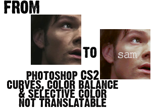
Tutorial #12 - Sam Winchester

Step one:
Crop your base and prepare it however you want.

Step two:
Add a new hue/saturation layer, saturation: +9

Step three:
Add a new curves layer:
RGB:
I: 80
O: 104

Step four:
New layer, filled with #FDFAA7, set to soft light at 100%.

Step five:
Add a new selective coloring layer with the following settings:
REDS:
C; -57
M; +14
Y; +8
B; 0
YELLOWS:
C; -38
M; 0
Y; -20
B; +10
NEUTRALS:
C; 0
M; 0
Y; -23
B; +6

Step six:
Add a new color balance layer with the following settings [make sure preserve luminosity is checked]:
MIDTONES:
+15, +10, +10
SHADOWS:
+5, -5, +10
HIGHLIGHTS:
-30, -10, +15

Step seven:
New brightness/contrast layer:
Brightness: -9
Contrast: +12

Step eight:
New layer filled with #E0DFDF, set to linear burn at 100%:

Step nine:
New hue/saturation layer with the following settings:
MASTER:
saturation; +13
YELLOW:
saturation; -15
CYAN:
saturation; +9

Step ten:
Add whatever text, textures, brushes, etc. that you want, and you're done!

OPTIONAL:
I didn't use this step on this icon, but I did on some of the others.
Add a new color balance layer with the following settings:
HIGHLIGHTS:
-27; -10; +18
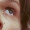
This will give you results like this:
I'd love to see what you come up with, and comments are ♥
Other examples of this coloring:


