Tutorial # 6
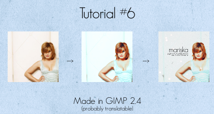
(involves channel mixer, curves, & color balance)
I've fallen in love with this effect, & thought I'd make a tutorial to share with everyone. I want to say before we get started that I'll show you the settings I used on my image, but your settings will most likely need to be tweaked, depedning on your image. :)
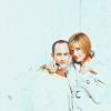
Step 1 - Grab your image (I suggest using an image that is very light). Mine is of the lovely Mariska Harigtay, from the website Mariska Hargitay Resource. I then cropped, & scaled to 100x100

Step 2 - Since the picture is blurry, I sharpened it up by using Unsharp Mask (Filters>Enhance>Unsharp Mask).
My settings;
Radius: 2.0
Amount: 2.5
Threshold: 0
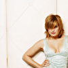
Step 3 - To add more color to the image, I duplicated my base and opened up the Channel Mixer (Colors>Components>Channel Mixer).
My settings;
Red: 90, -20, 0
Green: -10, 40, 60
Blue: -50, 80, 60
'Preserve Luminosity' is unchecked.
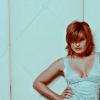
It looks kinda funky right now, but it'll get better, I promise!
Step 4 - Set your Channel Mixer Layer to Screen, opacity 100%
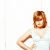
Step 5 - My image is far to bright for my liking now. To bring it down, I opened up the Brightness/Contrast tool (Colors>Brightness/Contrast).
My settings;
Brightness: -100
Contrast: 5
(Not everyone will need to do this step)
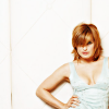
Step 6 - I copied my picture (Edit>Copy Visible) & pasted it (Edit>Paste) as a new layer.
Step 7 - To add a touch of blue to the picture, I opened up Curves (Colors>Curves). I then selected the Blue Channel, grabbed the black dot in the lower left corner, and moved it straight up.
My settings;
Blue - x: 0 y: 25

Step 8 - Mariska's coloring seems a little dull, so I opened up the Hue/Saturation tool (Colors>Hue/Saturation) to brighten it up.
My settings;
Red: 25
Yellow:10
Green: 30
Cyan:15
Blue: 50
Again, these settings will vary greatly depending on your image.
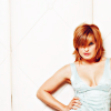
Step 9 - The picture could use a but more blue, so I opened up the color balance tool (Colors>Color Balance).
My settings;
Shadows: -25, 19, 23
(To keep Mariska's hair from getting overwhelmed, I upped the red level a bit in Highlights)
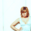
Step 10 - The image could still used a bit more color overall, so I duplicated the layer and opened up Channel Mixer again.
My settings;
Red: 90, -20, 0
Green: -10, 40, 60
Blue: -50, 80, 60
This time we will check 'Preserve Luminosity'

Step 11 - The image's colors are now far to vivid for my liking, so I set that layer to 'Color' opacity 25%
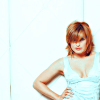
You can stop here if you like, & mess around with it a little. I thought it could use a bit more work though, so one more step!
Step 12 - The overall picture just seems to bright for my liking. So I opened up this texture

(Please help me find out me who made this!)
and set it to 'Darken Only' opacity 50%
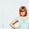
You can be done here. I added this texture
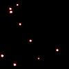
(from
spooky_window)
set to 'Screen', 100%. I added the text 'mariska' in the font 'Geo Sans Light', size 15, layer opacity 80%. I finally added a tiny text brush to a transparent layer, set to opacity 60%.
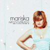
& voila! That's it!
I hope people will find this tutorial useful! =D I love seeing results, too.
Other icons made with this tutorial:
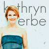

This tutorial is an expansion of the lovely
creamsodas Tutorial 18 =)