#31 - Aoi Miyazaki Tutorial.
Going from:
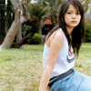
to
Translatable.
Begin with base:

Duplicate your base and set the layer to SCREEN (my icon's opacity is at 84%):
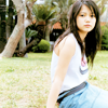
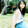
Create a new layer filled with #78d7fa and set the layer to (COLOR) BURN 52%:

>
Go to Layer>New Adjustment Layer>COLOR BALANCE, enter in:
MIDTONES: -40, -11, 8
SHADOWS: 3, 5, -7
HIGHLIGHTS: 5, -7, 5
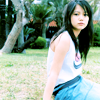
Create ANOTHER COLOR BALANCE layer, enter in:
MIDTONES: -34, -11, 8
SHADOWS: 7, -21, 2
HIGHLIGHTS: 1, 6, 0
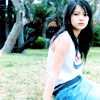
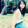
Create a new layer filled with #060d27 and set the layer to EXCLUSION:

>
Go to Layer>New Adjustment Layer>BRIGHTNESS/CONTRAST, enter in:
BRIGHTNESS: 2
CONTRAST: 13
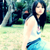
Go to Layers>New Adjustment Layer>HUE/SATURATION, enter in:
MASTER: 0, 11, 0
REDS: -7, 9, 0
GREENS: 3, 8, 0
MAGENTAS: 0, 5, 0

And it's done! Not too bad, although it is annoying to have to enter in all these numbers. If it looks too bleh, just mess with the numbers a bit and it will probably look alright. It may come out too bright for some, so just mess with the BRIGHTNESS/CONTRAST layer a bit.
Questions, comments, results, friending... yeah.
Other examples:
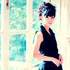
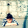
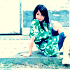
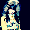
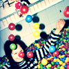
-Kelsey

to

Translatable.
Begin with base:

Duplicate your base and set the layer to SCREEN (my icon's opacity is at 84%):

Create a new layer filled with #78d7fa and set the layer to (COLOR) BURN 52%:

>

Go to Layer>New Adjustment Layer>COLOR BALANCE, enter in:
MIDTONES: -40, -11, 8
SHADOWS: 3, 5, -7
HIGHLIGHTS: 5, -7, 5

Create ANOTHER COLOR BALANCE layer, enter in:
MIDTONES: -34, -11, 8
SHADOWS: 7, -21, 2
HIGHLIGHTS: 1, 6, 0

Create a new layer filled with #060d27 and set the layer to EXCLUSION:

>

Go to Layer>New Adjustment Layer>BRIGHTNESS/CONTRAST, enter in:
BRIGHTNESS: 2
CONTRAST: 13

Go to Layers>New Adjustment Layer>HUE/SATURATION, enter in:
MASTER: 0, 11, 0
REDS: -7, 9, 0
GREENS: 3, 8, 0
MAGENTAS: 0, 5, 0

And it's done! Not too bad, although it is annoying to have to enter in all these numbers. If it looks too bleh, just mess with the numbers a bit and it will probably look alright. It may come out too bright for some, so just mess with the BRIGHTNESS/CONTRAST layer a bit.
Questions, comments, results, friending... yeah.
Other examples:


-Kelsey