Round 6; Challenge 7: Results
Banner maker this week is hot_radcliffe.
Results:
Eliminated:


phoenix39
with -9 votes
pokecharm
with -5 votes
Please stick around to vote for other challenges!
People's Choice:Mod's Choice:


jadedanielle
with +4 votes
li_potter
Comments:
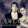
1. (-5) + (0) = -5
- the cropping of harry & hermione seems too crisp...it's a very awkward cropping and need to be more smooth
- text is starting to get lost in bg, the t is what almost looks like a 7
- the edges around their bodies are too sharp making the manipulation too obviou[s]
- a little bit too sharp, and some of the edges are a bit ragged
- persons too bright for font, oversharpened
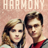
2. (-9) + (0) = -9
- The purple coloring in the background doesn't compliment the images very well.
- the dark blue coloring overpowers the icon
- icon needs more contrast between the lights and the darks to help the image pop out form the bg more
- the icon would benefit from some added contrast
- The icon has too low contrast, and the text stands too much out.
- The background and the image doesn't blend too well and the colouring is a little off putting.
- the font is a bit too pixely and hard to read
- for coloring and awkward text
- oversharpened
3. (-6) + (+2) = -4
- The image could be a bit crisper and the colors don't suit the icon very well. The pink is overpowering.
- the way the 2 images are placed feels akward. Also where the images is meet is the direct center make the icon less appealing to the eye.
+ good colouring and blending
- The icon is too blurry
- The definition has been lost in some parts of the icon which are too light.
+ the coloring is lovely and flattering, and matches the soft look of the photos
- faces are washed out
- colouring doesn't fit
4. (-5) + (+1) = -4
- Harry Hermione look a bit too defined. The icon looks grainy and the yellow is too strong for the icon.
- the yellow coloring is way over powering. it makes the skin look like a really bad tan
+ fun coloring and texture use
- The texture doesn't fit the colors of the icon. The icon is also too blurry.
- The edges of the people look sharpened but the rest of the image looks blurry.
- background and being off-centered
5. (0) + (+4) = +4
+ I love the subtle coloring and the way that Harry and Hermione are placed. It compliments the background very well and the text placement is perfect.
+ i love pics you picked to use & the text. nicely done =]
+ Nice use of texture
+ simple but effective.
6. (-2) + (+2) = 0
- the text is a bit too large and overpowers the icon
- the background seems a little bit too bright and doesn't fit the photo well
+ no comment
+ nice blend and colour
Results:
Eliminated:


phoenix39
with -9 votes
pokecharm
with -5 votes
Please stick around to vote for other challenges!
People's Choice:Mod's Choice:


jadedanielle
with +4 votes
li_potter
Comments:
1. (-5) + (0) = -5
- the cropping of harry & hermione seems too crisp...it's a very awkward cropping and need to be more smooth
- text is starting to get lost in bg, the t is what almost looks like a 7
- the edges around their bodies are too sharp making the manipulation too obviou[s]
- a little bit too sharp, and some of the edges are a bit ragged
- persons too bright for font, oversharpened
2. (-9) + (0) = -9
- The purple coloring in the background doesn't compliment the images very well.
- the dark blue coloring overpowers the icon
- icon needs more contrast between the lights and the darks to help the image pop out form the bg more
- the icon would benefit from some added contrast
- The icon has too low contrast, and the text stands too much out.
- The background and the image doesn't blend too well and the colouring is a little off putting.
- the font is a bit too pixely and hard to read
- for coloring and awkward text
- oversharpened
3. (-6) + (+2) = -4
- The image could be a bit crisper and the colors don't suit the icon very well. The pink is overpowering.
- the way the 2 images are placed feels akward. Also where the images is meet is the direct center make the icon less appealing to the eye.
+ good colouring and blending
- The icon is too blurry
- The definition has been lost in some parts of the icon which are too light.
+ the coloring is lovely and flattering, and matches the soft look of the photos
- faces are washed out
- colouring doesn't fit
4. (-5) + (+1) = -4
- Harry Hermione look a bit too defined. The icon looks grainy and the yellow is too strong for the icon.
- the yellow coloring is way over powering. it makes the skin look like a really bad tan
+ fun coloring and texture use
- The texture doesn't fit the colors of the icon. The icon is also too blurry.
- The edges of the people look sharpened but the rest of the image looks blurry.
- background and being off-centered
5. (0) + (+4) = +4
+ I love the subtle coloring and the way that Harry and Hermione are placed. It compliments the background very well and the text placement is perfect.
+ i love pics you picked to use & the text. nicely done =]
+ Nice use of texture
+ simple but effective.
6. (-2) + (+2) = 0
- the text is a bit too large and overpowers the icon
- the background seems a little bit too bright and doesn't fit the photo well
+ no comment
+ nice blend and colour