Round 6; Challenge 8: Results
Bannermaker this week is orlandogirl. (Volunteer here!)
Eliminated:


jadedanielle
with -6 votes
carmineador
with -5 votes
People's Choice:Mod's Choice


azi_69_daniela
with +2 votes
ennelya
Comments:
#1: (-2) + (+1) = -1
- the icon could use some added contrast
- looks pixel-y
+ Nice choice of cap and crop.
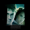
#2: (-5) = -5
- The colors are too blue and very close to the original image.
- the crop and colouring is really too blue and too tight
- the icon is a bit oversaturated
- the border cuts off the image and its too distracting
- The cropping is at a very odd angle and it seems to into there face to much.
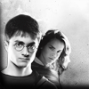
#3: (+1) = 1
+ No comment
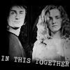
#4: (-3) = -3
- the size of Hermione and Harry is really off
- the texture is overpowering
- i love the image bing black and white,its a perfect image for it!but the light texture seems in the way,it looks over crowded and it looks like its just trying to cover the image
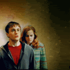
#5: (-6) = -6
- The image quality is very poor (like blurred and sharped at the same time).
- the icon is far too light
- the icon is too sharp
- needs more contrast, harry's face lacks definition
- the image looks over sharpened
- The text is very nice but the image's seem very grungy in the wrong places.There seems to be a grungy texture on Hermione's face that looks very odd and harry's neck looks very pixely on the sides.
#6: (+3) = 3
+ quite frankly, I just like the cap.
+ nice colouring and cropping
+ No comment
#7: (-2) + (+1) = -1
- The picture is blurry and the overall coloring is too pink.
- the pink text background blends into her dress. would look better with no background or something to help balance all the pink colouring used in this icon.
+ good colouring and text
Eliminated:
jadedanielle
with -6 votes
carmineador
with -5 votes
People's Choice:Mod's Choice
azi_69_daniela
with +2 votes
ennelya
Comments:
#1: (-2) + (+1) = -1
- the icon could use some added contrast
- looks pixel-y
+ Nice choice of cap and crop.
#2: (-5) = -5
- The colors are too blue and very close to the original image.
- the crop and colouring is really too blue and too tight
- the icon is a bit oversaturated
- the border cuts off the image and its too distracting
- The cropping is at a very odd angle and it seems to into there face to much.
#3: (+1) = 1
+ No comment
#4: (-3) = -3
- the size of Hermione and Harry is really off
- the texture is overpowering
- i love the image bing black and white,its a perfect image for it!but the light texture seems in the way,it looks over crowded and it looks like its just trying to cover the image
#5: (-6) = -6
- The image quality is very poor (like blurred and sharped at the same time).
- the icon is far too light
- the icon is too sharp
- needs more contrast, harry's face lacks definition
- the image looks over sharpened
- The text is very nice but the image's seem very grungy in the wrong places.There seems to be a grungy texture on Hermione's face that looks very odd and harry's neck looks very pixely on the sides.
#6: (+3) = 3
+ quite frankly, I just like the cap.
+ nice colouring and cropping
+ No comment
#7: (-2) + (+1) = -1
- The picture is blurry and the overall coloring is too pink.
- the pink text background blends into her dress. would look better with no background or something to help balance all the pink colouring used in this icon.
+ good colouring and text