Full-Icon Tutorial - Syd/Vaughn "Talk"
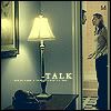
In this tutorial, we will be making this icon:

We'll be using the Levels and Gradient Map adjustment layers in Photoshop 7, and you'll need a basic familiarity with the tool pallette.
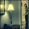
We start with the cropped base:

It's really dark and blurry, so I used the sharpen tool, the dodge tool (to make Syd & the bathroom wall lighter), and the burn tool (to adjust the look of the lamp) until I liked what I had with the base:

It's still quite dark, so I used a Levels adjustment layer to lighten the whole thing without losing too much contrast. To create an adjustment layer, go to Layer -> New Adjustment Layer -> Levels... I used it in the RGB channel with the input levels at 28, 1.45, and 213, and the output levels at 0 and 255:

Now it's time to use a Gradient Map adjustment layer to play with the colors. Go to Layer -> New Adjustment Layer -> Gradient Map... I used the "dark blue to lemon" gradient in a set by cooldecade. The layer is set on Normal at 50% opacity:

Next I added a 1px black border around the outside. I created a new layer, then using the rectangular marquee tool selected the whole canvas, right-clicked inside the selection and chose "Stroke..." and set it on 1px black:

Finally, I added some text. I find that it's easier to make the colors match if I can put black or white text (depending on the lightness or darkness of the background) underneath the gradient map or other color-manipulating layers (like color textures, exclusion layers, etc). So I added all my text directly on top of the base layer, underneath all the other layers.
First, the word "talk" in all-caps Garamond with the anti-alias set on Strong. I moved it around until I found a place I liked it at:

That didn't look quite done to me, so I decided to add some tiny text. Being slightly anal about my text, I had to think up words/find lyrics that I felt matched the icon. I ended up going with "everytime I try to talk to you" which, incidentally, is a snippet from "Why Don't You and I" by Santana & Chad Kroeger. At any rate, I set it down in all-caps Garamond, size 1. When I use tiny text, I almost always set the letter spacing as far apart as it will go, since I think it looks better that way. I then placed the line of tiny text under the word "talk" like so:

And that's it!
I hope this was clear and helpful. If you have any questions, feel free to comment and ask! If y'all enjoyed this, I might do some more :)
We'll be using the Levels and Gradient Map adjustment layers in Photoshop 7, and you'll need a basic familiarity with the tool pallette.
We start with the cropped base:
It's really dark and blurry, so I used the sharpen tool, the dodge tool (to make Syd & the bathroom wall lighter), and the burn tool (to adjust the look of the lamp) until I liked what I had with the base:
It's still quite dark, so I used a Levels adjustment layer to lighten the whole thing without losing too much contrast. To create an adjustment layer, go to Layer -> New Adjustment Layer -> Levels... I used it in the RGB channel with the input levels at 28, 1.45, and 213, and the output levels at 0 and 255:
Now it's time to use a Gradient Map adjustment layer to play with the colors. Go to Layer -> New Adjustment Layer -> Gradient Map... I used the "dark blue to lemon" gradient in a set by cooldecade. The layer is set on Normal at 50% opacity:
Next I added a 1px black border around the outside. I created a new layer, then using the rectangular marquee tool selected the whole canvas, right-clicked inside the selection and chose "Stroke..." and set it on 1px black:
Finally, I added some text. I find that it's easier to make the colors match if I can put black or white text (depending on the lightness or darkness of the background) underneath the gradient map or other color-manipulating layers (like color textures, exclusion layers, etc). So I added all my text directly on top of the base layer, underneath all the other layers.
First, the word "talk" in all-caps Garamond with the anti-alias set on Strong. I moved it around until I found a place I liked it at:
That didn't look quite done to me, so I decided to add some tiny text. Being slightly anal about my text, I had to think up words/find lyrics that I felt matched the icon. I ended up going with "everytime I try to talk to you" which, incidentally, is a snippet from "Why Don't You and I" by Santana & Chad Kroeger. At any rate, I set it down in all-caps Garamond, size 1. When I use tiny text, I almost always set the letter spacing as far apart as it will go, since I think it looks better that way. I then placed the line of tiny text under the word "talk" like so:
And that's it!
I hope this was clear and helpful. If you have any questions, feel free to comment and ask! If y'all enjoyed this, I might do some more :)