Full-Icon Tutorial - Syd/Vaughn "So It Begins"
In this tutorial, we'll be making this icon:

You'll need to have a least a basic familiarity with Photoshop 7. It should be fairly transferable to PSP as well, I think. Remember, this tutorial is intended as a series of tips for icon-making. Please don't duplicate the icon exactly and then call it your own, because that would make me sad.
We will be using: the sharpen filter, a gradient map adjustment layer, the rectangular marquee tool, and the text tool.
First, we start with the cropped base:

As with most cropped bases, it's too dark and blurry. I use the sharpen filter (Filter -> Sharpen -> Sharpen), which I then faded by about 15% or so. Use your discretion on your base, but keep in mind that over-sharpening is just as bad as under-sharpening!
So, now we have:
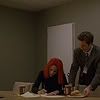
It's now nice and sharp, but we still have to make it lighter. I duplicate the background layer and set it to Screen at 100%. This still feels a little dark to me, so I duplicate the screen layer and set the new layer to 77%. The number of screen layers you'll use and their opacities depends on how dark your initial base was. Mine now looks like this:
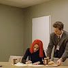
Much lighter! If you wanted to, you could accomplish the same thing (lightening the base) through various other methods - pick your favorite! I described how I do it using the dodge/burn tools and adjustment layers in my previous icon tutorial.
At this point I felt that the icon was a little flat, so I selected the whole canvas and copy merged (CTRL-SHIFT-C) and pasted (CTRL-V). I set the new layer to soft light at 100% opacity. Now my base looks like this:
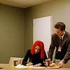
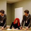
I decided that I wanted to fill in some of the empty space on the left side of the icon with a repeated image, so I once again selected the whole canvas and copy merged/pasted. I shifted the new layer to the left so that only Vaughn was repeated:
I was happy with the basic composition of the icon, but I wanted to tone down the color a little bit. Instead of playing with Hue/Saturation or Color Balance adjustment layers, which are a couple other options I could have chosen, I decided to use a Gradient Map adjustment layer. I used a light-medium-blue to medium-purple gradient from a set of gradients by crumblingwalls, with the "Reverse" box checked on the "Gradient Map" dialog box.
To create a gradient map adjustment layer, go to Layer -> New Adjustment Layer -> Gradient Map..., and a dialog box will pop up. Just hit OK. In the box labeled "Gradient Used for Grayscale Mapping" you can click on the arrow on the right to choose a gradient from those you have installed in Photoshop. If you don't have crumblingwalls's gradients and want to make a blue-to-purple one yourself, you can edit the gradient by clicking directly onto it and playing with the sliders and whatnot. In the gradient I used, the blue is #304D7A and the purple is #7E658B. Before you hit OK, make sure that the blue is on the left and the purple on the right. In general, when using gradient maps, the darker color should always be first, or it makes the image look like a negative. Keeping the preview box checked will help you make sure you've got things set okay. Once everything's set right, click OK. The icon looks like this:

Now, clearly I didn't leave it like that for long *grin*. Leaving the layer's blending mode on Normal, I reduced the opacity to 20%:
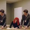
See how it muted the yellow tone of the icon without taking away too much contrast?
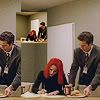
I was still not happy with the empty space at the top of the icon, so I decided to add another repeated image. I made the gradient map layer and the duplicate Vaughn layer invisible by clicking on the little eye in the layer palette that is associated with each layer. Then, making sure I had the topmost visible layer selected, I once again copy merged/pasted. I selected the whole canvas with the rectangular marquee tool (right-click, select all) and then right-clicked within the marquee and chose "Free Transform". Holding down the shift key to preserve the correct aspect ratio, I made the new layer smaller, stopping when it was about 31% of its original size. I positioned it where I wanted it and sharpened it with the sharpen filter:
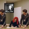
Still not quite happy with the way the icon looked, I decided to fiddle more with the small box. I desaturated it (Image -> Adjustments -> Desaturate), then I selected the box itself. While still using the rectangular marquee tool, right-click inside the selection and choose "Stroke...". I put the width as 2px and chose "center" because I wanted a 2px border, but I didn't want to take away 2px from the box or add them to the outside, so 1px on either side made for a nice balance. The icon now looks like this:
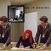
Finally, we're ready for my favorite part, text! Since this was Sydney and Vaughn's first meeting, and it was the start of a long, rocky, and wonderful relationship, I decided I wanted to put "so it begins" on the icon. Using the font Garamond (my stand-by font for icons) at size 4, with the letter-spacing set at 460, the all-caps option on, and the anti-alias set on Strong (ALWAYS SET IT TO SOMETHING, even if you like crisp or smooth or whatever better, as long as you anti-alias it), I typed it in:
You could stop there, of course, but I'm a fan of tiny text, so I added some. Incidentally, it's a line from "At the Beginning" from the animated film Anastasia - "We were strangers starting out on a journey". Seemed appropriate. I always do tiny text at 1pt with the letter spacing set to 1000, the maximum in PS7. I put the tiny text under the readable text like so:

And, ta-da! We're done!
Hopefully that wasn't too hard to follow and will be useful! If you have any questions, feel free to comment and ask! (And rememeber, you're always welcome to ask questions on techniques in icon posts as well, if you're curious about a specific icon!) Let me know if you'd like tutorials for other icons as well :D

You'll need to have a least a basic familiarity with Photoshop 7. It should be fairly transferable to PSP as well, I think. Remember, this tutorial is intended as a series of tips for icon-making. Please don't duplicate the icon exactly and then call it your own, because that would make me sad.
We will be using: the sharpen filter, a gradient map adjustment layer, the rectangular marquee tool, and the text tool.
First, we start with the cropped base:
As with most cropped bases, it's too dark and blurry. I use the sharpen filter (Filter -> Sharpen -> Sharpen), which I then faded by about 15% or so. Use your discretion on your base, but keep in mind that over-sharpening is just as bad as under-sharpening!
So, now we have:
It's now nice and sharp, but we still have to make it lighter. I duplicate the background layer and set it to Screen at 100%. This still feels a little dark to me, so I duplicate the screen layer and set the new layer to 77%. The number of screen layers you'll use and their opacities depends on how dark your initial base was. Mine now looks like this:
Much lighter! If you wanted to, you could accomplish the same thing (lightening the base) through various other methods - pick your favorite! I described how I do it using the dodge/burn tools and adjustment layers in my previous icon tutorial.
At this point I felt that the icon was a little flat, so I selected the whole canvas and copy merged (CTRL-SHIFT-C) and pasted (CTRL-V). I set the new layer to soft light at 100% opacity. Now my base looks like this:
I decided that I wanted to fill in some of the empty space on the left side of the icon with a repeated image, so I once again selected the whole canvas and copy merged/pasted. I shifted the new layer to the left so that only Vaughn was repeated:
I was happy with the basic composition of the icon, but I wanted to tone down the color a little bit. Instead of playing with Hue/Saturation or Color Balance adjustment layers, which are a couple other options I could have chosen, I decided to use a Gradient Map adjustment layer. I used a light-medium-blue to medium-purple gradient from a set of gradients by crumblingwalls, with the "Reverse" box checked on the "Gradient Map" dialog box.
To create a gradient map adjustment layer, go to Layer -> New Adjustment Layer -> Gradient Map..., and a dialog box will pop up. Just hit OK. In the box labeled "Gradient Used for Grayscale Mapping" you can click on the arrow on the right to choose a gradient from those you have installed in Photoshop. If you don't have crumblingwalls's gradients and want to make a blue-to-purple one yourself, you can edit the gradient by clicking directly onto it and playing with the sliders and whatnot. In the gradient I used, the blue is #304D7A and the purple is #7E658B. Before you hit OK, make sure that the blue is on the left and the purple on the right. In general, when using gradient maps, the darker color should always be first, or it makes the image look like a negative. Keeping the preview box checked will help you make sure you've got things set okay. Once everything's set right, click OK. The icon looks like this:
Now, clearly I didn't leave it like that for long *grin*. Leaving the layer's blending mode on Normal, I reduced the opacity to 20%:
See how it muted the yellow tone of the icon without taking away too much contrast?
I was still not happy with the empty space at the top of the icon, so I decided to add another repeated image. I made the gradient map layer and the duplicate Vaughn layer invisible by clicking on the little eye in the layer palette that is associated with each layer. Then, making sure I had the topmost visible layer selected, I once again copy merged/pasted. I selected the whole canvas with the rectangular marquee tool (right-click, select all) and then right-clicked within the marquee and chose "Free Transform". Holding down the shift key to preserve the correct aspect ratio, I made the new layer smaller, stopping when it was about 31% of its original size. I positioned it where I wanted it and sharpened it with the sharpen filter:
Still not quite happy with the way the icon looked, I decided to fiddle more with the small box. I desaturated it (Image -> Adjustments -> Desaturate), then I selected the box itself. While still using the rectangular marquee tool, right-click inside the selection and choose "Stroke...". I put the width as 2px and chose "center" because I wanted a 2px border, but I didn't want to take away 2px from the box or add them to the outside, so 1px on either side made for a nice balance. The icon now looks like this:
Finally, we're ready for my favorite part, text! Since this was Sydney and Vaughn's first meeting, and it was the start of a long, rocky, and wonderful relationship, I decided I wanted to put "so it begins" on the icon. Using the font Garamond (my stand-by font for icons) at size 4, with the letter-spacing set at 460, the all-caps option on, and the anti-alias set on Strong (ALWAYS SET IT TO SOMETHING, even if you like crisp or smooth or whatever better, as long as you anti-alias it), I typed it in:
You could stop there, of course, but I'm a fan of tiny text, so I added some. Incidentally, it's a line from "At the Beginning" from the animated film Anastasia - "We were strangers starting out on a journey". Seemed appropriate. I always do tiny text at 1pt with the letter spacing set to 1000, the maximum in PS7. I put the tiny text under the readable text like so:

And, ta-da! We're done!
Hopefully that wasn't too hard to follow and will be useful! If you have any questions, feel free to comment and ask! (And rememeber, you're always welcome to ask questions on techniques in icon posts as well, if you're curious about a specific icon!) Let me know if you'd like tutorials for other icons as well :D