Tutorial 1: Witchking of Angmar icon
First tutorial on this icon: 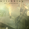
Ok I'm not really good at explaining things, so I hope this makes some sense. Before I go into the tutorial, I'd just like to say that this is aimed for more "advanced" icon makers, and those who are familiar with PSP terms and whatnot...Although i'll try my best to explain anything unclear to those who really don't understand a concept.
**If the brushes/gradients are not credited it means i forgot who made them *meep*...if you see any of your brushes/gradients here and want credit, just add a comment :)
On to the PSP tutorial (not too sure if it would work in Photoshop, but you can give it a try)...
*drum roll*
Original Picture
Here is what the original cropped picture looks like -->
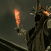
(pretty menacing aiye)
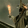
1. Duplicate the picture layer twice
2. Set one layer to "Lighten"
3. Set the other layer to "Screen"
4. "Sharpen" each layer once (so that would equate to 3 times)
You will get something like this -->
Brush Manipulation
Ok this is the "secret", that may be used by other icon makers, and is really effective with darker pictures.
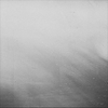
1. Choose a brush (jpeg. stamp) which really will produce a light texture to the icon
I picked this brush -->
2. Then choose a gradient. I picked a nice green one since Cirith Ungol and Nazgul so exemplifies green ;)
I picked this gradient -->

3. Now here comes the fun part. "Copy" and "Paste" the brush onto the gradient (don't do it the other way around, since it won't work). It should look the same as the original brush stamp after this
4. Set this layer to "Multiply"
5. Ok now you duplicate the original Gradient Background
6. Set this layer to "Screen"
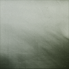
Your "Manipulated brush" should look like this now -->
Back to the Original Picture
1. All you do is paste the "Manipulated Brush" (with its new look) onto the picture
2. You can fiddle around with the opacity if you like
Tip 1: Keep a duplicated copy of the "Manipulated brush" since you'll need it later on ;)
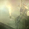
The icon should look like this now -->
New Gradient
I picked this gradient by killprettyx since it looks cool and "firey" -->
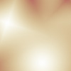
1. Now copy and paste this gradient onto the icon
2. Duplicate the gradient layer once
3. Set one layer to "Dodge" --> Opacity 48%
The icon should look like this -->
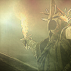
4. Set the other layer to "Multiply" --> Opacity 27% However with this layer, i erased quite a bit of the gradient colour out to give it a subdued look. And i also didn't like the rosy look on the helmet for some reason...There should be a slight difference to the icon
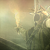
The icon should look like this now -->
Tips and some nifty effects
Ok we haven't finished yet, the icon looks a bit too plain for my liking, so i decided to throw in a few effects which will tizz up the icon
1. I "copied" this picture -->

(the sharpened one at the beginning) and pasted it onto the icon
2. Then i used the "Mover" button to move the picture to the left side of the icon, leaving only this part exposed onto the icon -->

3. I then erased around this picture so it can blend in with the colour
4. Then you just change that layers opacity to "Multiply" (i think) and set it to a low percentage
If you have a look at the finished icon, you can see it on the left hand side slightly :)
Ok now , remember the "Manipulated brush" that i had a spare copy of? I'm going to use that on the icon again...
5. "Copy" and "Paste" the manipulated brush onto the icon again
6. Use the "Mover" button to move this brush to the top left hand corner of the icon (just like i did with the picture)
The icon should look something like this -->
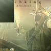
7. Now what you do is erase around the square edges of what is left of the brush
It should look something like this -->
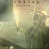
8. Now all you do is set this layer to "Soft Light"
9. After a gruelling half hour of figuring that out, i had a nice cup of coffee *giggles*
Tip 2: With brushes, i find that erasing some of it once it has been applied gives a neat effect (just like i did with this icon)
Now all you do is slap on some text of your choice and your done! :) (i added text earlier, but you can add it after...it will still look nice)

*throws confetti*
Note: You can sort of see on the left hand side how the extra tips make the icon look that extra special ;)
Phew that took longer than i thought...hope you guys enjoyed the tutorial...
*Rules Regarding this Tutorial*
1. This is meant to "inspire" other icon makers to experiment with their icons and just give some extra hints and insight into icon making practice
2. This tutorial has not been made for others to blatantly copy this exact icon
3. Try out some new stuff in between the steps of this tutorial...the best way to get great looking icons is to keep on experimenting with colours and brush stamps...thats the key :)
4. Enjoy ;)
Ok I'm not really good at explaining things, so I hope this makes some sense. Before I go into the tutorial, I'd just like to say that this is aimed for more "advanced" icon makers, and those who are familiar with PSP terms and whatnot...Although i'll try my best to explain anything unclear to those who really don't understand a concept.
**If the brushes/gradients are not credited it means i forgot who made them *meep*...if you see any of your brushes/gradients here and want credit, just add a comment :)
On to the PSP tutorial (not too sure if it would work in Photoshop, but you can give it a try)...
*drum roll*
Original Picture
Here is what the original cropped picture looks like -->
(pretty menacing aiye)
1. Duplicate the picture layer twice
2. Set one layer to "Lighten"
3. Set the other layer to "Screen"
4. "Sharpen" each layer once (so that would equate to 3 times)
You will get something like this -->

Brush Manipulation
Ok this is the "secret", that may be used by other icon makers, and is really effective with darker pictures.
1. Choose a brush (jpeg. stamp) which really will produce a light texture to the icon
I picked this brush -->

2. Then choose a gradient. I picked a nice green one since Cirith Ungol and Nazgul so exemplifies green ;)
I picked this gradient -->

3. Now here comes the fun part. "Copy" and "Paste" the brush onto the gradient (don't do it the other way around, since it won't work). It should look the same as the original brush stamp after this
4. Set this layer to "Multiply"
5. Ok now you duplicate the original Gradient Background
6. Set this layer to "Screen"
Your "Manipulated brush" should look like this now -->

Back to the Original Picture
1. All you do is paste the "Manipulated Brush" (with its new look) onto the picture
2. You can fiddle around with the opacity if you like
Tip 1: Keep a duplicated copy of the "Manipulated brush" since you'll need it later on ;)
The icon should look like this now -->

New Gradient
I picked this gradient by killprettyx since it looks cool and "firey" -->

1. Now copy and paste this gradient onto the icon
2. Duplicate the gradient layer once
3. Set one layer to "Dodge" --> Opacity 48%
The icon should look like this -->

4. Set the other layer to "Multiply" --> Opacity 27% However with this layer, i erased quite a bit of the gradient colour out to give it a subdued look. And i also didn't like the rosy look on the helmet for some reason...There should be a slight difference to the icon
The icon should look like this now -->

Tips and some nifty effects
Ok we haven't finished yet, the icon looks a bit too plain for my liking, so i decided to throw in a few effects which will tizz up the icon
1. I "copied" this picture -->

(the sharpened one at the beginning) and pasted it onto the icon
2. Then i used the "Mover" button to move the picture to the left side of the icon, leaving only this part exposed onto the icon -->

3. I then erased around this picture so it can blend in with the colour
4. Then you just change that layers opacity to "Multiply" (i think) and set it to a low percentage
If you have a look at the finished icon, you can see it on the left hand side slightly :)
Ok now , remember the "Manipulated brush" that i had a spare copy of? I'm going to use that on the icon again...
5. "Copy" and "Paste" the manipulated brush onto the icon again
6. Use the "Mover" button to move this brush to the top left hand corner of the icon (just like i did with the picture)
The icon should look something like this -->

7. Now what you do is erase around the square edges of what is left of the brush
It should look something like this -->

8. Now all you do is set this layer to "Soft Light"
9. After a gruelling half hour of figuring that out, i had a nice cup of coffee *giggles*
Tip 2: With brushes, i find that erasing some of it once it has been applied gives a neat effect (just like i did with this icon)
Now all you do is slap on some text of your choice and your done! :) (i added text earlier, but you can add it after...it will still look nice)
*throws confetti*
Note: You can sort of see on the left hand side how the extra tips make the icon look that extra special ;)
Phew that took longer than i thought...hope you guys enjoyed the tutorial...
*Rules Regarding this Tutorial*
1. This is meant to "inspire" other icon makers to experiment with their icons and just give some extra hints and insight into icon making practice
2. This tutorial has not been made for others to blatantly copy this exact icon
3. Try out some new stuff in between the steps of this tutorial...the best way to get great looking icons is to keep on experimenting with colours and brush stamps...thats the key :)
4. Enjoy ;)