(no subject)
First time tutorial, long time lurker. :D Made in PS7, most likely easy to translate into other programs.
Learn how to go from -THIS- lovely image of Shinku from Rozen Maiden...To this icon here in 10 steps!:
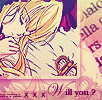
1 -- Start off by having one layer at all time at the bottom of this icon filled with the standad #FFFFFF fill, (so that the opacity shows up nicely!) Take your image of your choice, (Yay,
Shinku!) crop and resize to 100x100. Then sharpen once, and duplicate the layer. Now, set the top duplicate layer to invisible mode(Click the little eye in the layers pallet, next to the layer,) while we work on the bottom layer. For the first base I have of Shinku all you have to do is change is opacity. I chose a rather light 19% since we don't need much at all!
2 -- Next take that duplicate image of you base image, and resize it to which ever size you feel fits best, (So it sits nice+snug in the corner.) So far you should be okay, and your layers should look like - SO -. Easy right? Make this layer visible again once more.
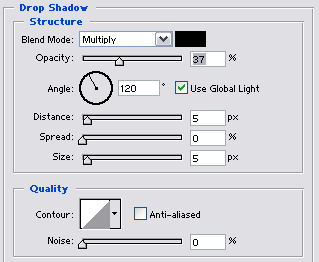
3 -- Now, select the layer you just resized and right cick, to select the blending options! Now alter the Stroke and Shadow options
to the ones you see below:
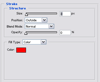
+
4 -- Now you should have an icon and layers looking like - THIS - woo!
Now just add this lovely newspaper texture (-PREVIEW-) by
twisted_fruitie which can be downloaded here all I did
was tuck it under my smallest image and left it was it was.
5 -- Now I used one of photoshops own grads:
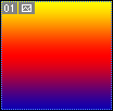
-- I set this layer to Overlay and 61% Opacity. (Colour codes are: Y: #FFF800 R: #FF0000 B:0A00B2 )
While your on this layer, you might want to erase the part of the layer that covers our top, smaller image. It looks nicer I think.
If not, you can keep it there! But I recommend getting rid of it.
6 -- Second grad!

-- Set this layer to Soft Light and keep it at %100 Opacity. 'Nuff said.
By
gender
7 -- Next make a new layer and fill it with a #110F4C colour, and set the layer to Exclusion. That's all of our colouring done!
Layers and icons should look like - THIS - Not much more to go now.
8 -- Now for some font, add whatever you'd like. IMPORTANT. Make all of your layers from now on are BELOW the Exclusion and Pink grads, but not below the
rainbow grad okay? :D I used two fonts, The first one being Edwardian Script ITC. (18 pt.) I then used the same blending options for this effect as I did in step 3,
to give it that nice outline. The second font was Bookman Old Style. Layers and icon should look like
9 -- Added a brush. I sadly don't reconise who made it, but if anyone knows do let me know thanks. :)
Just added this for a little more decoration.
10 -- Finally I just added a straight block of black at the bottom at 19% opacity, and we're done! Finally everything should look like this:

Taa-daa!

And there you have it.
Feedback is welcomed!
I hoped I've helped someone. XD;
-Pillsburry
Learn how to go from -THIS- lovely image of Shinku from Rozen Maiden...To this icon here in 10 steps!:
1 -- Start off by having one layer at all time at the bottom of this icon filled with the standad #FFFFFF fill, (so that the opacity shows up nicely!) Take your image of your choice, (Yay,
Shinku!) crop and resize to 100x100. Then sharpen once, and duplicate the layer. Now, set the top duplicate layer to invisible mode(Click the little eye in the layers pallet, next to the layer,) while we work on the bottom layer. For the first base I have of Shinku all you have to do is change is opacity. I chose a rather light 19% since we don't need much at all!
2 -- Next take that duplicate image of you base image, and resize it to which ever size you feel fits best, (So it sits nice+snug in the corner.) So far you should be okay, and your layers should look like - SO -. Easy right? Make this layer visible again once more.
3 -- Now, select the layer you just resized and right cick, to select the blending options! Now alter the Stroke and Shadow options
to the ones you see below:
+
4 -- Now you should have an icon and layers looking like - THIS - woo!
Now just add this lovely newspaper texture (-PREVIEW-) by

twisted_fruitie which can be downloaded here all I did
was tuck it under my smallest image and left it was it was.
5 -- Now I used one of photoshops own grads:
-- I set this layer to Overlay and 61% Opacity. (Colour codes are: Y: #FFF800 R: #FF0000 B:0A00B2 )
While your on this layer, you might want to erase the part of the layer that covers our top, smaller image. It looks nicer I think.
If not, you can keep it there! But I recommend getting rid of it.
6 -- Second grad!
-- Set this layer to Soft Light and keep it at %100 Opacity. 'Nuff said.
By

gender
7 -- Next make a new layer and fill it with a #110F4C colour, and set the layer to Exclusion. That's all of our colouring done!
Layers and icons should look like - THIS - Not much more to go now.
8 -- Now for some font, add whatever you'd like. IMPORTANT. Make all of your layers from now on are BELOW the Exclusion and Pink grads, but not below the
rainbow grad okay? :D I used two fonts, The first one being Edwardian Script ITC. (18 pt.) I then used the same blending options for this effect as I did in step 3,
to give it that nice outline. The second font was Bookman Old Style. Layers and icon should look like
9 -- Added a brush. I sadly don't reconise who made it, but if anyone knows do let me know thanks. :)
Just added this for a little more decoration.
10 -- Finally I just added a straight block of black at the bottom at 19% opacity, and we're done! Finally everything should look like this:
Taa-daa!
And there you have it.
Feedback is welcomed!
I hoped I've helped someone. XD;
-Pillsburry