Icon Tutorial in Adobe Photoshop CS2: Textures, curves, selective color
Go from 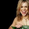
to
Hey kids, today I'm going to show you a technique I abuse use quite often to jazz up a base with a plain background. It works best on darker backgrounds, but with some tweaking I've also used it on the dreaded white background.
Be aware that I'm just going to demonstrate the absolute basics--each base is different, so your procedure will be slightly different every time. You can't just churn out this exact tutorial with different bases or you run the risk of that lovely radioactive look. So please, please, please feel free to tweak and experiment as you like.
We're doing the Photoshizzle CS2 thing this time, so I'm not sure about PSP and other graphic programs. Hopefully y'all can figure it out, if you're not rockin' the best graphics program tever Photoshop. I'm going to assume you know the basics of iconing--layers, blend modes, filters, etc. In other words, I'm assuming you've gotten past the OMGZ I JUST GOT PHOTOSHOP HOW DO I USE IT???? stage.
Base Prep
This procedure will be different based on the quality of your original image. I used a very HQ image for this tutorial, so I won't need to do much to make it pretty. So if you used a decent quality image you could probably follow this procedure and it'll turn out OK.
1. We're going to start with this base:

I usually do the following step on bases to make the colors brighter and more vibrant. Copy this layer (ctrl+J) and set to "soft light"

2. Go back to the bottom layer (your background) and run the "sharpen" filter once.
It's a little too sharp now, so go to edit >> fade sharpen and drag the slider to 50%, blend mode "normal." Hit OK.

3. I created a new layer between the background and soft light layer, then filled with a dark blue color (#0d1749 for this example) and changed the blend mode to "exclusion." Then I lowered the opacity to 50%. This gives our base a nice matte look. Adjust the hue and opacity to suit your base. Anyway, we now have:

You can do one of two things here: Merge all your layers (you should have three) or put them in a group. I'm a merge-phobic, so I usually use layer groups (which I am not going to teach you b/c I am lazy, but I did cover that in this here tutorial). Whatever you're most comfortable with.
The fun part!
Now that you're done fixing up the base, here's everyone's faaaaaavorite part--playing with textures and color! W00t!
4. Create a new layer on top of your base (a term I will heretofore use to reference your merged base layers or layer group, whatever you decided to do) and fill with the texture of your choice. This technique works best on textures that are sort of mid-tone--not too light and not too dark. I used the following texture by missymw88icons
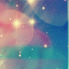
Change the blend mode to "hard light" at 100% opacity:

It looks pretty manky now, but don't worry--we'll be fixing it up later!
5. Using the "dodge" tool and a soft-edged brush, lighten up the part of the texture over your subject. I usually keep the exposure at a low setting, about 20%. This gives a more subtle effect, and you can always keep painting over it to intensify the effect.

6. Duplicate your texture layer and set the duplicate to "lighten." Leave it at 100% for now.

Again, don't worry if it looks really light... we're going to darken things up in the next few steps.
7. Go back down to your base layer or group. Duplicate this layer/group and move it to the very top. If you're using a layer group, merge the duplicate group (which will be called "group 1 copy" by default). Change the blend mode of this top layer to "soft light" at 100%. Duplicate this layer. Now you should have two "soft light" layers at the very top.

Better, but the background's a bit too dark now. This is easy to fix. I created a layer mask on the topmost "soft light" layer (on the layers palette, third icon from the left) and masked out the background. There are a variety of ways to do this. If you've got a solid background that contrasts sharply from the subject (in this case) you can usually get away with the magic wand (however, I like to do select >> modify >> smooth by a pixel or two so it doesn't look all jaggedy and gross). If not, however, you can use the pen tool or polygonal lasso tool to select the background. There's also an excellent tutorial here. Aaaanyway, once you mask out the background, you should have something like this:

8. Now it's a bit too washed out for my tastes. Time to add some color. Create a new layer below the very top, "soft light" layer. Fill this layer with a lighter-toned gradient, such as the following pastel gradient of unknown origins:

I like to put the lighter part of the gradient in the opposite corner from my subject, but it's really up to you. Change the blend mode to "hard light" and stick to 100% for now.

9. OK, I know it's really light now. But fear not--we're about to fix that. Copy the gradient layer (ctrl+J) and go to edit >> transform >> rotate 180 degrees. Or else you could just do like I do and fill the new layer with the same gradient, but drag the mouse in the opposite direction. Either way, your second gradient layer should look like this:

Set this second gradient layer to "color burn" at 100%. Now you should have something like this:

10. Now we're going to make a new adjustment layer. Hit the adjustment layer icon in the layers palette (fourth from the left) and select "selective color" or go to layers >> new adjustment layer >> selective color. A dialog box should pop up with a drop-down menu and several sliders. Now, our picture is looking a bit too pinky for my tastes, so click on the drop-down and select "Magentas." I wanted to reduce the pinkiness, so I experimented with the various sliders and ended up using the following settings:
Cyan: -40
Magenta: -50
Yellow: +44
Black: +35
Then I went to "Reds" and used the following settings:
Cyan: +46
Magenta: -20
Yellow: -20
Black: -20
Do not just plug these settings! I never use the same settings every time! After playing with this technique enough, you'll develop a feel for which color channels to adjust and what sliders to... erm, slide. Till then, just drag them around and experiment--that's what I did. Anyway, now we have:

11. Now for that lovely curves layer we're all so fond of. I know all these tutorials proudly boost "no curves!" but screw that, curves are simply wonduhful (well, provided you actually know how to use them). Don't knock the curves, man. Anyway, make a new "curves" adjustment layer. If you've been paying attention, you probably know what comes next--that's right, kids. Drag around the line thingy and experiment! But don't worry, I'll provide some guidance for ya curves n00bs.
I went to the blue channel first to adjust the blue-ishness. After some experimental dragging, I ended up making two points, each with the following coordinates:
Input: 33
Output: 36
Input: 137
Output: 93
Next, the green channel:
Input: 74
Output: 50
Input: 162
Output: 153
Input: 255
Output: 231
The red channel:
Input: 56
Output: 64
Input: 162
Output: 137
Now that the individual colors are adjusted to my liking, I went to the RGB channel to adjust the contrast/vibrancy. Yup--more experimenting! Here be my coordinates:
Input: 14
Output: 0
Input: 70
Output: 54
Input: 143
Output: 115
Input: 194
Output: 184
Again, do not just plug these settings! This is only to give you a general idea of what I usually do. Every icon uses different curves settings. Aaaaanyway, our progress report thus far:

So that's it for today's tutorial. Here's some other icons I made using this technique:


Oh, and please don't gank those icons! They're for a 100 icons thing and I'm not supposed to post them yet... ssshhhh!

to
Hey kids, today I'm going to show you a technique I abuse use quite often to jazz up a base with a plain background. It works best on darker backgrounds, but with some tweaking I've also used it on the dreaded white background.
Be aware that I'm just going to demonstrate the absolute basics--each base is different, so your procedure will be slightly different every time. You can't just churn out this exact tutorial with different bases or you run the risk of that lovely radioactive look. So please, please, please feel free to tweak and experiment as you like.
We're doing the Photoshizzle CS2 thing this time, so I'm not sure about PSP and other graphic programs. Hopefully y'all can figure it out, if you're not rockin' the best graphics program tever Photoshop. I'm going to assume you know the basics of iconing--layers, blend modes, filters, etc. In other words, I'm assuming you've gotten past the OMGZ I JUST GOT PHOTOSHOP HOW DO I USE IT???? stage.
Base Prep
This procedure will be different based on the quality of your original image. I used a very HQ image for this tutorial, so I won't need to do much to make it pretty. So if you used a decent quality image you could probably follow this procedure and it'll turn out OK.
1. We're going to start with this base:

I usually do the following step on bases to make the colors brighter and more vibrant. Copy this layer (ctrl+J) and set to "soft light"

2. Go back to the bottom layer (your background) and run the "sharpen" filter once.
It's a little too sharp now, so go to edit >> fade sharpen and drag the slider to 50%, blend mode "normal." Hit OK.

3. I created a new layer between the background and soft light layer, then filled with a dark blue color (#0d1749 for this example) and changed the blend mode to "exclusion." Then I lowered the opacity to 50%. This gives our base a nice matte look. Adjust the hue and opacity to suit your base. Anyway, we now have:

You can do one of two things here: Merge all your layers (you should have three) or put them in a group. I'm a merge-phobic, so I usually use layer groups (which I am not going to teach you b/c I am lazy, but I did cover that in this here tutorial). Whatever you're most comfortable with.
The fun part!
Now that you're done fixing up the base, here's everyone's faaaaaavorite part--playing with textures and color! W00t!
4. Create a new layer on top of your base (a term I will heretofore use to reference your merged base layers or layer group, whatever you decided to do) and fill with the texture of your choice. This technique works best on textures that are sort of mid-tone--not too light and not too dark. I used the following texture by missymw88icons

Change the blend mode to "hard light" at 100% opacity:

It looks pretty manky now, but don't worry--we'll be fixing it up later!
5. Using the "dodge" tool and a soft-edged brush, lighten up the part of the texture over your subject. I usually keep the exposure at a low setting, about 20%. This gives a more subtle effect, and you can always keep painting over it to intensify the effect.

6. Duplicate your texture layer and set the duplicate to "lighten." Leave it at 100% for now.

Again, don't worry if it looks really light... we're going to darken things up in the next few steps.
7. Go back down to your base layer or group. Duplicate this layer/group and move it to the very top. If you're using a layer group, merge the duplicate group (which will be called "group 1 copy" by default). Change the blend mode of this top layer to "soft light" at 100%. Duplicate this layer. Now you should have two "soft light" layers at the very top.

Better, but the background's a bit too dark now. This is easy to fix. I created a layer mask on the topmost "soft light" layer (on the layers palette, third icon from the left) and masked out the background. There are a variety of ways to do this. If you've got a solid background that contrasts sharply from the subject (in this case) you can usually get away with the magic wand (however, I like to do select >> modify >> smooth by a pixel or two so it doesn't look all jaggedy and gross). If not, however, you can use the pen tool or polygonal lasso tool to select the background. There's also an excellent tutorial here. Aaaanyway, once you mask out the background, you should have something like this:

8. Now it's a bit too washed out for my tastes. Time to add some color. Create a new layer below the very top, "soft light" layer. Fill this layer with a lighter-toned gradient, such as the following pastel gradient of unknown origins:

I like to put the lighter part of the gradient in the opposite corner from my subject, but it's really up to you. Change the blend mode to "hard light" and stick to 100% for now.

9. OK, I know it's really light now. But fear not--we're about to fix that. Copy the gradient layer (ctrl+J) and go to edit >> transform >> rotate 180 degrees. Or else you could just do like I do and fill the new layer with the same gradient, but drag the mouse in the opposite direction. Either way, your second gradient layer should look like this:

Set this second gradient layer to "color burn" at 100%. Now you should have something like this:

10. Now we're going to make a new adjustment layer. Hit the adjustment layer icon in the layers palette (fourth from the left) and select "selective color" or go to layers >> new adjustment layer >> selective color. A dialog box should pop up with a drop-down menu and several sliders. Now, our picture is looking a bit too pinky for my tastes, so click on the drop-down and select "Magentas." I wanted to reduce the pinkiness, so I experimented with the various sliders and ended up using the following settings:
Cyan: -40
Magenta: -50
Yellow: +44
Black: +35
Then I went to "Reds" and used the following settings:
Cyan: +46
Magenta: -20
Yellow: -20
Black: -20
Do not just plug these settings! I never use the same settings every time! After playing with this technique enough, you'll develop a feel for which color channels to adjust and what sliders to... erm, slide. Till then, just drag them around and experiment--that's what I did. Anyway, now we have:

11. Now for that lovely curves layer we're all so fond of. I know all these tutorials proudly boost "no curves!" but screw that, curves are simply wonduhful (well, provided you actually know how to use them). Don't knock the curves, man. Anyway, make a new "curves" adjustment layer. If you've been paying attention, you probably know what comes next--that's right, kids. Drag around the line thingy and experiment! But don't worry, I'll provide some guidance for ya curves n00bs.
I went to the blue channel first to adjust the blue-ishness. After some experimental dragging, I ended up making two points, each with the following coordinates:
Input: 33
Output: 36
Input: 137
Output: 93
Next, the green channel:
Input: 74
Output: 50
Input: 162
Output: 153
Input: 255
Output: 231
The red channel:
Input: 56
Output: 64
Input: 162
Output: 137
Now that the individual colors are adjusted to my liking, I went to the RGB channel to adjust the contrast/vibrancy. Yup--more experimenting! Here be my coordinates:
Input: 14
Output: 0
Input: 70
Output: 54
Input: 143
Output: 115
Input: 194
Output: 184
Again, do not just plug these settings! This is only to give you a general idea of what I usually do. Every icon uses different curves settings. Aaaaanyway, our progress report thus far:

So that's it for today's tutorial. Here's some other icons I made using this technique:
Oh, and please don't gank those icons! They're for a 100 icons thing and I'm not supposed to post them yet... ssshhhh!