Full icon tutorial; PS; gradients, blend modes, brightening techniques
queen_cindyc wanted a tutorial for this icon, so here goes. The one created here might be subtly different, since I just have the .psd file and will attempt to start from scratch. Warning: image heavy!
From this to this: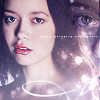
As always, this tutorial is done on Photoshop CS 2, but most of the techniques are pretty basic so you should be able to easily translate to earlier versions of PS or to PSP. I'm going to assume you know how to do the basics like cropping, resizing, layers, etc. To save space and loading time, the demo pictures are .jpg, so they will be lower quality than the final icon. As usual, I recommend saving in .png for sharper detail and purdier colors.
I will also warn you I am a keyboard shortcut whore, so I often will give directions in terms of keyboard shortcuts rather than the menus (and, erm, sometimes I forget where stuff is on the menus since I use keyboard shortcuts so much :p). So enough of this tl;dr already, and on with the tutorial.
We will start out with this Firefly promo pic of River: here
Crop to 100x100 icon size, like so:

I think what I did next was my usual first step in base prep--hit ctrl+J to duplicate the layer, then changed the duplicate to blend mode: soft light. In this particular case I left the opacity at 100%, but depending on your base you can fiddle around with the opacity to your liking. I find the soft light layer helps in improving brightness and contrast, and makes the colors really pop. See my tutorial on base prep for more tips and tricks.

The coloring is brighter, but it's still a bit blurry, and I like my icons to have that nice sharp, crisp look. So next we're going to--yup, you guessed it!--sharpen! At this point I like to take a snapshot in the history palette (see my history brush tutorial for details) to refer back to in case the image is oversharpened in the next step. Anyhoo, making sure the bottom layer (should be your background) is selected, I ran filter >> sharpen and then filter >> sharpen edges to get:

Now, this is a little *too* sharp-- I like the detail around the eyes and lips but the jaggedy edges on the rest of the face, hair and clothes are unsightly. Now is when that history palette snapshot comes in handy. The following step uses techniques clarified in my history brush tutorial. Basically, you go to the history palette and click the square thingy to the left of your snapshot. Then press "Y" to select the history brush tool. With the opacity set to about 50-60%, select a soft-edged brush on a very small size (usually 9-10px). Brush over the jaggedy parts (and for the love of avoiding mousecramp and eyestrain, please zoom in!), avoiding the eyes and lips, to get:

Now we're gonna do the skin smoothy thing. Merge visible (shft+cntrl+E) and then duplicate what should now be your only (background) layer (ctrl+J). Set the duplicate to 80%. Now, with the duplicate selected, select the smudge tool (press "R," select little icon that looks like hand thingy). Using a soft-edged brush of about 9-10px, with the opacity set to 15% or thereabouts, brush over the cheeks, forehead, and neck, avoiding the eyes and lips. Progress carefully and try to follow the direction of the shading and light, as not to distort the image too much. Change to a smaller brush (5-6px) when working around the eyes and lips (and please, oh please *prays* zoom in! I ain't payin' for the Lasik and/or carpal tunnel surgery if you don't).
The next step is optional. You could use the sharpen tool (again, very small soft-edged brush, only 5-7px or so, opacity 15%ish) and brush carefully over the lips for added crispness. I highly recommend *only* doing this step if you know what you're doing, and have the sense to not go overboard. I *hate* the zombie icon look with a passion and refuse to have any part in perpetuating it. kthx.
Our icon so far:

Merge visible (shft+ctrl+E). Now for the fun part--the coloring! Woor. Anyway, here's another standard step I do in 90% of my icons: the good ole exclusion layer. You know the drill. Create new layer, fill with dark blue, hit "exclusion". In this particular case, I used #0d2b49 at 50% opacity. How did I pick that particular color? Experimentation, mostly. I just grab a random dark blue off my colors palette and mess with the hue slider on hue/saturation (cntrl+U) till I like the look. I also play with opacities till I find something I like. Anyway, here's our progress report:

The next step is pure and simple experimentation with various gradients and blend modes. Make a new layer and play around till you find a pretty effect. I usually like to start off with a very light color set on "multiply." Gives a nice depth to your icon and is a good foundation. In this case, I filled the new layer with the following gradient from I-don't-know-who-but-check-my-resource-post, then changed the blend mode to multiply, 30% opacity:


It's looking a bit dark, so we're gonna brighten things up with another gradient. So you know the rest--new layer, fill with the following gradient of mysterious but credited in resource post origins, set to vivid light at 70%


Purdy colors, but it's looking a bit washed out. Now comes another trick that has become an icon staple: the duplicated base set on soft light. So, ummm, duplicate the base layer (should be your background), move to the top (shft+cntrl+]) and whack to *gasp* soft light! I used 50% opacity:

Still looking a bit dark, so here's another trick I grabbed from an excellent tutorial at Tangled Synthesis. It's a little tricky though, so hold onto your mouse and try to stay with me. switch over to the channels palette, and you should see a listing of your channels. Ctrl+click on the RGB palette to select it.
Go back to your layers. You should now see marching ants all over your picture, like so:
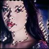
With your RGB channel still selected, copy merge (shft+ctrl+C or edit >> copy merged). Now make a new layer, then go to edit>>paste or ctrl+V. Change the opacity of this layer to "screen." Brightened things up quite a bit, huh? However, it's still a bit of an overkill for me, so to make it look less washed out, I duplicated this layer and set the duplicate to "soft light." Then I lowered the opacity of the screened layer to 28% and the soft light layer to 50% to get:

BTW, those values aren't set in stone. Depending on your base, mess around with the sliders till you find a good balance. I know the difference doesn't seem huge now, but trust me, it *does* show!
Now we're going to have some more gradient-y fun to add some interest. I ended up slapping on another gradient of mysterious origins, set at pin light 65%. I always liked pin light b/c it can add a really subtle but elegant color effect if used at low opacities and with the right colors. Now we have:

I like my colors now, so all that's left is adding some pretty accents. I usually choose to do this with brushes or textures. In this case, I found a texture by julia_thorne13 and dropped it on top at screen, 100%:


Then I took a light texture by erm... filipinoz_rule I think, and dropped it on top at screen, 100% opacity. I also colorized it (ctrl+U to launch "hue./saturation", then checked "colorize" and slid the hue slider around till I found an effect I liked) to match the color scheme of my icon. So now we have:

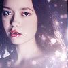
The next step is optional, but I think it looks cool, and it isn't that hard to do. Open the big, uncropped version of your base again. I forget exactly what I did here, but I think I resized it to a size that I thought would look good on the icon (I usually just zoom out to get a feel for how it would look, then go to image >> image size and shrink to the percent I zoomed out to). Then I copied the resized base image and pasted onto the icon (select the "move" tool (ctrl+V), click on the resized image and drag and drop onto the icon). Then I lowered the opacity a bit to see what I was doing and positioned this resized image in a place that I thought looked good. In this case, that would be off to the side on the right. Then I turned the opacity back up to 100%. So now we have:

It looks dark and blurry, so I was lazy and did a quick fix. I ran the sharpen filter once, then adjusted the levels to brighten a bit. In this case, I used auto levels (shift+ctrl+L) but in some cases it might look funky, in which case you might wanna adjust the levels manually (ctrl+L). I think I also made the eye pop a little more by creating a new layer, setting the blend mode to "overlay." Using the brush tool ("B"), I used a small brush, about 10px or so, with hard edges, and brushed over the pupil and iris. Erase excess with the eraser tool. Then lower the opacity to avoid frightening possessed eyes. In this case, I used 70%:

Merge this layer with the one below it, which I will call big River for now. This is easily done by selecting the overlay layer, then pressing ctrl+E to merge down. Next, I changed the blend mode to soft light, 100%. I then created a layer mask, and, using a medium-sized brush (25-30px) with soft edges, masked over all the parts covering little River. You could also use the eraser tool, if you're not comfortable working with layer masks. So now we have:
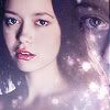
Then I added a swirly brush by dj43 I think, in the lower right corner to balance things out a bit. I created a new layer, set the foreground color to white and dropped the brush on at 100% opacity:

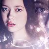
Almost done! Now all that's left is text. I didn't want to overwhelm the icon with large text, so instaed I opted for the trend you all luff so much, tiny text. I typed out "Watch Serenity best movie evah!" (teehee) and made it teeny. For more on tiny text, consult my text tutorial. I used white as the font color and set the blend mode to screen at 100%. It still was a little too faint, though, so I duplicated the text layer. Anyway, I saved as .png 24 for the final result:

Congrats! Y'all are done! Wooor. Now my fingers are tired from typing so I think I'm gonna watch Alias and spaz. Meanwhile, knock yourself out. :)
From this to this:

As always, this tutorial is done on Photoshop CS 2, but most of the techniques are pretty basic so you should be able to easily translate to earlier versions of PS or to PSP. I'm going to assume you know how to do the basics like cropping, resizing, layers, etc. To save space and loading time, the demo pictures are .jpg, so they will be lower quality than the final icon. As usual, I recommend saving in .png for sharper detail and purdier colors.
I will also warn you I am a keyboard shortcut whore, so I often will give directions in terms of keyboard shortcuts rather than the menus (and, erm, sometimes I forget where stuff is on the menus since I use keyboard shortcuts so much :p). So enough of this tl;dr already, and on with the tutorial.
We will start out with this Firefly promo pic of River: here
Crop to 100x100 icon size, like so:

I think what I did next was my usual first step in base prep--hit ctrl+J to duplicate the layer, then changed the duplicate to blend mode: soft light. In this particular case I left the opacity at 100%, but depending on your base you can fiddle around with the opacity to your liking. I find the soft light layer helps in improving brightness and contrast, and makes the colors really pop. See my tutorial on base prep for more tips and tricks.

The coloring is brighter, but it's still a bit blurry, and I like my icons to have that nice sharp, crisp look. So next we're going to--yup, you guessed it!--sharpen! At this point I like to take a snapshot in the history palette (see my history brush tutorial for details) to refer back to in case the image is oversharpened in the next step. Anyhoo, making sure the bottom layer (should be your background) is selected, I ran filter >> sharpen and then filter >> sharpen edges to get:

Now, this is a little *too* sharp-- I like the detail around the eyes and lips but the jaggedy edges on the rest of the face, hair and clothes are unsightly. Now is when that history palette snapshot comes in handy. The following step uses techniques clarified in my history brush tutorial. Basically, you go to the history palette and click the square thingy to the left of your snapshot. Then press "Y" to select the history brush tool. With the opacity set to about 50-60%, select a soft-edged brush on a very small size (usually 9-10px). Brush over the jaggedy parts (and for the love of avoiding mousecramp and eyestrain, please zoom in!), avoiding the eyes and lips, to get:

Now we're gonna do the skin smoothy thing. Merge visible (shft+cntrl+E) and then duplicate what should now be your only (background) layer (ctrl+J). Set the duplicate to 80%. Now, with the duplicate selected, select the smudge tool (press "R," select little icon that looks like hand thingy). Using a soft-edged brush of about 9-10px, with the opacity set to 15% or thereabouts, brush over the cheeks, forehead, and neck, avoiding the eyes and lips. Progress carefully and try to follow the direction of the shading and light, as not to distort the image too much. Change to a smaller brush (5-6px) when working around the eyes and lips (and please, oh please *prays* zoom in! I ain't payin' for the Lasik and/or carpal tunnel surgery if you don't).
The next step is optional. You could use the sharpen tool (again, very small soft-edged brush, only 5-7px or so, opacity 15%ish) and brush carefully over the lips for added crispness. I highly recommend *only* doing this step if you know what you're doing, and have the sense to not go overboard. I *hate* the zombie icon look with a passion and refuse to have any part in perpetuating it. kthx.
Our icon so far:

Merge visible (shft+ctrl+E). Now for the fun part--the coloring! Woor. Anyway, here's another standard step I do in 90% of my icons: the good ole exclusion layer. You know the drill. Create new layer, fill with dark blue, hit "exclusion". In this particular case, I used #0d2b49 at 50% opacity. How did I pick that particular color? Experimentation, mostly. I just grab a random dark blue off my colors palette and mess with the hue slider on hue/saturation (cntrl+U) till I like the look. I also play with opacities till I find something I like. Anyway, here's our progress report:

The next step is pure and simple experimentation with various gradients and blend modes. Make a new layer and play around till you find a pretty effect. I usually like to start off with a very light color set on "multiply." Gives a nice depth to your icon and is a good foundation. In this case, I filled the new layer with the following gradient from I-don't-know-who-but-check-my-resource-post, then changed the blend mode to multiply, 30% opacity:


It's looking a bit dark, so we're gonna brighten things up with another gradient. So you know the rest--new layer, fill with the following gradient of mysterious but credited in resource post origins, set to vivid light at 70%


Purdy colors, but it's looking a bit washed out. Now comes another trick that has become an icon staple: the duplicated base set on soft light. So, ummm, duplicate the base layer (should be your background), move to the top (shft+cntrl+]) and whack to *gasp* soft light! I used 50% opacity:

Still looking a bit dark, so here's another trick I grabbed from an excellent tutorial at Tangled Synthesis. It's a little tricky though, so hold onto your mouse and try to stay with me. switch over to the channels palette, and you should see a listing of your channels. Ctrl+click on the RGB palette to select it.
Go back to your layers. You should now see marching ants all over your picture, like so:

With your RGB channel still selected, copy merge (shft+ctrl+C or edit >> copy merged). Now make a new layer, then go to edit>>paste or ctrl+V. Change the opacity of this layer to "screen." Brightened things up quite a bit, huh? However, it's still a bit of an overkill for me, so to make it look less washed out, I duplicated this layer and set the duplicate to "soft light." Then I lowered the opacity of the screened layer to 28% and the soft light layer to 50% to get:

BTW, those values aren't set in stone. Depending on your base, mess around with the sliders till you find a good balance. I know the difference doesn't seem huge now, but trust me, it *does* show!
Now we're going to have some more gradient-y fun to add some interest. I ended up slapping on another gradient of mysterious origins, set at pin light 65%. I always liked pin light b/c it can add a really subtle but elegant color effect if used at low opacities and with the right colors. Now we have:

I like my colors now, so all that's left is adding some pretty accents. I usually choose to do this with brushes or textures. In this case, I found a texture by julia_thorne13 and dropped it on top at screen, 100%:


Then I took a light texture by erm... filipinoz_rule I think, and dropped it on top at screen, 100% opacity. I also colorized it (ctrl+U to launch "hue./saturation", then checked "colorize" and slid the hue slider around till I found an effect I liked) to match the color scheme of my icon. So now we have:


The next step is optional, but I think it looks cool, and it isn't that hard to do. Open the big, uncropped version of your base again. I forget exactly what I did here, but I think I resized it to a size that I thought would look good on the icon (I usually just zoom out to get a feel for how it would look, then go to image >> image size and shrink to the percent I zoomed out to). Then I copied the resized base image and pasted onto the icon (select the "move" tool (ctrl+V), click on the resized image and drag and drop onto the icon). Then I lowered the opacity a bit to see what I was doing and positioned this resized image in a place that I thought looked good. In this case, that would be off to the side on the right. Then I turned the opacity back up to 100%. So now we have:

It looks dark and blurry, so I was lazy and did a quick fix. I ran the sharpen filter once, then adjusted the levels to brighten a bit. In this case, I used auto levels (shift+ctrl+L) but in some cases it might look funky, in which case you might wanna adjust the levels manually (ctrl+L). I think I also made the eye pop a little more by creating a new layer, setting the blend mode to "overlay." Using the brush tool ("B"), I used a small brush, about 10px or so, with hard edges, and brushed over the pupil and iris. Erase excess with the eraser tool. Then lower the opacity to avoid frightening possessed eyes. In this case, I used 70%:

Merge this layer with the one below it, which I will call big River for now. This is easily done by selecting the overlay layer, then pressing ctrl+E to merge down. Next, I changed the blend mode to soft light, 100%. I then created a layer mask, and, using a medium-sized brush (25-30px) with soft edges, masked over all the parts covering little River. You could also use the eraser tool, if you're not comfortable working with layer masks. So now we have:

Then I added a swirly brush by dj43 I think, in the lower right corner to balance things out a bit. I created a new layer, set the foreground color to white and dropped the brush on at 100% opacity:


Almost done! Now all that's left is text. I didn't want to overwhelm the icon with large text, so instaed I opted for the trend you all luff so much, tiny text. I typed out "Watch Serenity best movie evah!" (teehee) and made it teeny. For more on tiny text, consult my text tutorial. I used white as the font color and set the blend mode to screen at 100%. It still was a little too faint, though, so I duplicated the text layer. Anyway, I saved as .png 24 for the final result:

Congrats! Y'all are done! Wooor. Now my fingers are tired from typing so I think I'm gonna watch Alias and spaz. Meanwhile, knock yourself out. :)