Tutorial #1 - Tohru
Bringing my old tutorials from my personal journal to the community, but it's a cute one and I couldn't resist.
This tutorial is totally translatable and it was made using Photoshop CS2.
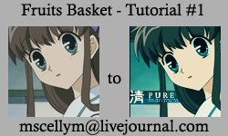
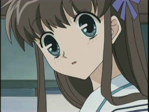
1- Grab your pretty base, I'm using a capture from the anime Fruits Basket, featuring the lovely Tohru. I cropped it to 100x100 and left it like that, I didn't need to sharpen, but it's okay if you need to do that or your base needs it.
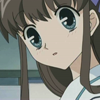
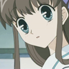
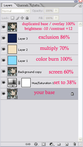
2- After preparing your base, duplicate it and set the duplicate layer to Screen. The opacity should be 60%. That's what I got:

>>
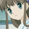
3- Go to Layer >> New Adjustment Layer >> Hue/Saturation. Increase the Saturation to 38% or whatever you feel comfortable. Place this new layer between the Screen layer and your base. I got:
4- On top of all layers, create a new one and fill it with #88DCFF. Set this new layer to Color Burn, leaving the opacity on 100%.

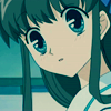
5- Create another new layer and fill it with #F3E1C0. Set this layer to Multiply and put the opacity around 70%. I came up with this:
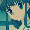
6- Create one more new layer (I promise it's almost finished!) and fill it with #121F4D. Set this layer to Exclusion and put the opacity on 86%. I came up with this:
7- Go to your base and duplicate it. Dragging it to the top of all layers, set it to Overlay. Here we go:

8- Last step: I simply love to play with Brightness and Contrast, so this is an optional step - go to Image >> Adjustments >> Brightness/Contrast and set it to:
Brightness: -10
Contrast: +12
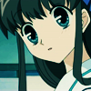
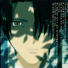
Flatten your image and voilà! You have a pretty new icon! Feel free to add text and/or brushes. I added this brush from yumei_k, in #f7f0dd, rotating my canvas 90º.
My layers palette, if you need some guidance:
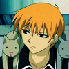
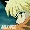
These are other examples of icons made with the same tutorial:

[x] Comments are love
[x] Watch/Join icon_collide for more!
[x] Enjoy it!
[x] Hotlinking is bad and makes me sad, so don't do it! ^_^
[x] Please post your results!
This tutorial is totally translatable and it was made using Photoshop CS2.

1- Grab your pretty base, I'm using a capture from the anime Fruits Basket, featuring the lovely Tohru. I cropped it to 100x100 and left it like that, I didn't need to sharpen, but it's okay if you need to do that or your base needs it.


2- After preparing your base, duplicate it and set the duplicate layer to Screen. The opacity should be 60%. That's what I got:

>>

3- Go to Layer >> New Adjustment Layer >> Hue/Saturation. Increase the Saturation to 38% or whatever you feel comfortable. Place this new layer between the Screen layer and your base. I got:

4- On top of all layers, create a new one and fill it with #88DCFF. Set this new layer to Color Burn, leaving the opacity on 100%.

5- Create another new layer and fill it with #F3E1C0. Set this layer to Multiply and put the opacity around 70%. I came up with this:

6- Create one more new layer (I promise it's almost finished!) and fill it with #121F4D. Set this layer to Exclusion and put the opacity on 86%. I came up with this:

7- Go to your base and duplicate it. Dragging it to the top of all layers, set it to Overlay. Here we go:

8- Last step: I simply love to play with Brightness and Contrast, so this is an optional step - go to Image >> Adjustments >> Brightness/Contrast and set it to:
Brightness: -10
Contrast: +12

Flatten your image and voilà! You have a pretty new icon! Feel free to add text and/or brushes. I added this brush from yumei_k, in #f7f0dd, rotating my canvas 90º.

My layers palette, if you need some guidance:

These are other examples of icons made with the same tutorial:


[x] Comments are love
[x] Watch/Join icon_collide for more!
[x] Enjoy it!
[x] Hotlinking is bad and makes me sad, so don't do it! ^_^
[x] Please post your results!