(no subject)
Wow, this was like running a marathon. Haha.
So I decided to knock over the tutorial requests and the questions in one hit. Cool, huh? With the tutorials, there isn't one tutorial for each icon that was requested, but just a general how-to, because essentially the main thing is that you experiment for yourself.
If I haven't answered your question, suck it up just reply to this and I'll see what I can do.
general questions
How do you describe your iconning style?
Somebody with ADD on a LSD trip.
Who are your strongest influences?
Well, I did the massive pimp post earlier with ALL of the people that influence me a lot, but I suppose there are four particular makers who I adore: prettybutt @ atomic_apples, blueymcphluey and animotus + speakfree @ twofortheroad.
What's the longest you're willing to spend on one icon?
As with most things about my icons, it really depends on the cap/fandom. If there's a cap I love, I'm more than willing to spend weeks on iconning it. Take for example this icon:

I spent about three weeks on this. I know it's not all that complicated, but it took me ages before I found coloring and a crop that I felt suited it. Funnily enough, for about 99% of those three weeks, this was an icon with colors and a black background. Lol. So to answer the question, if I want to icon something enough, I'll take as long as need be.
tutorials/guides
sharpening
I thought that some people might be interested in knowing that I always start with a 200x200 image. I do it for a number of reasons, but the main one is resolution. I find that you generally get much higher image quality when you start with a 200x200 base, especially if you like your icons sharp.
Let me show you three different examples of the same icon:


The first one was made on a 200x200 canvas. It was colored then sharpened twice at the end. The second one was made on a 100x100 canvas and sharpened one at the end. The last one was made on a 100x100 canvas and at the end, the icon was duplicated, the high pass (set to 0.5) filter was used on the duplicated layer and it was set to soft light. It's a subtle difference, and everybody does it differently, but that's just my two cents.
curves
Curves are the reason that I wake up in the morning. Hah, okay, maybe that's a bit of an overstatement, but really, I love them. If curves were a man, I would have a sordid love affair with him. Why? Because they can be used for a bajillion different things. I've had a couple of questions about this, so I'll take you through some of the things that they're great for.
Lightening a Cap

So we start with our base image. I probably should have picked a darker one, or one with more wierd colors on it, because in the great scheme of things, this is a pretty good cap. Anyway, moving right along. Obviously it's too dull to do anything with, so we have to lighten it.

=
New Curves Layer
Like I said, this cap is good because it really only needs one of these layers before things are visible. Sometimes you'll have to make up to four of these before you have any idea what's happening. The settings for this will be different for each icon, but so long as your line follows that kind of curve, it'll lighten things up.

=
New Curves Layer
Now to add some contrast. After my caps are bright enough, I always put a layer in like this (sometimes without that top point) to give it some blacks. My old art teacher told me that a good photograph always has clear blacks and clear whites in it. That's not always the case, but for now, it's a principle that I go by. Again, the settings will vary on this, but this general shape will give you some more contrast. Also, because this cap has a lot of yellow in it, this layer will bring that out.

=
New Curves Layer
Now to start adding in some color. Personally I rarely use curves as my only coloring layers. Usually I combine them with selective color, channel mixer, color balance, fill layers, gradients etc. Usually I'll only use curves to accentuate colors in the original caps that I want to manipulate more later on, or to give it a bit of balance, like I've done in this cap. This is just a matter of fiddling with the different channels. Personally I find the Blue channel to be the most useful, but the Green channel can be handy. I rarely touch the red, but like I said before, it depends on the cap and your own preferences.
And that, my friends, is how I lighten a cap with curves. Now onto my favorite bit:
Crazy Curves
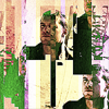
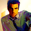
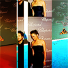
Hah, I came up with that name at like 3 in the morning, so let's just not even talk about it. A couple of people have asked me how I get some of the colors that I do, and really, this is it. Some examples of where I've used it are:

And also the background image on my icon journal, imotorized.
First let me say this: IT DOES NOT WORK ON EVERY CAP, AND MUST BE USED IN MODERATION. The examples I'll use below don't show moderation, but basically enough of this is enough to give somebody an epileptic fit. That being said, onto the curves.

=
New Curves Layer
See what I mean? Epileptic fit. This is basically what I used to do when I was bored, but then I figured - hey, it kind of looks cool. Basically, you just go crazy with that curves layer. Add in as many points as PS will let you, and see what you come up with. Okay, so this bit here isn't so much as a guide as it is an encouragement to go crazy. XD

MASK IT BBY.
I haven't done it so well in this pic, but the idea is that you don't use crazy curves over the whole picture. Add a layer mask, grab some crazy brushes and go wild. Usually I like to take it off the faces, but other than that, go wild. I'd also suggest you play with the coloring of your icons/graphics, so that they don't end up with that awful muddy yellow color that I've got in the above example.
bright colors
Sorry to disappoint, but instead of doing a full on walk-through here, I thought that I'd just outline some of the techniques I use on icons like these:

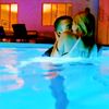

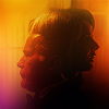
Selective Color is your friend.
Selective color really has taken a bit of a bashing in the last year or so, mainly due to the radioactive trend that hit the iconning world a little while back. IT'S NOT ALL BAD, FOLKS. The main thing that I preach when it comes to selective color is that it should be used SELECTIVELY (lol), and really, I only ever use it to enhance pretty colors in caps. DON'T BE AFRAID TO USE LAYER MASKS. If you want your foreground to be really green but you don't want your background to be the same, use it, bby. Also, there are more channels than just the red, yellow and neutral. Play with the cyans, blues and greens - you'll get fun results.
Color dodge, baby.
See that Milo Ventimiglia icon up there? The one with the purple splodge? That's color dodge in action. Grab your brush tool and put a contrasting color splodge in somewhere for some variation. It also helps to brighten things up a lot.
Curve it up.
See all that stuff I said about curves before? That's my secret. XD On every bright icon that I do, I use curves. Why? I'm not sure... really... all that I know is that it's great to have a really subtle curves layer that just makes your icon pop out of the screen.
Channel mixer
Okay, so the blue channel mixer thing went out of vogue a while ago, but that doesn't mean that the whole thing itself should go forgotten these days. Personally I love playing with the blue layer to give my icons WOW yellows, greens, magentas and all that shiz. Also, while we're on the subject of channels, if you have a play around with the channels tab, you can get some interesting results. Try switching off the blue layer. See what you get.
Soft light
Soft light layers are God's gift to mankind, and I saved it for last for a reason. Whether you use a light soft layer to make your icon brighter (as in, more white), or you use a dark soft layer to add contrast, these babies are one of my most used things. You know how out download all of those light textures and gradients and whatnot? Chuck 'em on top of an icon, set it to soft light and see what you come up with. Even put your adjustment layers on soft light if you're feeling a little wild. (hah, not really...)
I think that covers it. Oh, you have your light textures and whatever else you use, but those are really the main things that I do to give my icons a bit of kick.
black and white icons
I like my black and white icons to have a lot of contrast in them. Take, for example, these bad boys:
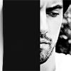
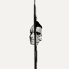


About 90% of the time, if I look at a pic/cap, I'll know whether I want it to be a black and white icon or one with color. With some people it might just be a matter of trial and error. Others might be like me - it's really up to the individual.
Basically, when it comes to black and white icons, curves is my friend. I'll go through the usual process of mine when it comes to b/w icons, but please note - this doesn't necessarily apply to every icon. Some b/w icons look fantastic with little contrast. It's all a matter of personal taste.
Here's a day in the life of one of Kate's b/w icons.


Starting with my base right hurr, the lovely Chris Pine. I'll use the smudge tool to extend my background all the way up. Then I'll desaturate.

=
I add in a new curves layer and really, really max out the whites. It looks dodgy, but that's the way these things are. Depending on how bright/dark your cap is to begin with, you might need to do a couple of these layers before you get it really light. It's usually at this stage that I decide whether or not I'm gonna use a fake background. I don't add it, but I usually decide about now, if you're interested.

=
Another new curves layer, this time really pumping those blacks. I suggest that even if you don't want too much contrast in your final icon, you do this step, because otherwise it might tend to look way, way too white in the end.

=
I add another curves layer, this time to add some contrast. If you think you already have enough contrast, then you can leave this out, but personally I'm all for it.
Texture time
Now is when I put in my textures. If I'm feeling a fake background, I'll add a layer mask to my base and get all of the background outta there. If I'm feeling some other kind of texture, I'll try it here. This is basically a free for all, and there's no right or wrong way to do it. Most of the time, though, I won't leave my icons as they are in the previous step. You can do all sorts of stuff, light textures, wierd croppy textures, grunge textures - whatever. Some examples of what I can do include:


At the end I sharpen and end up with my finished result(s) (because I couldn't pick one...)


Adding some BANG
So somebody asked me how I make icons like these:
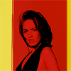


Essentially I do the same thing as above, then very very simply I add two new fill layers. The first fill layer is always in the darkest quadrant (eg. navy blue), and is set to screen. The second is a lighter color (eg. light pink) set to multiply. Then we end up getting something that looks like this:

This technique can be used for colored pics as well. Sometimes I also use gradients, like in that third example icon up there. It really just depends on the icon.
lost caps
Yeah, so some of you might be wondering (prettybutt, maybe?), why no foxy fox yet? That's because Lost gets a whole category to itself. Why? Because it's a pretty show, but I find that it's always a challenge to make icons THAT I LIKE out of it. So basically, I'm gonna go through the general way in which I make lost icons. It changes with every one, 'cause obviously they don't all look the same, but here's just something I felt I needed to write so I could get some pretty in here.
Green, green, green


So I've got my base. To kick of my greeny green coloring, I always chuck a couple of yellow-ey soft light layers in there, a. to brighten it and b. to bring out the yellows, which we'll work with more later on.

Guess what? Curves time. This is mainly just to get our shadows back in there. Now after this layer, you can do two things. You can really pump the greens using your selective color, and make a nice yellow-ey/greeney icon, or you can get your color balance out, take all of the yellows out and make a really bluey, fresh looking icon. Let me demonstrate:


Obviously I won't leave my icons like this. Textures and other coloring layers come after, but basically, this is the main type of coloring I use. Often I'll put in a couple of yellow blobs put on soft light to give an icon that glowy look, but for the most part, this is it. The main thing is that you EXPERIMENT FOR YOURSELF. Don't, please for the love of god, don't take this for the gospel or anything, because that's just a one way road to disaster. Lol.
textures
First of all, let me say that if you're new to textures, a guide like this one over at coffeeforcloser is a great place to start.
A couple of people asked me how do I pick textures for certain icons, and the answer is this: it really depends on what I'm looking for, or what the icon needs. TAKE TIME TO LOOK AT YOUR ICON. REALLY, REALLY LOOK AT IT. Take for example, this icon here:

Looking at it I figure that it needs something to make it a more interesting crop, and it needs maybe a bit more color, and some glowy-nedd (because foxy is a god, K?)

+
=
Sometimes I work on a 200x200 canvas, sometimes 100x100 - it really depends on my mood. Anyway, first to fix the cropping problem. I'm a big fan of reusing caps as textures, because I'm lazy, and because it can make some pretty interesting results. Usually I'd just use the same cap as the one that the base came from, but there was no green in the background, so I grabbed a different one. Anyway, I'd like to think it was pretty obvious what I did, I just chucked the second picture over half of Jack's face. Tah-dah - more interesting crop.

+
=
Alternatively, you can use the same texture, set it to lighten and then use the layer mask to create a more interesting crop.

+
=
Now the next thing I have to fix is the color, so I sharpen the image twice and resize it down to 100x100. This is where our light textures come into play. So I take the above light texture (made by me) and set it to screen. I then use the smudge and eraser tools to shift it around a bit so that it fits with my icon. Then what I do is, using similar colors, I get the paintbrush tool out (a soft brush, just one of the presets) and put some dollops of color in set at soft light until I'm happy. And there you have it.
Basically I suggest you just look at your picture and decide what it needs. Also, don't be afraid to make your own textures. For example, if you want a border, why not grab the paintbrush tool and draw one yourself instead of combing the internet to find the perfect brush or texture. I have a massive collection of textures, maybe like, 600 or so, and of those 600, I only really use about 20 of them. I use them over and over again, but realistically, that's it.
Also, experiment with images that don't come in little zip file. Check out ffffound.com. Go crazy.
wallpapers/big graphics
Okay, to be honest with you all, half the time I have no idea where I'm going with my bigger graphics. Usually they end up following this sort of form:
01. Grab some textures that I like, shove it on a canvas.
02. Find some pics that I like. Either cut them out with a layer mask or use a blending mode to blend them into the background.
03. Texture to the cows come home.
General tips
- The best way to learn how to make big graphics is a. to do them yourself, and b. to look at people who do them really, really well and get inspiration from them.
- Always try and work on a larger canvas, then resize it down. So just say you was a banner that's 600x400px, do all of the work on an 1200x800 canvas (or smaller, it doesn't matter) and then resize it down. The quality will generally be much better.
- USE HQ PICS.
I know that isn't very detailed, and I'm really sorry, but honestly, I have no idea what I do half the time. Basically I just play with blending modes, layer masks and textures. I recommend ex-posed.com and ffffound.com for textures.
To the person that requested this bit, I AM TERRIBLY SORRY. Heh... I just can't think of anything to add to this bit that I haven't said above...
So I decided to knock over the tutorial requests and the questions in one hit. Cool, huh? With the tutorials, there isn't one tutorial for each icon that was requested, but just a general how-to, because essentially the main thing is that you experiment for yourself.
If I haven't answered your question, suck it up just reply to this and I'll see what I can do.
general questions
How do you describe your iconning style?
Somebody with ADD on a LSD trip.
Who are your strongest influences?
Well, I did the massive pimp post earlier with ALL of the people that influence me a lot, but I suppose there are four particular makers who I adore: prettybutt @ atomic_apples, blueymcphluey and animotus + speakfree @ twofortheroad.
What's the longest you're willing to spend on one icon?
As with most things about my icons, it really depends on the cap/fandom. If there's a cap I love, I'm more than willing to spend weeks on iconning it. Take for example this icon:

I spent about three weeks on this. I know it's not all that complicated, but it took me ages before I found coloring and a crop that I felt suited it. Funnily enough, for about 99% of those three weeks, this was an icon with colors and a black background. Lol. So to answer the question, if I want to icon something enough, I'll take as long as need be.
tutorials/guides
sharpening
I thought that some people might be interested in knowing that I always start with a 200x200 image. I do it for a number of reasons, but the main one is resolution. I find that you generally get much higher image quality when you start with a 200x200 base, especially if you like your icons sharp.
Let me show you three different examples of the same icon:


The first one was made on a 200x200 canvas. It was colored then sharpened twice at the end. The second one was made on a 100x100 canvas and sharpened one at the end. The last one was made on a 100x100 canvas and at the end, the icon was duplicated, the high pass (set to 0.5) filter was used on the duplicated layer and it was set to soft light. It's a subtle difference, and everybody does it differently, but that's just my two cents.
curves
Curves are the reason that I wake up in the morning. Hah, okay, maybe that's a bit of an overstatement, but really, I love them. If curves were a man, I would have a sordid love affair with him. Why? Because they can be used for a bajillion different things. I've had a couple of questions about this, so I'll take you through some of the things that they're great for.
Lightening a Cap

So we start with our base image. I probably should have picked a darker one, or one with more wierd colors on it, because in the great scheme of things, this is a pretty good cap. Anyway, moving right along. Obviously it's too dull to do anything with, so we have to lighten it.

=

New Curves Layer
Like I said, this cap is good because it really only needs one of these layers before things are visible. Sometimes you'll have to make up to four of these before you have any idea what's happening. The settings for this will be different for each icon, but so long as your line follows that kind of curve, it'll lighten things up.

=

New Curves Layer
Now to add some contrast. After my caps are bright enough, I always put a layer in like this (sometimes without that top point) to give it some blacks. My old art teacher told me that a good photograph always has clear blacks and clear whites in it. That's not always the case, but for now, it's a principle that I go by. Again, the settings will vary on this, but this general shape will give you some more contrast. Also, because this cap has a lot of yellow in it, this layer will bring that out.

=

New Curves Layer
Now to start adding in some color. Personally I rarely use curves as my only coloring layers. Usually I combine them with selective color, channel mixer, color balance, fill layers, gradients etc. Usually I'll only use curves to accentuate colors in the original caps that I want to manipulate more later on, or to give it a bit of balance, like I've done in this cap. This is just a matter of fiddling with the different channels. Personally I find the Blue channel to be the most useful, but the Green channel can be handy. I rarely touch the red, but like I said before, it depends on the cap and your own preferences.
And that, my friends, is how I lighten a cap with curves. Now onto my favorite bit:
Crazy Curves
Hah, I came up with that name at like 3 in the morning, so let's just not even talk about it. A couple of people have asked me how I get some of the colors that I do, and really, this is it. Some examples of where I've used it are:


And also the background image on my icon journal, imotorized.
First let me say this: IT DOES NOT WORK ON EVERY CAP, AND MUST BE USED IN MODERATION. The examples I'll use below don't show moderation, but basically enough of this is enough to give somebody an epileptic fit. That being said, onto the curves.

=

New Curves Layer
See what I mean? Epileptic fit. This is basically what I used to do when I was bored, but then I figured - hey, it kind of looks cool. Basically, you just go crazy with that curves layer. Add in as many points as PS will let you, and see what you come up with. Okay, so this bit here isn't so much as a guide as it is an encouragement to go crazy. XD

MASK IT BBY.
I haven't done it so well in this pic, but the idea is that you don't use crazy curves over the whole picture. Add a layer mask, grab some crazy brushes and go wild. Usually I like to take it off the faces, but other than that, go wild. I'd also suggest you play with the coloring of your icons/graphics, so that they don't end up with that awful muddy yellow color that I've got in the above example.
bright colors
Sorry to disappoint, but instead of doing a full on walk-through here, I thought that I'd just outline some of the techniques I use on icons like these:


Selective Color is your friend.
Selective color really has taken a bit of a bashing in the last year or so, mainly due to the radioactive trend that hit the iconning world a little while back. IT'S NOT ALL BAD, FOLKS. The main thing that I preach when it comes to selective color is that it should be used SELECTIVELY (lol), and really, I only ever use it to enhance pretty colors in caps. DON'T BE AFRAID TO USE LAYER MASKS. If you want your foreground to be really green but you don't want your background to be the same, use it, bby. Also, there are more channels than just the red, yellow and neutral. Play with the cyans, blues and greens - you'll get fun results.
Color dodge, baby.
See that Milo Ventimiglia icon up there? The one with the purple splodge? That's color dodge in action. Grab your brush tool and put a contrasting color splodge in somewhere for some variation. It also helps to brighten things up a lot.
Curve it up.
See all that stuff I said about curves before? That's my secret. XD On every bright icon that I do, I use curves. Why? I'm not sure... really... all that I know is that it's great to have a really subtle curves layer that just makes your icon pop out of the screen.
Channel mixer
Okay, so the blue channel mixer thing went out of vogue a while ago, but that doesn't mean that the whole thing itself should go forgotten these days. Personally I love playing with the blue layer to give my icons WOW yellows, greens, magentas and all that shiz. Also, while we're on the subject of channels, if you have a play around with the channels tab, you can get some interesting results. Try switching off the blue layer. See what you get.
Soft light
Soft light layers are God's gift to mankind, and I saved it for last for a reason. Whether you use a light soft layer to make your icon brighter (as in, more white), or you use a dark soft layer to add contrast, these babies are one of my most used things. You know how out download all of those light textures and gradients and whatnot? Chuck 'em on top of an icon, set it to soft light and see what you come up with. Even put your adjustment layers on soft light if you're feeling a little wild. (hah, not really...)
I think that covers it. Oh, you have your light textures and whatever else you use, but those are really the main things that I do to give my icons a bit of kick.
black and white icons
I like my black and white icons to have a lot of contrast in them. Take, for example, these bad boys:


About 90% of the time, if I look at a pic/cap, I'll know whether I want it to be a black and white icon or one with color. With some people it might just be a matter of trial and error. Others might be like me - it's really up to the individual.
Basically, when it comes to black and white icons, curves is my friend. I'll go through the usual process of mine when it comes to b/w icons, but please note - this doesn't necessarily apply to every icon. Some b/w icons look fantastic with little contrast. It's all a matter of personal taste.
Here's a day in the life of one of Kate's b/w icons.


Starting with my base right hurr, the lovely Chris Pine. I'll use the smudge tool to extend my background all the way up. Then I'll desaturate.

=

I add in a new curves layer and really, really max out the whites. It looks dodgy, but that's the way these things are. Depending on how bright/dark your cap is to begin with, you might need to do a couple of these layers before you get it really light. It's usually at this stage that I decide whether or not I'm gonna use a fake background. I don't add it, but I usually decide about now, if you're interested.

=

Another new curves layer, this time really pumping those blacks. I suggest that even if you don't want too much contrast in your final icon, you do this step, because otherwise it might tend to look way, way too white in the end.

=

I add another curves layer, this time to add some contrast. If you think you already have enough contrast, then you can leave this out, but personally I'm all for it.
Texture time
Now is when I put in my textures. If I'm feeling a fake background, I'll add a layer mask to my base and get all of the background outta there. If I'm feeling some other kind of texture, I'll try it here. This is basically a free for all, and there's no right or wrong way to do it. Most of the time, though, I won't leave my icons as they are in the previous step. You can do all sorts of stuff, light textures, wierd croppy textures, grunge textures - whatever. Some examples of what I can do include:


At the end I sharpen and end up with my finished result(s) (because I couldn't pick one...)


Adding some BANG
So somebody asked me how I make icons like these:


Essentially I do the same thing as above, then very very simply I add two new fill layers. The first fill layer is always in the darkest quadrant (eg. navy blue), and is set to screen. The second is a lighter color (eg. light pink) set to multiply. Then we end up getting something that looks like this:

This technique can be used for colored pics as well. Sometimes I also use gradients, like in that third example icon up there. It really just depends on the icon.
lost caps
Yeah, so some of you might be wondering (prettybutt, maybe?), why no foxy fox yet? That's because Lost gets a whole category to itself. Why? Because it's a pretty show, but I find that it's always a challenge to make icons THAT I LIKE out of it. So basically, I'm gonna go through the general way in which I make lost icons. It changes with every one, 'cause obviously they don't all look the same, but here's just something I felt I needed to write so I could get some pretty in here.
Green, green, green


So I've got my base. To kick of my greeny green coloring, I always chuck a couple of yellow-ey soft light layers in there, a. to brighten it and b. to bring out the yellows, which we'll work with more later on.

Guess what? Curves time. This is mainly just to get our shadows back in there. Now after this layer, you can do two things. You can really pump the greens using your selective color, and make a nice yellow-ey/greeney icon, or you can get your color balance out, take all of the yellows out and make a really bluey, fresh looking icon. Let me demonstrate:


Obviously I won't leave my icons like this. Textures and other coloring layers come after, but basically, this is the main type of coloring I use. Often I'll put in a couple of yellow blobs put on soft light to give an icon that glowy look, but for the most part, this is it. The main thing is that you EXPERIMENT FOR YOURSELF. Don't, please for the love of god, don't take this for the gospel or anything, because that's just a one way road to disaster. Lol.
textures
First of all, let me say that if you're new to textures, a guide like this one over at coffeeforcloser is a great place to start.
A couple of people asked me how do I pick textures for certain icons, and the answer is this: it really depends on what I'm looking for, or what the icon needs. TAKE TIME TO LOOK AT YOUR ICON. REALLY, REALLY LOOK AT IT. Take for example, this icon here:

Looking at it I figure that it needs something to make it a more interesting crop, and it needs maybe a bit more color, and some glowy-nedd (because foxy is a god, K?)

+

=

Sometimes I work on a 200x200 canvas, sometimes 100x100 - it really depends on my mood. Anyway, first to fix the cropping problem. I'm a big fan of reusing caps as textures, because I'm lazy, and because it can make some pretty interesting results. Usually I'd just use the same cap as the one that the base came from, but there was no green in the background, so I grabbed a different one. Anyway, I'd like to think it was pretty obvious what I did, I just chucked the second picture over half of Jack's face. Tah-dah - more interesting crop.

+

=

Alternatively, you can use the same texture, set it to lighten and then use the layer mask to create a more interesting crop.

+

=

Now the next thing I have to fix is the color, so I sharpen the image twice and resize it down to 100x100. This is where our light textures come into play. So I take the above light texture (made by me) and set it to screen. I then use the smudge and eraser tools to shift it around a bit so that it fits with my icon. Then what I do is, using similar colors, I get the paintbrush tool out (a soft brush, just one of the presets) and put some dollops of color in set at soft light until I'm happy. And there you have it.
Basically I suggest you just look at your picture and decide what it needs. Also, don't be afraid to make your own textures. For example, if you want a border, why not grab the paintbrush tool and draw one yourself instead of combing the internet to find the perfect brush or texture. I have a massive collection of textures, maybe like, 600 or so, and of those 600, I only really use about 20 of them. I use them over and over again, but realistically, that's it.
Also, experiment with images that don't come in little zip file. Check out ffffound.com. Go crazy.
wallpapers/big graphics
Okay, to be honest with you all, half the time I have no idea where I'm going with my bigger graphics. Usually they end up following this sort of form:
01. Grab some textures that I like, shove it on a canvas.
02. Find some pics that I like. Either cut them out with a layer mask or use a blending mode to blend them into the background.
03. Texture to the cows come home.
General tips
- The best way to learn how to make big graphics is a. to do them yourself, and b. to look at people who do them really, really well and get inspiration from them.
- Always try and work on a larger canvas, then resize it down. So just say you was a banner that's 600x400px, do all of the work on an 1200x800 canvas (or smaller, it doesn't matter) and then resize it down. The quality will generally be much better.
- USE HQ PICS.
I know that isn't very detailed, and I'm really sorry, but honestly, I have no idea what I do half the time. Basically I just play with blending modes, layer masks and textures. I recommend ex-posed.com and ffffound.com for textures.
To the person that requested this bit, I AM TERRIBLY SORRY. Heh... I just can't think of anything to add to this bit that I haven't said above...