Tutorial
Wow, the week sure went by fast!
Here's the tutorial I promised, and I'll see if I can squeeze in a post on my favorite icon makers later on today.
Oh, and for those of you who requested icons, they may be awhile. 'Tis the season and what-not, so I'm a bit busy.
Anyway, we'll be going from

to
And I use PSP 9.
Warning, I'm nothing spectacular when it comes to tutorials.
1. Start with the base. Sharpen the layer and duplicate it twice. Set the middle layer to screen and the top layer to soft light. Duplicate the screen layer 3 times.
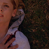

2. Insert a new layer between the top screen layer and the soft light layer. Fill it with a blue gradient and set it to burn at 50% opacity.


3. Insert a new layer above the burn layer with a peach-y gradient set to soft light at 80%.


4. Insert a new raster layer below the top layer. Use a round, white brush set to size 63 with 0 hardness to create the bright white spot. You can fiddle with the shape and the location depending on the image.
Add text of your choice. I used Arial Narrow, 12 point with -50 kerning.

VOILA! It's a fairly simple, clear icon.
Here's the tutorial I promised, and I'll see if I can squeeze in a post on my favorite icon makers later on today.
Oh, and for those of you who requested icons, they may be awhile. 'Tis the season and what-not, so I'm a bit busy.
Anyway, we'll be going from
to
And I use PSP 9.
Warning, I'm nothing spectacular when it comes to tutorials.
1. Start with the base. Sharpen the layer and duplicate it twice. Set the middle layer to screen and the top layer to soft light. Duplicate the screen layer 3 times.
2. Insert a new layer between the top screen layer and the soft light layer. Fill it with a blue gradient and set it to burn at 50% opacity.
3. Insert a new layer above the burn layer with a peach-y gradient set to soft light at 80%.
4. Insert a new raster layer below the top layer. Use a round, white brush set to size 63 with 0 hardness to create the bright white spot. You can fiddle with the shape and the location depending on the image.
Add text of your choice. I used Arial Narrow, 12 point with -50 kerning.
VOILA! It's a fairly simple, clear icon.