Black and white to color tutorial
I'm kinda bored, and I've had some people wonder how I've made my black and white to color icons...like this icon I made of Judy Garland:
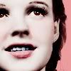
So here's a Paint Shop Pro tutorial using the lovely Bettie Page!
First off, the original Judy image I used was in black and white. But I really liked this pic of Bettie page, so I changed it to b&w for this tutorial. You could use the first couple steps on a color photo to make the subject's skin look sorta porcelain, then add other effects if you really wanted to. But we're going from b&w to color in this tutorial :D
I started with this image, found on BettiePage.com:
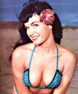
Cropped it, resized it, and changed it to grayscale:
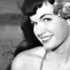
Sharpened once:

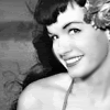
Here's where it gets a little tricky. Find the blur tool and use a small round brush to blur her skin. You have to be careful not to hit her lips, eyes, eyebrows, bottom of her nose, and outline of her face. You'll see what I mean once you try it...if you blur everything it just looks like mush. Just stay away from most of the sharp lines really. Here's what it should look like:
I used the color dropper tool to pick a skintone from the original color image...but if you're working with an original b&w you'll probably have to google some color pictures of models or something. I used #FFF1E8. Add a new layer set to multiply, and color her skin in. You might have to adjust the opacity to make it look more natural, this is set at 100%. I also like to make things hard on myself and color everything in by hand. If you know an easier way, USE IT lol
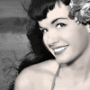
Add another layer set to multiply. I wanted to color her lips and flower the same, so picked a nice coral/pink color - #F86E8B. They were too dark at first, so I lowered the opacity to 75%.
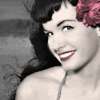
Add yet another new layer set to multiply. Use a small-medium size brush to put a few dabs of light pink onto her cheeks. I used #FEE0E6. Then use gaussian blur, with the radius set at 3 (you can adjust this if needed). It was still a little dark, so I lowered the opacity to 80%
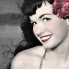
New multiply layer. We're gonna color the backround and where the light hits her hair. You can use any color you want, or you might choose to leave it blank! Whatever you feel looks best. I chose the same color as her lips/flower, #F86E8B. Went over the whole backround and most of her hair. On a lighter haired subject, it might look a little funny...be warned.
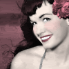
You could probably stop there, but I like to add a bit more to it. My favorite thing to do in icons is add a screen layer and fill it with dark brown. It softens the black lines, and just makes me feel warm and fuzzy hehe. For this icon I used #4E1C10, at 100% opacity.

Another optional layer is a burn layer filled with a khaki type color, like #E9E2D7. You'll have to mess with the opacity a bit though, or it'll be too dark or too strong a color change. I set this layer to 50%.

Then you can do whatever else it is you like to do to your icons. Use light effects, textures, text, brushes etc. I added a little heart brush (in that same pink color) on a screen layer, set to 75% opacity. On another new layer, I used Jenkins v2.0 font size 16...and lowered the opacity to 90% cause it seemed a bit sharp. VOILA! It is done!

Haha I fail at text XD Oh well, I hope this helped somebody out there! I'll probably be making a tutorial for coloring black and white manga images soon too, so keep an eye out for that :D
X-posted in icon_tutorial

So here's a Paint Shop Pro tutorial using the lovely Bettie Page!
First off, the original Judy image I used was in black and white. But I really liked this pic of Bettie page, so I changed it to b&w for this tutorial. You could use the first couple steps on a color photo to make the subject's skin look sorta porcelain, then add other effects if you really wanted to. But we're going from b&w to color in this tutorial :D
I started with this image, found on BettiePage.com:

Cropped it, resized it, and changed it to grayscale:

Sharpened once:

Here's where it gets a little tricky. Find the blur tool and use a small round brush to blur her skin. You have to be careful not to hit her lips, eyes, eyebrows, bottom of her nose, and outline of her face. You'll see what I mean once you try it...if you blur everything it just looks like mush. Just stay away from most of the sharp lines really. Here's what it should look like:

I used the color dropper tool to pick a skintone from the original color image...but if you're working with an original b&w you'll probably have to google some color pictures of models or something. I used #FFF1E8. Add a new layer set to multiply, and color her skin in. You might have to adjust the opacity to make it look more natural, this is set at 100%. I also like to make things hard on myself and color everything in by hand. If you know an easier way, USE IT lol

Add another layer set to multiply. I wanted to color her lips and flower the same, so picked a nice coral/pink color - #F86E8B. They were too dark at first, so I lowered the opacity to 75%.

Add yet another new layer set to multiply. Use a small-medium size brush to put a few dabs of light pink onto her cheeks. I used #FEE0E6. Then use gaussian blur, with the radius set at 3 (you can adjust this if needed). It was still a little dark, so I lowered the opacity to 80%

New multiply layer. We're gonna color the backround and where the light hits her hair. You can use any color you want, or you might choose to leave it blank! Whatever you feel looks best. I chose the same color as her lips/flower, #F86E8B. Went over the whole backround and most of her hair. On a lighter haired subject, it might look a little funny...be warned.

You could probably stop there, but I like to add a bit more to it. My favorite thing to do in icons is add a screen layer and fill it with dark brown. It softens the black lines, and just makes me feel warm and fuzzy hehe. For this icon I used #4E1C10, at 100% opacity.

Another optional layer is a burn layer filled with a khaki type color, like #E9E2D7. You'll have to mess with the opacity a bit though, or it'll be too dark or too strong a color change. I set this layer to 50%.

Then you can do whatever else it is you like to do to your icons. Use light effects, textures, text, brushes etc. I added a little heart brush (in that same pink color) on a screen layer, set to 75% opacity. On another new layer, I used Jenkins v2.0 font size 16...and lowered the opacity to 90% cause it seemed a bit sharp. VOILA! It is done!

Haha I fail at text XD Oh well, I hope this helped somebody out there! I'll probably be making a tutorial for coloring black and white manga images soon too, so keep an eye out for that :D
X-posted in icon_tutorial