Adjustment Layers tutorial
This detailed tutorial for beginners will walk you through the steps of how to use the basic adjustment layers in Photoshop 7: curves, selective color, color balance, hue/saturation, layer masks, etc.
From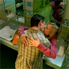
to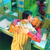
Okay! So, we start off with our 100x100 base from vm-caps.com. To brighten it up and to correct the color, we're going to use a curves adjustment layer. To do this, go to Layer > New adjustment layer > Curves. Also, you can select the black and white circle underneath the layers palette, which will show you all the adjustment layers.
Anyways, once you’ve got your new curves layer window up, we can start inputting values. When you click near the line, an anchor point will show up, and that will change the colors in your image. The curves can also be changed by typing in “input” and “output” values in the boxes below.
As you can see, the curves window is set up like a graph. The input values are represented by the horizontal gradient bar; the output values are represented by the vertical one. When the default diagonal line is moved, the input tone will change to the corresponding output tone.
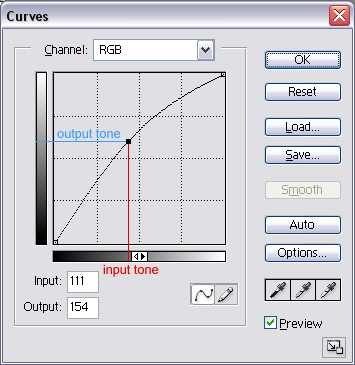
Basically, if the anchor point is close to the left, it will change the darker colors in your picture; likewise, if the dot is close to the right, it will modify the lighter colors in the picture. If the anchor point is above the default diagonal line, the tones will be brighter; likewise, if the anchor point is below the default diagonal line, the tones will be darker.
At the top of the curves window, there’s a box that says “channel”. You can set this to RGB, red, green, or blue. On the RGB selection, you can make the image darker or lighter. Say you wanted to give an image more contrast, you would click below the line near the bottom left, and make another click above the line near the top right (thus making a s-curve). Experiment with this to see what effects you can get.
In the red mode, you can add or take away red colors from the highlights or the shadows. If you take away red, the resulting color will have an added cyan tint. The same applies to the green and blue modes: taking away green yields magenta, taking away blue yields yellow.
In all my icons, I start with a curves layer to fix the color so that it is easier to work with. Our selected base is very dark and has a yellow-green tint. To solve this, we are going to add an anchor point in RGB mode above the line to lighten the image. Also, we are going to add more red tones, take away green tones, and add more blue tones. Basically, you want to add tones that will neutralize the existing overpowering tones.
Input/Output values:
RGB: 111/154
Red: 126/132
Green: 131/126
Blue: 124/134

-->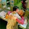
See? A lot brighter, and a lot more balanced.
Now, selective coloring. Go to Layers > New Adjustment Layer > Selective Color to open the window. This is pretty easy to understand. As its name suggests, you are selecting colors to change certain hues. There are 9 modes, but usually I only use red, yellow, cyan, and neutrals. However, this time, I’ll use all of them except black and white. Make sure to set it to “relative”.
In the red mode, you can change the tones of the red colors in the image. The only reddish tones are Veronica’s sweater, their skin, and the book. We want to make this stand out, so we’ll take -82% cyan and +32% yellow. As I said in the curves section, the opposite of cyan is red, the opposite of magenta is green, and the opposite of yellow is blue. So, to make the image more red, just take away the cyan. Also, we’re going to make Veronica’s hair stick out more, give the walls a bright green-blue hue, and make her sweater more purple.
Input these values for selective color (cyan/magenta/yellow/black):
Red: -82 / 0 / +32 / 0
Yellow: -63 / 0 / +93 / 0
Green: +100 / 0 / +100 / 0
Cyan: +100 / 0 / -100 / 0
Blue: +100 / 0 / -100 / 0
Magenta: +38 / +100 / 0 / 0
Neutrals: +46 / 0 / -7 / 0

-->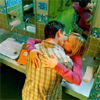
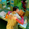
Right now it may seem like they have radioactive skin, but don’t worry, we’re just enhancing the surrounding room for now, and we’re going to erase the parts covering their skin. On your layers palette, next to the symbol for the selective color, you’ll see a white square. That’s a layer mask. It’s a very effective tool, and you can use it to erase parts of layers without losing the image on the layer. To erase, select a small soft brush and set it to about 70% opacity with black as the chosen color. Carefully paint over their heads and her hands. That’s better.

-->
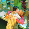
This is too easy. Add a brightness/contrast adjustment layer to brighten things up and keep things sharp.
Brightness: +28
Contrast: +2

-->
I usually use hue/saturation layers near the end of my icon, to finish it off. It just adds a bit more color and contrast.
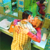
I usually don’t touch the hue because even a small change makes a big difference. Slide the saturation bar over until you think it looks nice. You can also change the hue/saturation for individual colors, just like in selective color. The changes aren’t that visible, but sometimes they work well.
Master Saturation: +11

-->
I think the icon could use a bit more blue in it, so one more selective color layer:
Neutrals: +19 / 0 / -7 / 0

-->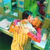
To me, the icon is still too green, so I’m going to add a color balance layer to make it a bit more blue.
This tool is almost identical to selective color, but instead of modifying different hues, you can modify midtones, shadows, and highlights. Experiment with this to see different results. I usually select “preserve luminosity” to keep the image relatively the same.
Midtones: -5 / 0 / +16

-->
And there you go! You’ve learned the basics of almost every adjustment layer in PS7. You don’t have to use all of these to make a good icon; in fact, I usually only use 3 or 4 simple layers. Make sure to experiment and mix it up - I'd love to see what you come up with!
Download the .psd file here.
Like what you see? Join us @ icon_supernova.
From
to
Okay! So, we start off with our 100x100 base from vm-caps.com. To brighten it up and to correct the color, we're going to use a curves adjustment layer. To do this, go to Layer > New adjustment layer > Curves. Also, you can select the black and white circle underneath the layers palette, which will show you all the adjustment layers.
Anyways, once you’ve got your new curves layer window up, we can start inputting values. When you click near the line, an anchor point will show up, and that will change the colors in your image. The curves can also be changed by typing in “input” and “output” values in the boxes below.
As you can see, the curves window is set up like a graph. The input values are represented by the horizontal gradient bar; the output values are represented by the vertical one. When the default diagonal line is moved, the input tone will change to the corresponding output tone.
Basically, if the anchor point is close to the left, it will change the darker colors in your picture; likewise, if the dot is close to the right, it will modify the lighter colors in the picture. If the anchor point is above the default diagonal line, the tones will be brighter; likewise, if the anchor point is below the default diagonal line, the tones will be darker.
At the top of the curves window, there’s a box that says “channel”. You can set this to RGB, red, green, or blue. On the RGB selection, you can make the image darker or lighter. Say you wanted to give an image more contrast, you would click below the line near the bottom left, and make another click above the line near the top right (thus making a s-curve). Experiment with this to see what effects you can get.
In the red mode, you can add or take away red colors from the highlights or the shadows. If you take away red, the resulting color will have an added cyan tint. The same applies to the green and blue modes: taking away green yields magenta, taking away blue yields yellow.
In all my icons, I start with a curves layer to fix the color so that it is easier to work with. Our selected base is very dark and has a yellow-green tint. To solve this, we are going to add an anchor point in RGB mode above the line to lighten the image. Also, we are going to add more red tones, take away green tones, and add more blue tones. Basically, you want to add tones that will neutralize the existing overpowering tones.
Input/Output values:
RGB: 111/154
Red: 126/132
Green: 131/126
Blue: 124/134
-->
See? A lot brighter, and a lot more balanced.
Now, selective coloring. Go to Layers > New Adjustment Layer > Selective Color to open the window. This is pretty easy to understand. As its name suggests, you are selecting colors to change certain hues. There are 9 modes, but usually I only use red, yellow, cyan, and neutrals. However, this time, I’ll use all of them except black and white. Make sure to set it to “relative”.
In the red mode, you can change the tones of the red colors in the image. The only reddish tones are Veronica’s sweater, their skin, and the book. We want to make this stand out, so we’ll take -82% cyan and +32% yellow. As I said in the curves section, the opposite of cyan is red, the opposite of magenta is green, and the opposite of yellow is blue. So, to make the image more red, just take away the cyan. Also, we’re going to make Veronica’s hair stick out more, give the walls a bright green-blue hue, and make her sweater more purple.
Input these values for selective color (cyan/magenta/yellow/black):
Red: -82 / 0 / +32 / 0
Yellow: -63 / 0 / +93 / 0
Green: +100 / 0 / +100 / 0
Cyan: +100 / 0 / -100 / 0
Blue: +100 / 0 / -100 / 0
Magenta: +38 / +100 / 0 / 0
Neutrals: +46 / 0 / -7 / 0
-->
Right now it may seem like they have radioactive skin, but don’t worry, we’re just enhancing the surrounding room for now, and we’re going to erase the parts covering their skin. On your layers palette, next to the symbol for the selective color, you’ll see a white square. That’s a layer mask. It’s a very effective tool, and you can use it to erase parts of layers without losing the image on the layer. To erase, select a small soft brush and set it to about 70% opacity with black as the chosen color. Carefully paint over their heads and her hands. That’s better.
-->
This is too easy. Add a brightness/contrast adjustment layer to brighten things up and keep things sharp.
Brightness: +28
Contrast: +2
-->
I usually use hue/saturation layers near the end of my icon, to finish it off. It just adds a bit more color and contrast.
I usually don’t touch the hue because even a small change makes a big difference. Slide the saturation bar over until you think it looks nice. You can also change the hue/saturation for individual colors, just like in selective color. The changes aren’t that visible, but sometimes they work well.
Master Saturation: +11
-->
I think the icon could use a bit more blue in it, so one more selective color layer:
Neutrals: +19 / 0 / -7 / 0
-->
To me, the icon is still too green, so I’m going to add a color balance layer to make it a bit more blue.
This tool is almost identical to selective color, but instead of modifying different hues, you can modify midtones, shadows, and highlights. Experiment with this to see different results. I usually select “preserve luminosity” to keep the image relatively the same.
Midtones: -5 / 0 / +16
-->
And there you go! You’ve learned the basics of almost every adjustment layer in PS7. You don’t have to use all of these to make a good icon; in fact, I usually only use 3 or 4 simple layers. Make sure to experiment and mix it up - I'd love to see what you come up with!
Download the .psd file here.
Like what you see? Join us @ icon_supernova.