First tutorial!
Tutorial time!
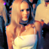
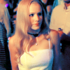
I got bored of making icons, so I decided to write a tutorial for changing super-yellow caps into a nice icon.
First tutorial ever, so if it sucks, I apologize =P
Okay! we'll be going from

to
.
Take your cap, crop, sharpen if you want. Duplicate the Layer, set to Screen 13%.

Add a curves adjustment layer, input these settings:
RBG: 81,96/ 162, 184
RED: 80,82/ 148,153
GREEN: 159,138
BLUE: 86,106/ 160,178
Of course, this changes from icon to icon, so play around to get the effects you want.

Duplicate the base again, drag above the curves layer, set to screen 48%.

Add a color balance adjustment layer, set to midtones and preserve luminosity.
-1, -39, +8

Add a new selective color layer:
REDS: +46, -11, +5, 0
YELLOWS: +100, 0, -64, 0
NEUTRALS: +100, 0, -56, -20
This gets rid of most of the yellow.

Duplicate the selective color layer, lower the opacity to 19%. It doesn't make much of a difference, but I prefer the icon with this layer.

Last step! Add a hue/saturation adjustment layer, set saturation to +15%. This step is also optional.

That's it! Hope it made some sense. If you have any questions, comment here, and I'll get back to you as soon as possible =)
To download the .psd file, click here.
Like what you see? Join us @ icon_supernova
I got bored of making icons, so I decided to write a tutorial for changing super-yellow caps into a nice icon.
First tutorial ever, so if it sucks, I apologize =P
Okay! we'll be going from
to
.
Take your cap, crop, sharpen if you want. Duplicate the Layer, set to Screen 13%.
Add a curves adjustment layer, input these settings:
RBG: 81,96/ 162, 184
RED: 80,82/ 148,153
GREEN: 159,138
BLUE: 86,106/ 160,178
Of course, this changes from icon to icon, so play around to get the effects you want.
Duplicate the base again, drag above the curves layer, set to screen 48%.
Add a color balance adjustment layer, set to midtones and preserve luminosity.
-1, -39, +8
Add a new selective color layer:
REDS: +46, -11, +5, 0
YELLOWS: +100, 0, -64, 0
NEUTRALS: +100, 0, -56, -20
This gets rid of most of the yellow.
Duplicate the selective color layer, lower the opacity to 19%. It doesn't make much of a difference, but I prefer the icon with this layer.
Last step! Add a hue/saturation adjustment layer, set saturation to +15%. This step is also optional.
That's it! Hope it made some sense. If you have any questions, comment here, and I'll get back to you as soon as possible =)
To download the .psd file, click here.
Like what you see? Join us @ icon_supernova