Wallpaper tutorial: blending, basic color theory
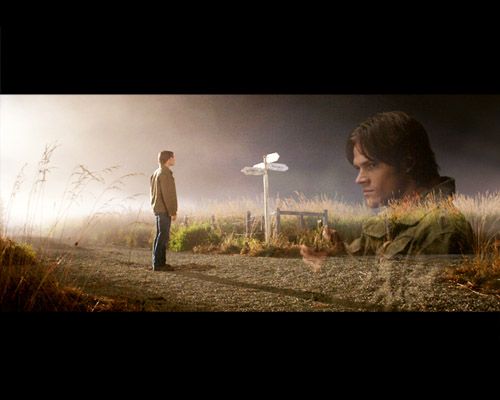
From [1] and [2] to

Made in Photoshop CS2, translatable.
1. Open a new document with your desired wallpaper size with a black background. Open and resize the image of Sam on the crosside to the width of your wallpaper. Copy it and paste it as a new layer.

2. Create a new layer and fill it with black. Fill about 25% on top and bottom each with black, to create a rough frame.
Every step after this will be done below this layer!

3. Open the image with Sam with the gun. Resize it to about 50% of your wallpaper hight (it'll cover the whole visible part, which is 50% of the hight) and paste it as new layer over the first image. Set it to Lighten.
The trick to blend images like this is the blending mode Lighten. It compares the colors in the second image (the one that's on Lighten) to those in the first image (which is on Normal). If the colors in the second are darker than those in the first, they will be replaced, means these parts appear transparent. If they are lighter, they will stay as they are.
I rarely use Lighten on 100%, because the effect is usually rather harsh. Lower the opacity until it blends nicely, here 30%.

4. Rather dull and dark, so we need to brighten it and add some color. A small focus will be the yellow weeds, so at first I'll add more yellow and red, which will make the yellow less harsh.
I did the original with Curves and Selective Color, but here we'll do it with Curves and Color Balance to make it translatable.
For the brightening part, add a new Curves Adjustment Layer and and work in RGB.
Make two points, one on the lower half (affects the darker parts of your image) and one on the upper half of the line (affects the lighter parts of your image). Pulling the points upwards brightens your image, lowering them darkens it. This goes for darker and lighter parts.
Since we want to brighten everything, move both points upwards until you like your result.
For the coloring, we'll do some basic color improvement in the same layer. In each of the other three channels (Red, Green, Blue), make one dot and pull it a tiny bit upwards. This way you increase the intensity of that channel. If you would lower these points, you'd increase their complementary colors, e.g. if you'd lower the point in Blue you's increase Yellow.
Your Curves should look similar to this:


5. Add another Curves layer. Brighten it some more in RGB, and add more yellow and red to help with the skin and weed color.
Add red by increasing Red (pulling the dot upwards), add Yellow by lowering the dot in in its complementary color Blue.


6. Now, I'd like this to be overall yellow/green and not so much red. For more drastic color changes I work with a Color Balance layer.
To achive an overall warmer look and increase the yellow of the grass more, increase yellow in Shadows. This often gives a rather strong but flat effect.
My tip: if you increase one color in Shadows, add a bit of its complementary color in Midtones and vice versa. It'll make your colors pop and increase the contrast.
Shadows: +5 0 -17
Midtones: -3 0 +10
7. The intention was to make the overeall wallpaper greenish. Add a new layer filled with a vibrant green (#93c7249) and set it to Soft Light. That's very green, so lower to opacity until it looks natural, around 25%.

8. Add another layer filled with a very dark red and set it to Exclusion. This adds a mysterious bluish glow. Lower the opacity to around 80%.

9. It's dark, so the sky should be bluish, as well as the green grass. Add a light blue fill layer (#acdafa) and set it to Color Burn 43%. This will increase the blue part by eliminating its complementary color red in the grass and sky.
10. I like a lot of contrast and I usually use Levels for that. Add a Levels layer, move the black slider on the left to the right and you'll see how the dark parts get darker.
Input levels: 33 1,00 255

11. Not bad, but could be a bit lighter and more vibrant. You can achieve this with another Curves layer for example. Here I chose instead another fill layer in a soft pink (#f6c6b3)on Overlay.
Setting light colors to Soft Light or Overlay lightens images very strong. Overlay has a stronger effect than Soft Light and also increases contrast and brightness. Use it carefully and lower the opacity until it looks right (here 20%).

12. To make it a bit more interesting, add a new layer and paint with a large brush in black diagonally over the lines of the black frame. Here I used one of the default Spatter brushes for the ragged line effect.
Move the layer where it looks best, here I placed it between the two images.

13. As a little highlight , put a Light Texture over the singpost and set it to Screen 100%.

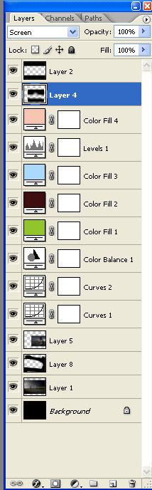
My layer palette.
Feel free to ask any questions.
More tutorials.
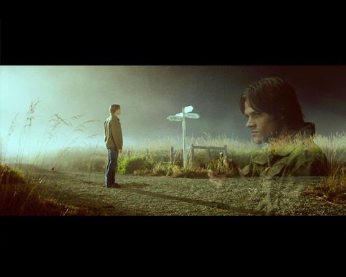
Made in Photoshop CS2, translatable.
1. Open a new document with your desired wallpaper size with a black background. Open and resize the image of Sam on the crosside to the width of your wallpaper. Copy it and paste it as a new layer.
2. Create a new layer and fill it with black. Fill about 25% on top and bottom each with black, to create a rough frame.
Every step after this will be done below this layer!
3. Open the image with Sam with the gun. Resize it to about 50% of your wallpaper hight (it'll cover the whole visible part, which is 50% of the hight) and paste it as new layer over the first image. Set it to Lighten.
The trick to blend images like this is the blending mode Lighten. It compares the colors in the second image (the one that's on Lighten) to those in the first image (which is on Normal). If the colors in the second are darker than those in the first, they will be replaced, means these parts appear transparent. If they are lighter, they will stay as they are.
I rarely use Lighten on 100%, because the effect is usually rather harsh. Lower the opacity until it blends nicely, here 30%.
4. Rather dull and dark, so we need to brighten it and add some color. A small focus will be the yellow weeds, so at first I'll add more yellow and red, which will make the yellow less harsh.
I did the original with Curves and Selective Color, but here we'll do it with Curves and Color Balance to make it translatable.
For the brightening part, add a new Curves Adjustment Layer and and work in RGB.
Make two points, one on the lower half (affects the darker parts of your image) and one on the upper half of the line (affects the lighter parts of your image). Pulling the points upwards brightens your image, lowering them darkens it. This goes for darker and lighter parts.
Since we want to brighten everything, move both points upwards until you like your result.
For the coloring, we'll do some basic color improvement in the same layer. In each of the other three channels (Red, Green, Blue), make one dot and pull it a tiny bit upwards. This way you increase the intensity of that channel. If you would lower these points, you'd increase their complementary colors, e.g. if you'd lower the point in Blue you's increase Yellow.
Your Curves should look similar to this:
5. Add another Curves layer. Brighten it some more in RGB, and add more yellow and red to help with the skin and weed color.
Add red by increasing Red (pulling the dot upwards), add Yellow by lowering the dot in in its complementary color Blue.
6. Now, I'd like this to be overall yellow/green and not so much red. For more drastic color changes I work with a Color Balance layer.
To achive an overall warmer look and increase the yellow of the grass more, increase yellow in Shadows. This often gives a rather strong but flat effect.
My tip: if you increase one color in Shadows, add a bit of its complementary color in Midtones and vice versa. It'll make your colors pop and increase the contrast.
Shadows: +5 0 -17
Midtones: -3 0 +10
7. The intention was to make the overeall wallpaper greenish. Add a new layer filled with a vibrant green (#93c7249) and set it to Soft Light. That's very green, so lower to opacity until it looks natural, around 25%.
8. Add another layer filled with a very dark red and set it to Exclusion. This adds a mysterious bluish glow. Lower the opacity to around 80%.
9. It's dark, so the sky should be bluish, as well as the green grass. Add a light blue fill layer (#acdafa) and set it to Color Burn 43%. This will increase the blue part by eliminating its complementary color red in the grass and sky.
10. I like a lot of contrast and I usually use Levels for that. Add a Levels layer, move the black slider on the left to the right and you'll see how the dark parts get darker.
Input levels: 33 1,00 255
11. Not bad, but could be a bit lighter and more vibrant. You can achieve this with another Curves layer for example. Here I chose instead another fill layer in a soft pink (#f6c6b3)on Overlay.
Setting light colors to Soft Light or Overlay lightens images very strong. Overlay has a stronger effect than Soft Light and also increases contrast and brightness. Use it carefully and lower the opacity until it looks right (here 20%).
12. To make it a bit more interesting, add a new layer and paint with a large brush in black diagonally over the lines of the black frame. Here I used one of the default Spatter brushes for the ragged line effect.
Move the layer where it looks best, here I placed it between the two images.
13. As a little highlight , put a Light Texture over the singpost and set it to Screen 100%.
My layer palette.
Feel free to ask any questions.
More tutorials.