2 tutorials plus 1 random PSD
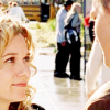
Tutorial #1 // Get this coloring:
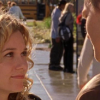
>>
PSD Included
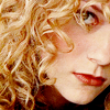

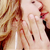
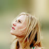
Tutorial #2 // Blurring around your subject:

>>
Programs Used: Photoshop 7 & Paint Shop Pro 10
Translatable: Everything except for the Selecting Coloring
Note: I use Photoshop 7 for the initial coloring and Paint Shop Pro 10 for everything after that. Everything should be pretty translatable though except for any selective coloring which can only be done in Photoshop.

>>
This isn't really a tutorial on how to get a specific coloring but a tutorial on the different things I do to get my colorings. A lot of it doesn't have to do with the coloring itself but the textures added and things done after the initial coloring. I use two different programs, Photoshop 7 and Paint Shop Pro 10, to make icons. I use Photoshop 7 for the initial coloring and Paint Shop Pro 10 for everything after that. Everything should be pretty translatable though except for any selective coloring which can only be done in Photoshop.
> Resize your original picture, here, to a size that's easier to work with but won't limit you when cropping your icon later. I resized mine to 400x300.

> Now duplicate your base twice, set the first new layer to Screen, opacity 100%.
> Set the other new layer to Screen, opacity 65%.

Now I don't think I have to explain what Screen does but for anyone new to making icons it simply lightens the image up. You'll probably use Screen in just about everything you make.
> Now add a Curves layer. Layer > New Adjustment Layer > Curves
I used the following settings:
RGB;
Input: 75
Output: 154
RED;
Input: 15
Output: 0
GREEN;
Input: 6
Output: 0
BLUE;
Input: 247
Output: 255
> Now set the Curves layer to Soft Light. Opacity 50%.
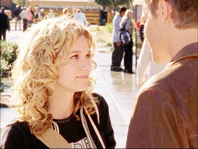
> Now add a Selective Color layer. Layer > New Adjustment Layer > Selective Color
I used the following settings:
REDS: 0, 0, 0, +36
YELLOWS: 0, 0, 0, +25
WHITES: 0, +10, +35, 0
NEUTRALS: 0, 0, 0, +8
BLACKS: 0, 0, 0, 26
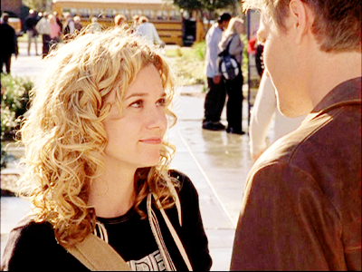
> Now add a new Selective Color layer.
I used the following settings:
NEUTRALS: +100, -75, -100, 0
> Set your new Selective Color layer to Soft Light. Opacity 40%.

^ Now that is my key step. I do it with just about everything, at different settings of course.
> Add another new Selective Color layer.
I used the following settings:
REDS: 0, 0, 0, +25
YELLOWS: 0, -5, 0, +13
BLACKS: 0, 0, 0, +15
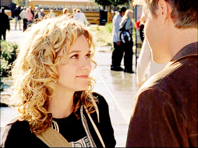
> And add one more new Selective Color layer.
I used the following settings:
WHITES: -25, -25, -55, -75
Set to opacity 60%.
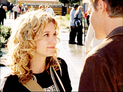
And voila that's the initial coloring! I think it's pretty simple. It's pretty much my go to coloring. Not the exact settings or anything because each picture needs different settings but that's my general coloring.
The other examples:
ORIGINAL >>
ORIGINAL >>
ORIGINAL >>
PSD File
Now I switch over to Paint Shop Pro, but everything should be pretty easily translated over to Photoshop.
I'm not going to go through specific steps at this point because I don't really have set steps for this part I just keep working with it until I'm happy with the final product ... but I will list some of the things I do.
My two favorite things to do:
> A desaturated Soft Light layer. Go to Image > Greyscale. Copy the base. Then Undo. Now paste. Set the newly pasted desaturated layer to Soft Light and fool around with the Opacity.
Original:
This step with the Opacity set at 100%:
See the difference? It gives it more depth plus takes away a bit of the color. That's something I do on just about every icon now. Even if it's only at an Opacity of 10%, I just love the bit of depth it gives it.
> A desaturated Luminance layer. Go to Image > Greyscale. Copy the base. Then undo. Now paste. Set the newly pasted desaturated layer to Soft Light and fool around with the Opacity.
Original:
This step with the Opacity set at 100%:
With this cap there's just a subtle difference. It just depends on the picture what the effect will be. Sometimes if will brighten up certain colors and sometimes it will make your icon look like crap. Just depends.
___________________________________________________

>>
The original cap, here.
> Color your image and all that jazz. I used a variation of the coloring tutorial above.
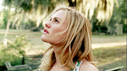
> Naturally crop it the way you want it.

> With your Smudge or Push tool (personally I use the Push tool) push up the top edges of your picture.
> Now I soften up the smudged area with the Soften tool. It's not really necessary, it's just something I've gotten in the habit of doing.
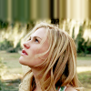
> Make sure to Flatten you image. Layers > Merge > Merge All (Flatten).
> Now duplicate your base and go to Gaussian Blur. Adjust > Blur > Gaussian Blur. Radius: 9.00
> Erase the blurred pat on her face, hair and body. It doesn't have to be exact.
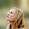
> Now go back to Gaussian Blur. Radius: 5.00.
> Erase everything on the face, body & hair.
> Duplicate your Gaussian Blur layer and set to an Opacity of 50%. Then Merge it down. Layers > Merge > Merge Down.
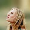
> You may or may not want to repeat the last few step of blurring and what not until you get it to a point where you like it. I'm gonna stop there for now though.
> And I quickly just brightened it up with some Curves since it was a little dark for my taste and Sharpened it a bit. I won't give the setting on that though since it doesn't have to do with the blurring.

And that's the basics of that kind of blurring around your subject! Very simple.
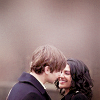
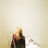
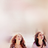
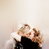
Some other examples of this blurring:
Cap Credit:
One Tree Hill - oth-caps.com
True Blood - crystalfires.net
And a random PSD of this photo:
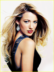
PSD File
I was asked for a tutorial a long time ago for it but I never got around to it, so at least here's the PSD.
Please post all comments and questions HERE. Thanks.

>>

PSD Included


Tutorial #2 // Blurring around your subject:

>>

Programs Used: Photoshop 7 & Paint Shop Pro 10
Translatable: Everything except for the Selecting Coloring
Note: I use Photoshop 7 for the initial coloring and Paint Shop Pro 10 for everything after that. Everything should be pretty translatable though except for any selective coloring which can only be done in Photoshop.

>>

This isn't really a tutorial on how to get a specific coloring but a tutorial on the different things I do to get my colorings. A lot of it doesn't have to do with the coloring itself but the textures added and things done after the initial coloring. I use two different programs, Photoshop 7 and Paint Shop Pro 10, to make icons. I use Photoshop 7 for the initial coloring and Paint Shop Pro 10 for everything after that. Everything should be pretty translatable though except for any selective coloring which can only be done in Photoshop.
> Resize your original picture, here, to a size that's easier to work with but won't limit you when cropping your icon later. I resized mine to 400x300.

> Now duplicate your base twice, set the first new layer to Screen, opacity 100%.
> Set the other new layer to Screen, opacity 65%.

Now I don't think I have to explain what Screen does but for anyone new to making icons it simply lightens the image up. You'll probably use Screen in just about everything you make.
> Now add a Curves layer. Layer > New Adjustment Layer > Curves
I used the following settings:
RGB;
Input: 75
Output: 154
RED;
Input: 15
Output: 0
GREEN;
Input: 6
Output: 0
BLUE;
Input: 247
Output: 255
> Now set the Curves layer to Soft Light. Opacity 50%.

> Now add a Selective Color layer. Layer > New Adjustment Layer > Selective Color
I used the following settings:
REDS: 0, 0, 0, +36
YELLOWS: 0, 0, 0, +25
WHITES: 0, +10, +35, 0
NEUTRALS: 0, 0, 0, +8
BLACKS: 0, 0, 0, 26

> Now add a new Selective Color layer.
I used the following settings:
NEUTRALS: +100, -75, -100, 0
> Set your new Selective Color layer to Soft Light. Opacity 40%.

^ Now that is my key step. I do it with just about everything, at different settings of course.
> Add another new Selective Color layer.
I used the following settings:
REDS: 0, 0, 0, +25
YELLOWS: 0, -5, 0, +13
BLACKS: 0, 0, 0, +15

> And add one more new Selective Color layer.
I used the following settings:
WHITES: -25, -25, -55, -75
Set to opacity 60%.

And voila that's the initial coloring! I think it's pretty simple. It's pretty much my go to coloring. Not the exact settings or anything because each picture needs different settings but that's my general coloring.
The other examples:
ORIGINAL >>

ORIGINAL >>

ORIGINAL >>

PSD File
Now I switch over to Paint Shop Pro, but everything should be pretty easily translated over to Photoshop.
I'm not going to go through specific steps at this point because I don't really have set steps for this part I just keep working with it until I'm happy with the final product ... but I will list some of the things I do.
My two favorite things to do:
> A desaturated Soft Light layer. Go to Image > Greyscale. Copy the base. Then Undo. Now paste. Set the newly pasted desaturated layer to Soft Light and fool around with the Opacity.
Original:

This step with the Opacity set at 100%:

See the difference? It gives it more depth plus takes away a bit of the color. That's something I do on just about every icon now. Even if it's only at an Opacity of 10%, I just love the bit of depth it gives it.
> A desaturated Luminance layer. Go to Image > Greyscale. Copy the base. Then undo. Now paste. Set the newly pasted desaturated layer to Soft Light and fool around with the Opacity.
Original:

This step with the Opacity set at 100%:

With this cap there's just a subtle difference. It just depends on the picture what the effect will be. Sometimes if will brighten up certain colors and sometimes it will make your icon look like crap. Just depends.
___________________________________________________

>>

The original cap, here.
> Color your image and all that jazz. I used a variation of the coloring tutorial above.

> Naturally crop it the way you want it.

> With your Smudge or Push tool (personally I use the Push tool) push up the top edges of your picture.

> Now I soften up the smudged area with the Soften tool. It's not really necessary, it's just something I've gotten in the habit of doing.

> Make sure to Flatten you image. Layers > Merge > Merge All (Flatten).
> Now duplicate your base and go to Gaussian Blur. Adjust > Blur > Gaussian Blur. Radius: 9.00

> Erase the blurred pat on her face, hair and body. It doesn't have to be exact.

> Now go back to Gaussian Blur. Radius: 5.00.
> Erase everything on the face, body & hair.
> Duplicate your Gaussian Blur layer and set to an Opacity of 50%. Then Merge it down. Layers > Merge > Merge Down.

> You may or may not want to repeat the last few step of blurring and what not until you get it to a point where you like it. I'm gonna stop there for now though.
> And I quickly just brightened it up with some Curves since it was a little dark for my taste and Sharpened it a bit. I won't give the setting on that though since it doesn't have to do with the blurring.

And that's the basics of that kind of blurring around your subject! Very simple.
Some other examples of this blurring:


Cap Credit:
One Tree Hill - oth-caps.com
True Blood - crystalfires.net
And a random PSD of this photo:

PSD File
I was asked for a tutorial a long time ago for it but I never got around to it, so at least here's the PSD.
Please post all comments and questions HERE. Thanks.