Jason Mraz Banner Tutorial
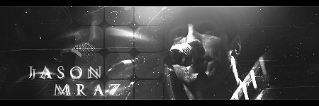
Translatable: Yes!
Program: Photoshop CS4
Steps: a lot
Image-heavy: sorry, yes.
Difficulty: Need some prior knowledge, but hopefully not that hard.
Hi, capitals_kid on another account, because I decided this will be my graphics account. ;)
1. Open a new 450x150 document. Fill it with a grey, which will serve as our background color. Since we are going for a black and white banner - a grey background is good. I filled it with #232323.
Add this texture as our background stock. Although it won't make a big difference at the end, it's less boring than just a solid color background:
Set this to Color Dodge, 50%.
2. Now add in a stock/picture/base whatever. This tutorial works better with darker stocks. I'm using one of Jason Mraz (who's awesome :D).
So now that you have that stock, paste it in, DON'T resize unless it's insanely huge. This is going to serve as our shadow render - so we don't want it to be as small as the main focal. I resized mine a tiny bit so his face covered about half the canvas. Then, desaturate it by pressing Control+Shift+U.
I erased the corners and edges because I wanted a smooth, blended picture.
As I said before, this is going to be shadow render. So let's set it to Color Dodge, 40% OPACITY.
3. Then, on the OTHER side, add in your stock again. Desaturate this one as well, and resize it so it's considerable smaller but still basically filling a lot of the other side. I wanted this to blend into the background, although not as much as the shadow. So, I again erased the corners and edges so it blended. Then, I set it to Color Dodge, 100% OPACITY. Well, that made it a little too blended. So duplicate it and set it to Color Dodge, 30% OPACITY. But I still wasn't satisfied. So duplicate it again, and set it to Color Dodge, 50%. But it still was too blended. So lastly duplicate it one more time and set it on Color Dodge, 40%.
If it's still too dark, then duplicate it as many times as you want and set it on Color Dodge, opacity to your liking.
4. Now we're going to add some nice scratch texture. This will add some nice grunge to it while keeping with the black and white theme:
Set this to Color Dodge, 40%. But I hate when things cover a focal's face. So erase on the face (that rhymed!).
5. Then, with your brush at 70% OPACITY, get out your 200px soft brush in WHITE. Brush once at the top of the banner to create a light source.
6. Then let's add some shape and attention to the focal. If we place a strong pattern or shape texture near the focal, then it will draw someone's eye to that area. So add this texture:
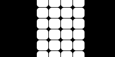
Set it on Color Dodge, but lower the opacity to 10%, as Color Dodge will really only get rid of the black and if that's all we do, it will be overpowering. If the shapes cover your focal a little bit, then erased a little.
7. Apply this texture to add a tiny bit of light:
Color Dodge, 60%.
8. Now to add some more lights and texture, apply this texture:
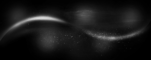
Set this to Color Dodge, 100%. I decided this was a bit too much, especially on the focal's face. So I erased a lot of it but still left enough to make a difference.
9. Now to add some contrast and darken it a bit, add this texture:
Set this to Overlay, 10%, which will darken it a lot, but not too much.
10. We've kind of been neglecting the left side of the banner, haven't we? Let's add a little bit of texture and depth to that side by applying this texture:
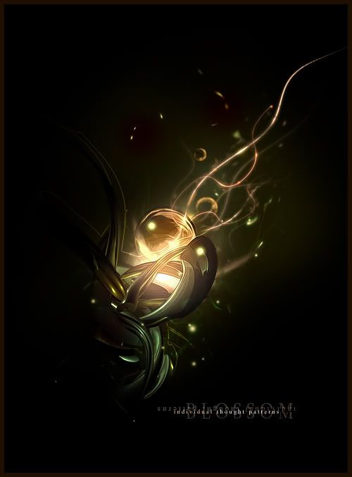
Desaturate this (Control+Shift+U, Remember?) and set it Color Dodge, 25%. I erased a lot of it because it was too overpowering, but left enough so it would make a difference.
11. Now let's add a little bit of light and shape to the focal. This texture won't add very much, so you can skip this step if the shape doesn't fit your focal:
Color Dodge, 20%.
12. Darken the sides a little bit by making a new layer and brushing in black on the sides. Keep it on Normal but lower the opacity to 25%.
13. To darken it again and add some contrast, make a new layer, and go to Image>Apply Image. This will make a copy of everything you've made so far. When the window comes up, leave all the default settings and click OK. Then set that layer to Overlay, 25%. If it's too dark for your liking, lower the opacity.
14. To add some pattern to the render area, let's add a dot texture:
Color Dodge, 100%. Place it on or around the focal, at least that's what I did.
15. Add another light source, like in step 5, except in a different area of the banner.
16. Add your text.
17. Make a new layer and go to Image>Apply Image (remember this makes a copy of everything so far). I then went to Filter>Sharpen>Sharpen. It was too sharp for my liking, so I lowered the opacity to 70%.
Add a border and you're done! Hope you enjoyed this, I'll be coming at ya with some more tomorrow (?) :)