Tutorial - Eric Minne - Blending in Photoshop: CS2
I was making this icon and I thought I would make a tutorial for it because it's actually pretty simple.
Made in Photoshop:CS2. I'm pretty sure it's translatable to other programs, but there will be detailed instructions for Photoshop: CS2 in this tut.
What you will learn:
How to crop an image, How to make an image black and white, How to blend using the "add Vector mask", How to use the "feather tool", How to use the "polygonal lasso tool"
How to use light textures.
This tutorial is extremely detailed and explains how to use the tools as well as explaining why I'm using certain techniques. It seems like a lot of steps for one little icon, but once you know how to use the tools it takes no time at all to make.
We are going to make this icon:
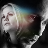
From these two images:
click for larger image
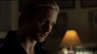
and
Let's get started.
I originally cropped the Eric image for an icon all by itself. I liked the way the light was hitting his face so I cropped it purposefully so that his face was in the lower right corner of the icon and tilted down somewhat.
Look at my example before reading further. Example - crop tool
1. Make sure the settings for your "crop tool" are Width=100/Height=100, the resolution should be set to 72 pixels/inch. (See the example for where the settings are located)
2. Open your image in Photoshop. Everyone has a different way of cropping and this is the way I do it most of the time. My image started out as a large screencap, so I reduced the size before I cropped it. Image>Image size... In the dialog box Image Size change the "Width" or "Height" of your image in pixels.
3. When you have your image reduced to a reasonable size select your "crop tool". Click and drag your crop tool across your image in the area you want to crop. I like to do it this way because I have a little bit more flexibility in what part of the image is included in my icon and the way the crop is rotated as you'll see.
4. Like I said, I wanted Eric to be looking down a little more, so I clicked outside my "crop tool" selection and rotated the square to the left a little.
NOTE: You can click and hold inside your crop tool to move it around. You can also click on the little squares at the corners of your crop tool to make it bigger or smaller. And you can tilt/rotate your crop tool by clicking on the image outside it. (see the crop tool example)
5. Now click on your "crop tool" again and select "crop" in the dialog box that pops up.
This is my result.

6.
a. Duplicate your layer and set it to screen at 100%(You can adjust your opacity if you like). This lightens it up a little bit.
b. While still on your screened layer, go to "Filter>Sharpen>Sharpen". This sharpens the icon a little without making it look too pixelated. (The sharpen part is optional. If you have a different way of sharpening your images, by all means, do it your way)
Result:

7. Now we are going to make the image black and white and add a little more contrast.
Look at my example before reading further. Example - Gradient Map
8.
a. Click on "New Fill or Adjustment Layer" in your Layers Palette.
b. Then click on "Gradient Map".
c. When the dialog box pops up you will see a new Gradient Map layer in your Layers Palette.
d. Select the Black and White gradient in the dialog box and click OK. Be sure that black is foreground and white is background. (This is only one way of making an image appear black and white)
Result.
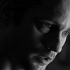
9. Now we are going to use "Levels" to add more contrast.
a. Click on the "New Fill and Adjustment Layer" tool in your Layers Palette.
b. Click on "Levels". When the Levels dialog box pops up use the sliders below the graph to adjust your whites, grays and blacks. Try to get a pure white without making it too bleached out and a really inky black somewhere in your icon if possible. Be careful not to obscure too much detail.
Example of Levels dialog box and my settings
Result
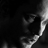
See the difference from the image above?
Alright, let's set Eric aside for a moment. We are going to work on Sookie.
Probably only fans of True Blood will relate to this, but you can do the same thing in your particular fandom with your favorite characters to make your icon more meaningful. I chose this image of Sookie because in the TV show Sookie is looking at Eric in this particular screencap which is from season 1. But also because I think she looks like she is looking off into the distance and I like the way her head is tilted. The Eric screencap we've been working with is from season 2. Doesn't matter to you, but like I said, you can do the same thing with your favorite characters. OK, moving on.
10. Repeat steps 1 through 5 for cropping your icon. Step 4 is optional. I didn't rotate this crop because her head is already in a nice position. I did crop Sookie a little smaller, just to make her fit better in the black area at the top left of the icon. I wanted to make it look like Sookie is in Eric's head, kind of. Yeah. lol. Anyway....
Example of Layers for Sookie
Don't be tempted to just drag your Sookie crop, without editing it, onto your Eric icon and position it under the Gradient Map layer and Levels layer, as a shortcut. The lighting in the Eric image is way different than the Sookie image and it won't look right.
11. Now flatten the Sookie layers.
Layer>Flatten Layers.
Result
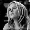
12. Click and hold on your flattened Sookie icon and drag it onto your Eric icon . Make sure it is on top of all the previous laters. Position it in the black area over Eric's head.
Result
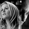
13. Set the Sookie layer to "screen" at 100%. You can move Sookie around after you screen her if you don't like where she is postioned.
Result
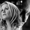
Look at the examples before reading further. Example - Vector mask and Brush Tool and Example - Select a brush and settings
14. Make sure your Sookie layer is selected. Click on the "Add vector mask" in the Layers Palette. A little white square will appear next to Sookie.
Now we are going to erase/mask parts of Sookie that are covering Eric and make everything blend a little more nicely.
15. Make sure your foreground is black and your background is white. Click on the "Brush Tool". Click on the arrow pointing down next to where it says "brush" and in the drop down select a soft round brush. I selected the soft round 27 pixel brush.
16. Click on the little white mask square in the Sookie layer to make sure it is selected. Now on your actual icon start going over the parts of the Sookie image you don't want.
I started out with my brush set at 100% opacity and I masked out the straight hard like covering Eric's face. And the white parts above her head. Example - Line masked out
17. After that I selected a different size soft brush and lowered the opacity to about 50% and masked out parts of her hair and the parts near the bottom of the icon. Basically, I just tried to make it look good.
Result
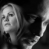
Looks kind of weird doesn't it? We're going to fix that in a very simple and easy way.
18. I don't know why, but the addition of a simple light texture can make all the difference in the world. It can make your icon a cohesive whole, while adding interest. In this case I think it makes the images relate to one another more.
Open this light texture by nokitas.
Drag it to the top of your icon and set it to "screen" at 100% opacity.
Result
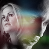
19. I rarely use textures as they are without altering them. In this case I don't like that yellowish part of the light texture covering Eric's mouth. I could just erase it, but then I would get something that looks like this.
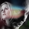
This does not look good.
Instead I am going to use "feather" to make the edges look more subtle.
Refer to this image of the steps so you have a visual of what it will look like. Example - using the Polygonal Lasso Tool and Feather
a. Click on the "Polygonal Lasso Tool" and make a selection around the part of the light texture you want to keep.
b. Click on Select>Inverse. This reverses your selection to the area outside the part of the texture you want to keep.
c. Click on Select>Feather
d. In the dialog box make the "Feather Radius" 15 pixels and click OK. Your selection smooths out.
e. Now hit the "Delete Key" on your keyboard.
Result

This looks much better. Now the yellowish part of the texture over Eric's mouth has been removed and the edges of the texture are less noticable.
NOTE: When using textures with a lot of grain or pattern in them I think it is always best to erase the parts that are covering a face in your icon. It just does not look good to have black specs or grid patterns over the faces of the people in your icons.
20. Last Step.
Press "Alt + Ctrl + Shft + E" in order. This makes a copy of all your layers. Set this layer to "Soft Light" and adjust the opacity till it looks nice. I set the opacity to 34%.
Save your icon as a .psd or layered file however your program does it. Then flatten it (Layers>Flatten Image in Photoshop) and save as a .png or .jpg, whichever you prefer.
Now you're done.

Please let me know if this tutorial was helpful.
If there are any parts that are not clear or you have a question please don't hesitate to ask.
The icon is up for adoption with credit.
Thanks
~endlessdeep
Made in Photoshop:CS2. I'm pretty sure it's translatable to other programs, but there will be detailed instructions for Photoshop: CS2 in this tut.
What you will learn:
How to crop an image, How to make an image black and white, How to blend using the "add Vector mask", How to use the "feather tool", How to use the "polygonal lasso tool"
How to use light textures.
This tutorial is extremely detailed and explains how to use the tools as well as explaining why I'm using certain techniques. It seems like a lot of steps for one little icon, but once you know how to use the tools it takes no time at all to make.
We are going to make this icon:

From these two images:
click for larger image

and

Let's get started.
I originally cropped the Eric image for an icon all by itself. I liked the way the light was hitting his face so I cropped it purposefully so that his face was in the lower right corner of the icon and tilted down somewhat.
Look at my example before reading further. Example - crop tool
1. Make sure the settings for your "crop tool" are Width=100/Height=100, the resolution should be set to 72 pixels/inch. (See the example for where the settings are located)
2. Open your image in Photoshop. Everyone has a different way of cropping and this is the way I do it most of the time. My image started out as a large screencap, so I reduced the size before I cropped it. Image>Image size... In the dialog box Image Size change the "Width" or "Height" of your image in pixels.
3. When you have your image reduced to a reasonable size select your "crop tool". Click and drag your crop tool across your image in the area you want to crop. I like to do it this way because I have a little bit more flexibility in what part of the image is included in my icon and the way the crop is rotated as you'll see.
4. Like I said, I wanted Eric to be looking down a little more, so I clicked outside my "crop tool" selection and rotated the square to the left a little.
NOTE: You can click and hold inside your crop tool to move it around. You can also click on the little squares at the corners of your crop tool to make it bigger or smaller. And you can tilt/rotate your crop tool by clicking on the image outside it. (see the crop tool example)
5. Now click on your "crop tool" again and select "crop" in the dialog box that pops up.
This is my result.

6.
a. Duplicate your layer and set it to screen at 100%(You can adjust your opacity if you like). This lightens it up a little bit.
b. While still on your screened layer, go to "Filter>Sharpen>Sharpen". This sharpens the icon a little without making it look too pixelated. (The sharpen part is optional. If you have a different way of sharpening your images, by all means, do it your way)
Result:

7. Now we are going to make the image black and white and add a little more contrast.
Look at my example before reading further. Example - Gradient Map
8.
a. Click on "New Fill or Adjustment Layer" in your Layers Palette.
b. Then click on "Gradient Map".
c. When the dialog box pops up you will see a new Gradient Map layer in your Layers Palette.
d. Select the Black and White gradient in the dialog box and click OK. Be sure that black is foreground and white is background. (This is only one way of making an image appear black and white)
Result.

9. Now we are going to use "Levels" to add more contrast.
a. Click on the "New Fill and Adjustment Layer" tool in your Layers Palette.
b. Click on "Levels". When the Levels dialog box pops up use the sliders below the graph to adjust your whites, grays and blacks. Try to get a pure white without making it too bleached out and a really inky black somewhere in your icon if possible. Be careful not to obscure too much detail.
Example of Levels dialog box and my settings
Result

See the difference from the image above?
Alright, let's set Eric aside for a moment. We are going to work on Sookie.
Probably only fans of True Blood will relate to this, but you can do the same thing in your particular fandom with your favorite characters to make your icon more meaningful. I chose this image of Sookie because in the TV show Sookie is looking at Eric in this particular screencap which is from season 1. But also because I think she looks like she is looking off into the distance and I like the way her head is tilted. The Eric screencap we've been working with is from season 2. Doesn't matter to you, but like I said, you can do the same thing with your favorite characters. OK, moving on.
10. Repeat steps 1 through 5 for cropping your icon. Step 4 is optional. I didn't rotate this crop because her head is already in a nice position. I did crop Sookie a little smaller, just to make her fit better in the black area at the top left of the icon. I wanted to make it look like Sookie is in Eric's head, kind of. Yeah. lol. Anyway....
Example of Layers for Sookie
Don't be tempted to just drag your Sookie crop, without editing it, onto your Eric icon and position it under the Gradient Map layer and Levels layer, as a shortcut. The lighting in the Eric image is way different than the Sookie image and it won't look right.
11. Now flatten the Sookie layers.
Layer>Flatten Layers.
Result

12. Click and hold on your flattened Sookie icon and drag it onto your Eric icon . Make sure it is on top of all the previous laters. Position it in the black area over Eric's head.
Result

13. Set the Sookie layer to "screen" at 100%. You can move Sookie around after you screen her if you don't like where she is postioned.
Result

Look at the examples before reading further. Example - Vector mask and Brush Tool and Example - Select a brush and settings
14. Make sure your Sookie layer is selected. Click on the "Add vector mask" in the Layers Palette. A little white square will appear next to Sookie.
Now we are going to erase/mask parts of Sookie that are covering Eric and make everything blend a little more nicely.
15. Make sure your foreground is black and your background is white. Click on the "Brush Tool". Click on the arrow pointing down next to where it says "brush" and in the drop down select a soft round brush. I selected the soft round 27 pixel brush.
16. Click on the little white mask square in the Sookie layer to make sure it is selected. Now on your actual icon start going over the parts of the Sookie image you don't want.
I started out with my brush set at 100% opacity and I masked out the straight hard like covering Eric's face. And the white parts above her head. Example - Line masked out
17. After that I selected a different size soft brush and lowered the opacity to about 50% and masked out parts of her hair and the parts near the bottom of the icon. Basically, I just tried to make it look good.
Result

Looks kind of weird doesn't it? We're going to fix that in a very simple and easy way.
18. I don't know why, but the addition of a simple light texture can make all the difference in the world. It can make your icon a cohesive whole, while adding interest. In this case I think it makes the images relate to one another more.
Open this light texture by nokitas.

Drag it to the top of your icon and set it to "screen" at 100% opacity.
Result

19. I rarely use textures as they are without altering them. In this case I don't like that yellowish part of the light texture covering Eric's mouth. I could just erase it, but then I would get something that looks like this.

This does not look good.
Instead I am going to use "feather" to make the edges look more subtle.
Refer to this image of the steps so you have a visual of what it will look like. Example - using the Polygonal Lasso Tool and Feather
a. Click on the "Polygonal Lasso Tool" and make a selection around the part of the light texture you want to keep.
b. Click on Select>Inverse. This reverses your selection to the area outside the part of the texture you want to keep.
c. Click on Select>Feather
d. In the dialog box make the "Feather Radius" 15 pixels and click OK. Your selection smooths out.
e. Now hit the "Delete Key" on your keyboard.
Result

This looks much better. Now the yellowish part of the texture over Eric's mouth has been removed and the edges of the texture are less noticable.
NOTE: When using textures with a lot of grain or pattern in them I think it is always best to erase the parts that are covering a face in your icon. It just does not look good to have black specs or grid patterns over the faces of the people in your icons.
20. Last Step.
Press "Alt + Ctrl + Shft + E" in order. This makes a copy of all your layers. Set this layer to "Soft Light" and adjust the opacity till it looks nice. I set the opacity to 34%.
Save your icon as a .psd or layered file however your program does it. Then flatten it (Layers>Flatten Image in Photoshop) and save as a .png or .jpg, whichever you prefer.
Now you're done.

Please let me know if this tutorial was helpful.
If there are any parts that are not clear or you have a question please don't hesitate to ask.
The icon is up for adoption with credit.
Thanks
~endlessdeep