PSP 7 tutorial - transferable
First tutorial :) Hope you like it
Going from:

to
This is my first tutorial, so don't go too hard on me ;) I made this icon in Paint Shop Pro 7, but it should easily be transferable.
We'll be going from
to
First you want to start out with a base picture. I got mine from Maggie-Grace.com. Here's the original picture I started out with:

Crop it into 100x100 and place it where you like. I also had to erase part of the red magazine logo to the left of Maggie's face, but then I was left with this:

The next few steps are really up to you. It's mostly just preparing the base and making it look the way you want it to before you start. For me, I did this(from bottom to top layer):
Duplicate the base and set it to Hard Light, 100%
Duplicate the base and set it to Normal, 50%
Duplicate the base and set it to Color, 64%
After doing this, I had this:
. It's not much of a difference, but it will be visible later.
Next, pick a part of the face. I picked the small section where her eye, nose, and mouth are all along each other, and copy that selection merged. For instance, I got this:

.
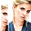
Paste it in a new layer and put a two pixel wide white border around it. Then move it over to the side of the canvas where her face isn't there, and move it down a bit. I was left with this:
.
Duplicate that layer and set it to Hard Light 58%, just to make it stand out from the base a little bit.
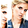
Make a new layer and put a horizontal white line at the bottom of the image. It really depends on how thick you want it to be, but mine was five or six pixels tall. Then using the eraser tool at about a 25 pixel diameter, erase most of the line at a diagonal so it looks like it dissapears. I cut mine off at Maggie's shirt so it didn't appear like there was a line going into her skin. This will help with the next image we're going to add. You should have something like this:
.
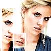
Next pick another part of her face to copy. I chose part of her nose and mouth, because I wanted to stay away from her eyes, but still pick a part of her face that draws attention. Copy merge that selection and paste it as a new layer. Also add a two pixel wide border to this one, like you did with the first selection. When you're done with that, move it over to where it rests upon the line you just added to the bottom of the image. You should now have something similar to this:
.
Make a new layer and create a 7 by 7 square. Take a color from the image, preferably a dark one(I picked #211F2A), and fill that square with the color. Put it in the corner near the two smaller images, and then duplicate it three times. On the first duplication, make it a slightly lighter color, also from the image, and move it up above the first square. Do the same with the other two. Also, it's best to play with the opacity to make it look like the squares are fading into the image. So the layers look like this:
Fourth Square, 25%
Third Square, 45%
Second Square, 79%
Dark Square, 100%
You should now have something like this: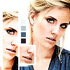
.
Next is, personally, the fun part. Take this gradient:
(unsure of who it's by?) and set it to hard light, 100% on a new layer. Then take a random light texture and set it on a new layer to screen, 100%. I used
(also not sure who it's by).
It should now look like this: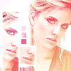
.
I actually like the color difference, makes it a lot more interesting. It doesn't have to be on screen either - try out different layer settings to get different effects. It all really depends on what you'd like your icon to look like.
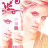
Then I took a simple brush(unsure of where I got it) and placed it up in the top left, using a color from the image(I used #DB2A53).With this change, you get this:

-
The last thing to do is to add some text. I placed mine in the bottom right because it was empty. The best results is any normal font, such as Arial or Times New Roman at size 2. It doesn't really matter what you type at all, and I typically like to ramble about my day.
And that leaves you with the final image:
And that's all there is to it! It may seem like it takes forever, but it's really not that hard once you're used to it. I hope this tutorial wasn't too hard to understand, as it's my first.
Going from:

to

This is my first tutorial, so don't go too hard on me ;) I made this icon in Paint Shop Pro 7, but it should easily be transferable.
We'll be going from

to

First you want to start out with a base picture. I got mine from Maggie-Grace.com. Here's the original picture I started out with:

Crop it into 100x100 and place it where you like. I also had to erase part of the red magazine logo to the left of Maggie's face, but then I was left with this:

The next few steps are really up to you. It's mostly just preparing the base and making it look the way you want it to before you start. For me, I did this(from bottom to top layer):
Duplicate the base and set it to Hard Light, 100%
Duplicate the base and set it to Normal, 50%
Duplicate the base and set it to Color, 64%
After doing this, I had this:

. It's not much of a difference, but it will be visible later.
Next, pick a part of the face. I picked the small section where her eye, nose, and mouth are all along each other, and copy that selection merged. For instance, I got this:

.
Paste it in a new layer and put a two pixel wide white border around it. Then move it over to the side of the canvas where her face isn't there, and move it down a bit. I was left with this:

.
Duplicate that layer and set it to Hard Light 58%, just to make it stand out from the base a little bit.
Make a new layer and put a horizontal white line at the bottom of the image. It really depends on how thick you want it to be, but mine was five or six pixels tall. Then using the eraser tool at about a 25 pixel diameter, erase most of the line at a diagonal so it looks like it dissapears. I cut mine off at Maggie's shirt so it didn't appear like there was a line going into her skin. This will help with the next image we're going to add. You should have something like this:

.
Next pick another part of her face to copy. I chose part of her nose and mouth, because I wanted to stay away from her eyes, but still pick a part of her face that draws attention. Copy merge that selection and paste it as a new layer. Also add a two pixel wide border to this one, like you did with the first selection. When you're done with that, move it over to where it rests upon the line you just added to the bottom of the image. You should now have something similar to this:

.
Make a new layer and create a 7 by 7 square. Take a color from the image, preferably a dark one(I picked #211F2A), and fill that square with the color. Put it in the corner near the two smaller images, and then duplicate it three times. On the first duplication, make it a slightly lighter color, also from the image, and move it up above the first square. Do the same with the other two. Also, it's best to play with the opacity to make it look like the squares are fading into the image. So the layers look like this:
Fourth Square, 25%
Third Square, 45%
Second Square, 79%
Dark Square, 100%
You should now have something like this:

.
Next is, personally, the fun part. Take this gradient:

(unsure of who it's by?) and set it to hard light, 100% on a new layer. Then take a random light texture and set it on a new layer to screen, 100%. I used

(also not sure who it's by).
It should now look like this:

.
I actually like the color difference, makes it a lot more interesting. It doesn't have to be on screen either - try out different layer settings to get different effects. It all really depends on what you'd like your icon to look like.
Then I took a simple brush(unsure of where I got it) and placed it up in the top left, using a color from the image(I used #DB2A53).With this change, you get this:

-

The last thing to do is to add some text. I placed mine in the bottom right because it was empty. The best results is any normal font, such as Arial or Times New Roman at size 2. It doesn't really matter what you type at all, and I typically like to ramble about my day.
And that leaves you with the final image:

And that's all there is to it! It may seem like it takes forever, but it's really not that hard once you're used to it. I hope this tutorial wasn't too hard to understand, as it's my first.