Full Icon Tutorial for PS7 -- Fear
Full Icon Tutorial for this icon:
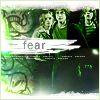
[Number of Layers: 17]
[Used: Gradients, Brushes, Textures]
[Font: 12pt, ITC Franklin Gothic]
[Steps: 9]
||Step One||
I started out with this image from Veritaserum.com. I cropped it and shrunk it (Ctrl + T, and then hold the shift key while adjusting the size so the image doesn't lose its porportions).
At this point, I went to Filter > Sharpen > Sharpen to make the image less blurred.
You'll notice that none of the background is in the final icon. This is because I used the masking tool to cut out the trio and deleted all the excess stuff behind them. This can be done with the polygonal lasso tool and the eraser tool also, if you do not wish to use the masking tool.
After I have the image of just the trio, I went to Image > Adjustments > Desaturate to make it greyscale, and this is what I have so far:

This layer's called "Trio Grey". Remember that if your image still looks really dull and there's little contrast, you can go to Image > Adjustments > Brightness/Contrast to fix that.
||Step Two||
The grey looks really boring, doesn't it? So, it's time to add some colour. I double clicked the Trio Grey layer so that the "Layer Style" box pops up. I went to "Gradient Overlay" and selected this gradient:

Now, if you've cut your Trio out properly, it should only cover the Trio, not the entire image, like so:
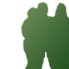
Now, set the gradient over the Trio to "Vivid Light", and this is what you should get:
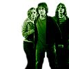
||Step Three||
I took this texture:
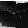
**
and put it behind the image of the Trio, so that it looks like this:
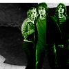
Then, I took a picture of the Dark Mark, cropped it, set it on a layer beneath the Trio one but above the texture, set it to "Overlay", and this is what I get:
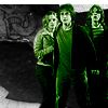
Now, you'll notice that the Dark Mark isn't very bright at all, and there's still a lot of excess space underneath it. So I duplicated the Dark Mark layer a bunch of times, moved them down, and this is what I end up with:
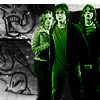
||Step Four||
Now, the left and right side of the icon doesn't match at this point. The left side has no colour, while the right side is mostly all green. To even it out, I took this texture (originally with black stuff where the white is now, but I cut it out using the polygonal lasso tool with a feather of 10):
**
I set this texture on "Linear Dodge" and this is what I have:
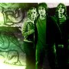
||Step Five||
The left side is still unbalanced right now, so I took these two light textures (from lvlwing) and set them both on screen:
You'll notice that some areas of the textures are cut out, and other areas have even been erased. This is because I thought there was too much green there and wanted to get rid of it. The eraser tool and polygonal lasso tool are essential for cutting out unnecessary parts of pictures.
After I set those to screen, I'm left with this:
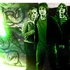
||Step Six||
I took this texture:
**
and set it on "Lighten" to get this:
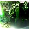
||Step Seven||
I placed these brushes (from teh_indy)
(made black so you can see them, but really they're white)
over all the layers and this is what I get:
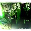
Then, I placed this brush (made by me):
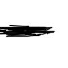
to get:
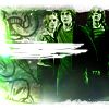
||Step Eight||
TEXT TIME!
12pt, ITC Franklin Gothic, #797979:
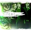
1pt, 600 spacing, ITC Franklin Gothic, #ffffff
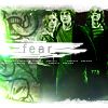
||Step Nine||
I made a new layer, filled it with white, but set the "fill" to zero. Then I double clicked that layer, chose "Stroke" on the Layer Styles box, and chose an "inside" stroke, colour #F3FFDF. Finally:

And you're done! If you have any questions, don't hesitate to ask!
** Once again, I do not know where I got these textures. I downloaded them a while ago - if anyone recognises them, please tell me so I can give credit. Thank you.
[Number of Layers: 17]
[Used: Gradients, Brushes, Textures]
[Font: 12pt, ITC Franklin Gothic]
[Steps: 9]
||Step One||
I started out with this image from Veritaserum.com. I cropped it and shrunk it (Ctrl + T, and then hold the shift key while adjusting the size so the image doesn't lose its porportions).
At this point, I went to Filter > Sharpen > Sharpen to make the image less blurred.
You'll notice that none of the background is in the final icon. This is because I used the masking tool to cut out the trio and deleted all the excess stuff behind them. This can be done with the polygonal lasso tool and the eraser tool also, if you do not wish to use the masking tool.
After I have the image of just the trio, I went to Image > Adjustments > Desaturate to make it greyscale, and this is what I have so far:

This layer's called "Trio Grey". Remember that if your image still looks really dull and there's little contrast, you can go to Image > Adjustments > Brightness/Contrast to fix that.
||Step Two||
The grey looks really boring, doesn't it? So, it's time to add some colour. I double clicked the Trio Grey layer so that the "Layer Style" box pops up. I went to "Gradient Overlay" and selected this gradient:

Now, if you've cut your Trio out properly, it should only cover the Trio, not the entire image, like so:

Now, set the gradient over the Trio to "Vivid Light", and this is what you should get:

||Step Three||
I took this texture:

**
and put it behind the image of the Trio, so that it looks like this:

Then, I took a picture of the Dark Mark, cropped it, set it on a layer beneath the Trio one but above the texture, set it to "Overlay", and this is what I get:

Now, you'll notice that the Dark Mark isn't very bright at all, and there's still a lot of excess space underneath it. So I duplicated the Dark Mark layer a bunch of times, moved them down, and this is what I end up with:

||Step Four||
Now, the left and right side of the icon doesn't match at this point. The left side has no colour, while the right side is mostly all green. To even it out, I took this texture (originally with black stuff where the white is now, but I cut it out using the polygonal lasso tool with a feather of 10):

**
I set this texture on "Linear Dodge" and this is what I have:

||Step Five||
The left side is still unbalanced right now, so I took these two light textures (from lvlwing) and set them both on screen:


You'll notice that some areas of the textures are cut out, and other areas have even been erased. This is because I thought there was too much green there and wanted to get rid of it. The eraser tool and polygonal lasso tool are essential for cutting out unnecessary parts of pictures.
After I set those to screen, I'm left with this:

||Step Six||
I took this texture:

**
and set it on "Lighten" to get this:

||Step Seven||
I placed these brushes (from teh_indy)

(made black so you can see them, but really they're white)
over all the layers and this is what I get:

Then, I placed this brush (made by me):

to get:

||Step Eight||
TEXT TIME!
12pt, ITC Franklin Gothic, #797979:

1pt, 600 spacing, ITC Franklin Gothic, #ffffff

||Step Nine||
I made a new layer, filled it with white, but set the "fill" to zero. Then I double clicked that layer, chose "Stroke" on the Layer Styles box, and chose an "inside" stroke, colour #F3FFDF. Finally:
And you're done! If you have any questions, don't hesitate to ask!
** Once again, I do not know where I got these textures. I downloaded them a while ago - if anyone recognises them, please tell me so I can give credit. Thank you.