PS7 tutorial: PoA screencap levels; gradient coloring; exclusion & tan multiply layers.
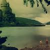
Go from this 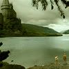
to this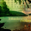
in PS7.
Ever since I posted this icon, everyone has been asking about the coloring and stuff. Luckily, I saved it in .psd format as well as .png, so I could make a tutorial. =D It's my fourth tutorial, by the way. I hope you learn something from it.
1. Starting from a cap from teh_indy's PoA screencaps, I cropped it, sharpened it, then went to Image >> Adjustments >> Levels. In channel RGB, I put the input levels as:
0, 1.00, 218. I only did this to this pic because the movie's got a dark tone to it; I just wanted it lighter. If your image is way light, don't do this. Remember that these levels are APPROXIMATED because I don't know exactly what I did when I did the levels for my icon the first time.
Then, in channel Red, I put the input levels as:
0, 1.00, 237. (Approximation.) I only did this because PoA kinda runs teal/blueish for some reason.
Then, in channel Blue, I put the input levels as:
20, 1.00, 255. (Approximation.) Again, I only did this because PoA kinda runs teal/blueish, and yellow kinda evens that out.
It should look something like this:

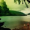
2. I duplicated the layer and put the new layer to Soft Light, 100% opacity. Since it's kinda dark in some spots (like the castle) I used this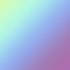
gradient by me and set it to Soft Light, 100%. If you need to, you can flip it around to fit your image.
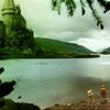
3. Create a new layer. Fill with #000F39 (or another dark blue) and set it to Exclusion, 100%. Create another new layer. Fill it with #D5C7A8 (or another tan) and set it to Multiply, 100%.
4. Paste this gradient
by me as a new layer. Set it to Soft Light, 100%. Since it's a tad bit too light, duplicate the base again; drag it to the top of the layers. Set it to Soft Light, 100%.
5. Now for a texture. Taking a texture by CandyCrack I flipped it horizontally and vertically so it looked like this: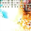
(you can flip it however which way to fit your icon). I set it to Multipy, 49%.
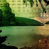
6. Text! I wrote inthedistance in 10pt Arial, #D6D97E. I bolded the 'the'. Then, I created another type layer. Same settings (arial, 10pt, #D6D97E.) I typed 'xxxxxxx'. I set it to Overlay, 100%.
Tada! You're done. It should look something like this:

If you want more gradients/icons/textures by me (or request icons) go to kirjava17_icons. If you want to see all the graphics by me, and all of my tutorials, go to Phoenixi

to this

in PS7.
Ever since I posted this icon, everyone has been asking about the coloring and stuff. Luckily, I saved it in .psd format as well as .png, so I could make a tutorial. =D It's my fourth tutorial, by the way. I hope you learn something from it.
1. Starting from a cap from teh_indy's PoA screencaps, I cropped it, sharpened it, then went to Image >> Adjustments >> Levels. In channel RGB, I put the input levels as:
0, 1.00, 218. I only did this to this pic because the movie's got a dark tone to it; I just wanted it lighter. If your image is way light, don't do this. Remember that these levels are APPROXIMATED because I don't know exactly what I did when I did the levels for my icon the first time.
Then, in channel Red, I put the input levels as:
0, 1.00, 237. (Approximation.) I only did this because PoA kinda runs teal/blueish for some reason.
Then, in channel Blue, I put the input levels as:
20, 1.00, 255. (Approximation.) Again, I only did this because PoA kinda runs teal/blueish, and yellow kinda evens that out.
It should look something like this:

2. I duplicated the layer and put the new layer to Soft Light, 100% opacity. Since it's kinda dark in some spots (like the castle) I used this

gradient by me and set it to Soft Light, 100%. If you need to, you can flip it around to fit your image.

3. Create a new layer. Fill with #000F39 (or another dark blue) and set it to Exclusion, 100%. Create another new layer. Fill it with #D5C7A8 (or another tan) and set it to Multiply, 100%.

4. Paste this gradient

by me as a new layer. Set it to Soft Light, 100%. Since it's a tad bit too light, duplicate the base again; drag it to the top of the layers. Set it to Soft Light, 100%.

5. Now for a texture. Taking a texture by CandyCrack I flipped it horizontally and vertically so it looked like this:

(you can flip it however which way to fit your icon). I set it to Multipy, 49%.

6. Text! I wrote inthedistance in 10pt Arial, #D6D97E. I bolded the 'the'. Then, I created another type layer. Same settings (arial, 10pt, #D6D97E.) I typed 'xxxxxxx'. I set it to Overlay, 100%.
Tada! You're done. It should look something like this:

If you want more gradients/icons/textures by me (or request icons) go to kirjava17_icons. If you want to see all the graphics by me, and all of my tutorials, go to Phoenixi