Emma Watson Tutorial: Exclusion & multiply, levels. PS7
Alright, here's a tutorial on a style I've been using for months. People have asked and here you are...
Made on Photoshop 7:
Go from
to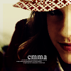
I took a pic from MuggleThai and cropped it down and made a base.

1. Duplicate base, set to soft light 100%.

2. Create a new layer. Fill with #000746 or another dark blue. Set to exclusion, 100%. Make another new layer, fill with a tan color - I used #B9B490. Set to Multiply, 100%.

3. Duplicate the base layer again. Drag to top of layers desaturate (shft ctrl u). Set to Soft Light, 100%.
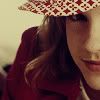
4. Duplicate base layer again... drag to top of layers, set to soft light, 100%. With this layer, you can choose to blur the face and sharpen the eyes and lips. I did.
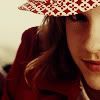
5. Now for the levels layer. If your icon is bright enough and has got good coloring, don't bother fiddling with this. Duplicate the base layer again, drag to top of layers, set to soft light, 100%. Mine looked like this:
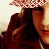
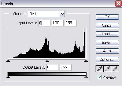
In my opinion, a little too red. So I went to image >> adjustments >> levels. Since this layer is a soft light layer, you can get away with drastic changes. If your picture is very dark or very light, play around with the RGB channel. I skipped over the RGB channel and went to red. Make sure preview is on. I dragged the black bar (teal) to the right to make the image tealer. I moved the gray bar (midtones) to the right to make it tealer as well. For red, I ended up with input levels of 20 .54 & 255. The output levels stayed the same.
>>
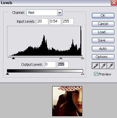
Next I went to green. Black bar is purple; white bar is green; middle gray bar is midtones. I wanted less redness and purpleness so I made the icon more green.
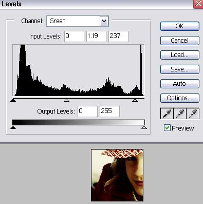
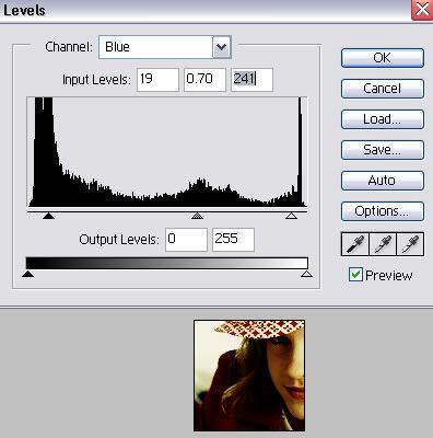
Then I went to blue. The pic seemed to get bluer with each change in levels, so I decided I needed more yellow (black bar). I did want a little blue in there. This is what I ended up doing:
Phew! Finally done with the levels.
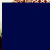
6. Create a new layer, fill with dark blue from before. Use the move tool to slightly offset the fill. Set to exclusion, 100%.
>>
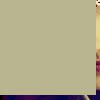
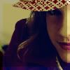
7. Create a new layer, fill with tan from before. Offset the layer with the move tool. I usually make the opposite sides from before's offsetting show through. Set to multiply, 100%.
>>
8. Duplicate the levels layer from before. Drag to top of layers. Desaturate (shft ctrl u) and set to soft light, 100%.
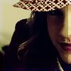
9. Duplicate the base, drag to top of layers, set to soft light, 100%.
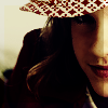
If you don't want to add text, as I usually don't with face closeups, you're done.
For the sake of the tutorial, though, I'll add text to this one.
10. Using white times new roman, 11pt, I typed 'emma' and moved it to a dark area on the icon that doesn't interfere with her face or hair or hat or whatever.
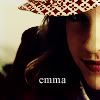
Then I added tiny text of my own because usually brushes don't work with the icon. Using 1pt white times new roman, I typed random letters from across the keyboard, with CAPS LOCK ON. Then hit enter twice...hit random keys from across the keyboard, spaced, enter, random keys from across the keyboard, spaced. Turn caps lock off now. =D

Tada! You're done.
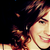
I've used this style on a TON of my icons, even the one I'm using right now. Some I've made with this technique:
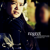

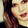

All my icons can be found at kirjava17_icons; all my icon tutorials there as well; blend tutorials and all my graphics can be found at Phoenixi.
Made on Photoshop 7:
Go from

to

I took a pic from MuggleThai and cropped it down and made a base.

1. Duplicate base, set to soft light 100%.

2. Create a new layer. Fill with #000746 or another dark blue. Set to exclusion, 100%. Make another new layer, fill with a tan color - I used #B9B490. Set to Multiply, 100%.

3. Duplicate the base layer again. Drag to top of layers desaturate (shft ctrl u). Set to Soft Light, 100%.

4. Duplicate base layer again... drag to top of layers, set to soft light, 100%. With this layer, you can choose to blur the face and sharpen the eyes and lips. I did.

5. Now for the levels layer. If your icon is bright enough and has got good coloring, don't bother fiddling with this. Duplicate the base layer again, drag to top of layers, set to soft light, 100%. Mine looked like this:

In my opinion, a little too red. So I went to image >> adjustments >> levels. Since this layer is a soft light layer, you can get away with drastic changes. If your picture is very dark or very light, play around with the RGB channel. I skipped over the RGB channel and went to red. Make sure preview is on. I dragged the black bar (teal) to the right to make the image tealer. I moved the gray bar (midtones) to the right to make it tealer as well. For red, I ended up with input levels of 20 .54 & 255. The output levels stayed the same.

>>

Next I went to green. Black bar is purple; white bar is green; middle gray bar is midtones. I wanted less redness and purpleness so I made the icon more green.

Then I went to blue. The pic seemed to get bluer with each change in levels, so I decided I needed more yellow (black bar). I did want a little blue in there. This is what I ended up doing:

Phew! Finally done with the levels.
6. Create a new layer, fill with dark blue from before. Use the move tool to slightly offset the fill. Set to exclusion, 100%.

>>

7. Create a new layer, fill with tan from before. Offset the layer with the move tool. I usually make the opposite sides from before's offsetting show through. Set to multiply, 100%.

>>

8. Duplicate the levels layer from before. Drag to top of layers. Desaturate (shft ctrl u) and set to soft light, 100%.

9. Duplicate the base, drag to top of layers, set to soft light, 100%.

If you don't want to add text, as I usually don't with face closeups, you're done.
For the sake of the tutorial, though, I'll add text to this one.
10. Using white times new roman, 11pt, I typed 'emma' and moved it to a dark area on the icon that doesn't interfere with her face or hair or hat or whatever.

Then I added tiny text of my own because usually brushes don't work with the icon. Using 1pt white times new roman, I typed random letters from across the keyboard, with CAPS LOCK ON. Then hit enter twice...hit random keys from across the keyboard, spaced, enter, random keys from across the keyboard, spaced. Turn caps lock off now. =D

Tada! You're done.
I've used this style on a TON of my icons, even the one I'm using right now. Some I've made with this technique:


All my icons can be found at kirjava17_icons; all my icon tutorials there as well; blend tutorials and all my graphics can be found at Phoenixi.