PSP9 Tutorial
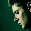
faniniohio wanted to know how I got the colouring in this icon : 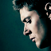
Tutorial #1 - PSP9. I'm pretty certain it'll translate. Beginner friendly (I think).
faniniohio wanted to know how I got the colouring in this icon :
I'd merged most of the layers, so the .psp file I had was only half complete, so I've recreated the icon as close as I can. This is what I ended up with:
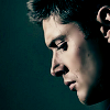
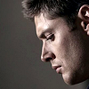
from this:
Step 1
Crop, Sharpen and then use the unsharp mask [Adjust -> Sharpness -> Unsharp Mask] Settings: Radius: 23.08/Strength: 25/Clipping: 7.
Step 2
Use the soften tool on the cheeks.

Step 3
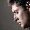
Duplicate the image and set the duplicated layer to screen, opacity 28%.
Step 4
Create a new raster layer and flood fill with #d7c89f Set to multiply at opacity 100%
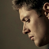
Step 5
Create a new raster layer and flood fill with #3be0e0 Set to burn at opacity 18%
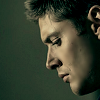
Step 6
Merge all. Then go to curves [Layers -> New Adjustment Layer -> Curves]
Settings: RGB: Input - 192/Output - 245, Red: Input - 228/Output - 245, Green: Input - 229/Ouput - 250, Blue: Input - 238/Output - 255. Set to soft light opacity 58%
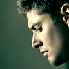
Step 7
Create a new raster layer flood fill with #3be0e0 and set to burn at opacity 20%.
Merge all your layers.
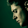
Step 8
Go to curves again.
Settings: RGB: Input - 207/Output - 254, Blue: Input - 169/Output - 239, Green: Input - 219/Output - 233, Red - No Values. Set to soft light at opacity 26%.
Merge all again.
Step 9
Duplicate image again and set to screen at opacity 34%.
Merge layers again.
Step 10
Go to colour balance [Adjust -> Colour Balance -> Colour Balance] Set colour levels in midtones to 0/-40/6.
Merge all layers again. Duplicate set to screen opacity 36%.
Final Product:
If you have any questions feel free to ask I'll try my best to answer them.

Tutorial #1 - PSP9. I'm pretty certain it'll translate. Beginner friendly (I think).
faniniohio wanted to know how I got the colouring in this icon :

I'd merged most of the layers, so the .psp file I had was only half complete, so I've recreated the icon as close as I can. This is what I ended up with:

from this:

Step 1
Crop, Sharpen and then use the unsharp mask [Adjust -> Sharpness -> Unsharp Mask] Settings: Radius: 23.08/Strength: 25/Clipping: 7.

Step 2
Use the soften tool on the cheeks.

Step 3
Duplicate the image and set the duplicated layer to screen, opacity 28%.

Step 4
Create a new raster layer and flood fill with #d7c89f Set to multiply at opacity 100%

Step 5
Create a new raster layer and flood fill with #3be0e0 Set to burn at opacity 18%

Step 6
Merge all. Then go to curves [Layers -> New Adjustment Layer -> Curves]
Settings: RGB: Input - 192/Output - 245, Red: Input - 228/Output - 245, Green: Input - 229/Ouput - 250, Blue: Input - 238/Output - 255. Set to soft light opacity 58%

Step 7
Create a new raster layer flood fill with #3be0e0 and set to burn at opacity 20%.
Merge all your layers.

Step 8
Go to curves again.
Settings: RGB: Input - 207/Output - 254, Blue: Input - 169/Output - 239, Green: Input - 219/Output - 233, Red - No Values. Set to soft light at opacity 26%.
Merge all again.

Step 9
Duplicate image again and set to screen at opacity 34%.
Merge layers again.
Step 10
Go to colour balance [Adjust -> Colour Balance -> Colour Balance] Set colour levels in midtones to 0/-40/6.
Merge all layers again. Duplicate set to screen opacity 36%.
Final Product:

If you have any questions feel free to ask I'll try my best to answer them.