(no subject)
Wanna see how I took this 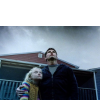
and created this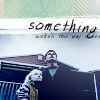
? Find out behind the cut!
Alrighty, ducklings, here's today's lesson. I'm gonna teach you how to create this icon, featuring "War of the Worlds". I'll assume that you have basic knowledge of your graphics program, 'cause I'm not good (At ALL) at explaining. It's not my thing ;)
(Cap courtesy of pinkpearl885)
1- Set up your base. This is pretty self-explainitory. Sharpen, resize, all that hooplah. For mine, I lowered the cap to at least halfway down the icon, so it looked like this:
>>>
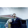
2- Then, I lightened the cap with curves. If you're not familiar with curves, check out some tutorials about curves that you can probably find in the memories. I don't exactly remember what the measurements were, so you have to improvise. The main idea is to make the base look vibrant and saturated.
>>>
3- Now, select and delete the white area. After doing that, I placed this base
by gender under my cap. I rotated it a bit, I think I should add. I fiddled around with it until I was happy with it.
>>>
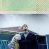
4- Following that, I copy-merged the icon into a new layer, and then desaturated it. I then set it to Soft Light, 100%.
>>>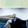
5- I then placed this gradient (made by me) as the top layer and set it to Lighten, 100%.
>>>

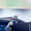
6- Next, I applied a light-blue (#8193ff)
and set it to 36%.
>>>
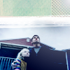
7- The next thing I did was I put this brush by I believe Thia of Hybrid Genesis-I know she has a livejournal, I just can't remember what it is inxsomniax- and placed it so that it seperates the cap and the base.
>>>
8- Finally, I applied the text "Something wicked this way comes" in Jewel Hill font, which can be found at Da Font. I sized "Sometimes" at Size 16 and the rest of the words at Size 7.
>>>
Thats it! Please give comments and feedback. I love comments and feedback as much as I love Tropical Starbursts. Yummm.
This is my first tutorial in, like, 300040598 years. Awesome!

and created this

? Find out behind the cut!
Alrighty, ducklings, here's today's lesson. I'm gonna teach you how to create this icon, featuring "War of the Worlds". I'll assume that you have basic knowledge of your graphics program, 'cause I'm not good (At ALL) at explaining. It's not my thing ;)
(Cap courtesy of pinkpearl885)
1- Set up your base. This is pretty self-explainitory. Sharpen, resize, all that hooplah. For mine, I lowered the cap to at least halfway down the icon, so it looked like this:
>>>

2- Then, I lightened the cap with curves. If you're not familiar with curves, check out some tutorials about curves that you can probably find in the memories. I don't exactly remember what the measurements were, so you have to improvise. The main idea is to make the base look vibrant and saturated.
>>>

3- Now, select and delete the white area. After doing that, I placed this base
by gender under my cap. I rotated it a bit, I think I should add. I fiddled around with it until I was happy with it.
>>>


4- Following that, I copy-merged the icon into a new layer, and then desaturated it. I then set it to Soft Light, 100%.
>>>

5- I then placed this gradient (made by me) as the top layer and set it to Lighten, 100%.
>>>


6- Next, I applied a light-blue (#8193ff)
and set it to 36%.
>>>


7- The next thing I did was I put this brush by I believe Thia of Hybrid Genesis-I know she has a livejournal, I just can't remember what it is inxsomniax- and placed it so that it seperates the cap and the base.
>>>


8- Finally, I applied the text "Something wicked this way comes" in Jewel Hill font, which can be found at Da Font. I sized "Sometimes" at Size 16 and the rest of the words at Size 7.
>>>

Thats it! Please give comments and feedback. I love comments and feedback as much as I love Tropical Starbursts. Yummm.
This is my first tutorial in, like, 300040598 years. Awesome!