Coloring tutorial { beginner friendly }
Hi!
Yay, my first post here! :D
How to go from

to
A very beginner friendly one, I made it in PSP9, but I think it's translatable in Photoshop too.
Okay, let's begin!
Open up your graphics programm, and copy/paste an icon base (100X100) into your programm.
I started with this one:

(credit goes to sikii, thank you! :))
We are going to duplicate the layer; so go to Layers>>Duplicate.
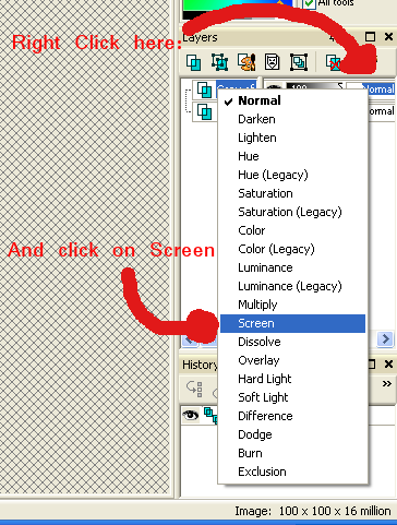
Now we're going to set the blend mode of the new layer to Screen (this will make the icon brighter).
Now copy this gradient (it's actually just a black 100x100 icon.. :P), and paste it as a new layer.
(Edit>>Paste>>Paste as new layer, OR just press Shift+L)
Change the blend mode to Overlay (just like we did with the Screen one).

-->
Now we add another color (as a new layer, etc.), but this time we set the blend mode to Multiply.

-->
Then we add a red one, and set the blend mode to Overlay.

It's a bit too red, isn't it? So, we're going to play around with the opacity. See the "100", next to Overlay?
move the withe 'thingie' around a bit, until your opacity has reached around 26.
Looks much better, doesn't it? :D

All-right, our last layer, we fill it with a very heavy blue, we set the blend mode to Burn, and the opacity to 14.

-->
We're going to merge the layers by going to Layer>>Merge>>Merg All (Flatten).
Now you can sharpen it, if you like, or change the brightness of the icon.
I'm going to make this one a bit brighter.
Go to Adjust>>Brightness and Contrast>>Brightness/Contrast. Play around with the settings until you like it. (My brightness was on 25, and my Contrast on 13).
My final result:

Add some more text/brushes if you like, or just leave it like this. :)
Wow......another way-to-long tutorial, but I'm pretty sure I didn't leave any tiny detail out, lol :P!
If I did, feel free to ask me about it! :)
Please show me what you made!
Love,
Min
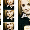
ps: Some other icons with the same coloring. (Bases by me, and the good ones by sikii! :P)


x-posted@myLJ
Yay, my first post here! :D
How to go from

to

A very beginner friendly one, I made it in PSP9, but I think it's translatable in Photoshop too.
Okay, let's begin!
Open up your graphics programm, and copy/paste an icon base (100X100) into your programm.
I started with this one:

(credit goes to sikii, thank you! :))
We are going to duplicate the layer; so go to Layers>>Duplicate.
Now we're going to set the blend mode of the new layer to Screen (this will make the icon brighter).

Now copy this gradient (it's actually just a black 100x100 icon.. :P), and paste it as a new layer.
(Edit>>Paste>>Paste as new layer, OR just press Shift+L)
Change the blend mode to Overlay (just like we did with the Screen one).

-->

Now we add another color (as a new layer, etc.), but this time we set the blend mode to Multiply.

-->

Then we add a red one, and set the blend mode to Overlay.

It's a bit too red, isn't it? So, we're going to play around with the opacity. See the "100", next to Overlay?
move the withe 'thingie' around a bit, until your opacity has reached around 26.
Looks much better, doesn't it? :D

All-right, our last layer, we fill it with a very heavy blue, we set the blend mode to Burn, and the opacity to 14.

-->

We're going to merge the layers by going to Layer>>Merge>>Merg All (Flatten).
Now you can sharpen it, if you like, or change the brightness of the icon.
I'm going to make this one a bit brighter.
Go to Adjust>>Brightness and Contrast>>Brightness/Contrast. Play around with the settings until you like it. (My brightness was on 25, and my Contrast on 13).
My final result:

Add some more text/brushes if you like, or just leave it like this. :)
Wow......another way-to-long tutorial, but I'm pretty sure I didn't leave any tiny detail out, lol :P!
If I did, feel free to ask me about it! :)
Please show me what you made!
Love,
Min
ps: Some other icons with the same coloring. (Bases by me, and the good ones by sikii! :P)


x-posted@myLJ