Kabuki Tutorial (Including a Curves Mini Lesson)
You’ll learn how to make a kabuki out of almost any portrait.
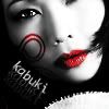
Techniques used:
+ Curves
+ Blur/Sharpen Tool
+ Burn Tool
+ Pen Tool
Program Used:
+ Photoshop CS, but easily translatable
You’ll learn how to make a kabuki out of almost any portrait. I say almost because I haven’t figured out how to do it with darker complexions. Sorry!
When picking your base, I prefer people with bigger lips so that the pop of color will stand out in the end. But that’s just an aesthetic that you do not necessarily have to follow.
The Base:
1) I’ve picked a picture of Thuy Trang (R.I.P.) and cropped it.
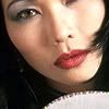
2) Copy that new layer, and then desaturate it.
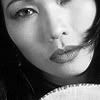
3) Now we need a bit more contrast. We want to get as much white in the face as possible without clipping, in other words, losing too much detail. In this picture, the light is shining on the right side of her face, so you’d want to focus on making that side as white as possible.
Beginners can use Brightness/Contrast, but in order to get the best results and target specifically that right side, Curves is the best. I know some of you are now running away from the mention of Curves, but it’s easier than you think.
------------------------------
[Curves Mini Lesson]
When you first open Curves, it’s scary as hell. But if you take it one piece at a time, it’s pretty simple.
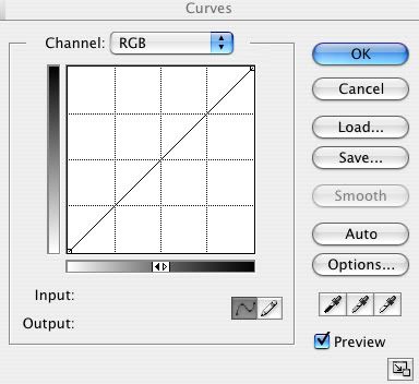
Don’t look at anything else but the Channel Name and the box with the diagonal line. (This is why it’s a mini lesson.)
When the Channel is on RGB, this means that you will be manipulation the Brightness/Contrast of the overall picture.
Now we’ll look at the gradients on the left side and the bottom of the box. The Bottom gradient is your input. This represents what is already in the original picture. The Left gradient is your output. This represents what your picture will result in after manipulation. Right now, the diagonal line represent that nothing had changed: White is White, Grey is Grey, and Black is Black.
For example: If there is white in the picture (Bottom Left), and you put a dot in the upper left-hand corner, that white will become black (Upper Left). Your input was white, and the output is now black.
So when we’re talking about the RGB channel, we’re not dealing specific colors, but brightness and contrast. With the example above, the white in the picture will become darker in contrast.
[/End of Curves Mini Lesson]
------------------------------
Cont. of 3) Back to the base. Copy that layer, and open up Curves. Remember, we want to make the right side of her face brighten up, and while we’re at it, make the background a bit darker.
With Curves opened up to the RGB channel, you’ll have two dots in the box: One having the somewhat darker input brought up to the darker output, and another having the somewhat lighter input brought down to the lighter output. You should have a small “S” shape. Start there, and then you can tweak around depending on the picture you have.

4) The base is looking pretty grainy. Copy that layer, and we’ll now smooth out her skin by using the Blur Tool. I used it at a strength of about 60%. Avoid the lips and eyes, and don’t overblur (is that a word?) the edges of her face.
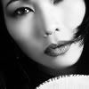
5) Copy that layer. Now the lighting on her face is a bit too even overall, so we’ll use the Burn Tool to give her some shadows on the left side. I used an exposure of 28%, brush size of 30 with 0% Hardness, and started with the Midtones.
Brush it a bit on her left side with more emphasis furthest away from the light source. Don’t “burn” her cheekbone as that and her bone at her eyebrow are where the light hits the best. Change it over from “Midtones” to “Shadows” and add a bit right on the left side of the bridge of her nose.
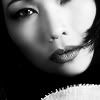
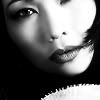
6) Copy that Layer! Personally, I still wanted more of a contrast in her face, so I went back to Curves and did the same technique that was explained in Step 3.
The Lips:
7) Copy that Layer! (Lol!) When I first did this icon, I tinkered around with the red lips (in Curves) she already had and just rolled with it. But since not everyone is going to have red lips, we’ll just start out with the desaturated lips and build from there. There are many ways to get the color red, but I just talk about 2.
Using Curves, you’ll go to the Red channel and tinker around with it until it’s as red as possible without clipping.
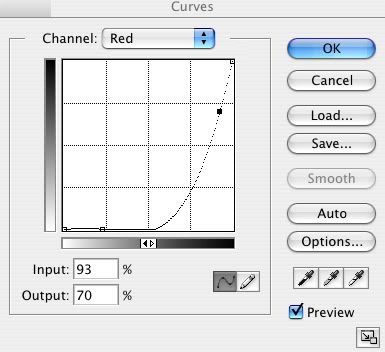
Then you have the option of going to the RGB channel and make the lips darker so that they look more realistic. Everyone’s “tinkering” will be different, but here was mine:
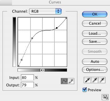
The main point of this was to get red lips without losing the detail, but you don’t have to use Curves to get this. The second way is using Selective Color. (In PS CS: Image > Adjustments > Selective Color.) Open it, and make sure the channel you’re manipulating is on “Reds.” Then the sliders are pretty self explanatory.
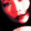
8) Erase everything but the lips.
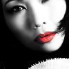
9) Depending what your output was, you can skip this step. For me, the lips weren’t red and rich enough, so I went back into Curves.

Details:
Ah yes! The main icon is complete, YAY! But details can make or break an icon, and we don’t want any breaking.
10) I like eyes that pop! So I took the Sharpen Tool at 50% strength and a very small brush and sharpened the pupil and white in her eye. Also, I sharpened her nostrils. For most, it wouldn’t be necessary, but they looked a bit too blurred for me.
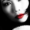
11) Make a new layer. We now need a decoration for the face. You can use any kind of brushes you desire, do whatever! I chose the color #AF191A and a cute brush (I completely forgot where I got it from. If anyone can help me out with the creator, please do!), rotated it and set it to “Color Burn.” Place it on the face where you see fit. Here are two examples, one with the brush and one with a lil som'n som'n I made (not as great, but whatever):
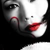
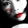
12) Finally, the text! The font I used is called “Monaco” and I set it on a path using the Pen Tool. I used Freeform Pen Tool and set the “Curve Fit” to 4 px. Then I made a path that loosely fit around the face, and then used the Text Tool to place the text right on that path.
I love to use my “fading text” technique by duplicating the text and using different opacities. This one was a bit different by making the duplicated texts black with a white drop shadow.

And then that’s it! The end of this tutorial! WOO! Hope you understand and learned from this tutorial, as this was my first. If you have any questions, feel free to ask :)

Techniques used:
+ Curves
+ Blur/Sharpen Tool
+ Burn Tool
+ Pen Tool
Program Used:
+ Photoshop CS, but easily translatable
You’ll learn how to make a kabuki out of almost any portrait. I say almost because I haven’t figured out how to do it with darker complexions. Sorry!
When picking your base, I prefer people with bigger lips so that the pop of color will stand out in the end. But that’s just an aesthetic that you do not necessarily have to follow.
The Base:
1) I’ve picked a picture of Thuy Trang (R.I.P.) and cropped it.

2) Copy that new layer, and then desaturate it.

3) Now we need a bit more contrast. We want to get as much white in the face as possible without clipping, in other words, losing too much detail. In this picture, the light is shining on the right side of her face, so you’d want to focus on making that side as white as possible.
Beginners can use Brightness/Contrast, but in order to get the best results and target specifically that right side, Curves is the best. I know some of you are now running away from the mention of Curves, but it’s easier than you think.
------------------------------
[Curves Mini Lesson]
When you first open Curves, it’s scary as hell. But if you take it one piece at a time, it’s pretty simple.

Don’t look at anything else but the Channel Name and the box with the diagonal line. (This is why it’s a mini lesson.)
When the Channel is on RGB, this means that you will be manipulation the Brightness/Contrast of the overall picture.
Now we’ll look at the gradients on the left side and the bottom of the box. The Bottom gradient is your input. This represents what is already in the original picture. The Left gradient is your output. This represents what your picture will result in after manipulation. Right now, the diagonal line represent that nothing had changed: White is White, Grey is Grey, and Black is Black.
For example: If there is white in the picture (Bottom Left), and you put a dot in the upper left-hand corner, that white will become black (Upper Left). Your input was white, and the output is now black.
So when we’re talking about the RGB channel, we’re not dealing specific colors, but brightness and contrast. With the example above, the white in the picture will become darker in contrast.
[/End of Curves Mini Lesson]
------------------------------
Cont. of 3) Back to the base. Copy that layer, and open up Curves. Remember, we want to make the right side of her face brighten up, and while we’re at it, make the background a bit darker.
With Curves opened up to the RGB channel, you’ll have two dots in the box: One having the somewhat darker input brought up to the darker output, and another having the somewhat lighter input brought down to the lighter output. You should have a small “S” shape. Start there, and then you can tweak around depending on the picture you have.

4) The base is looking pretty grainy. Copy that layer, and we’ll now smooth out her skin by using the Blur Tool. I used it at a strength of about 60%. Avoid the lips and eyes, and don’t overblur (is that a word?) the edges of her face.

5) Copy that layer. Now the lighting on her face is a bit too even overall, so we’ll use the Burn Tool to give her some shadows on the left side. I used an exposure of 28%, brush size of 30 with 0% Hardness, and started with the Midtones.
Brush it a bit on her left side with more emphasis furthest away from the light source. Don’t “burn” her cheekbone as that and her bone at her eyebrow are where the light hits the best. Change it over from “Midtones” to “Shadows” and add a bit right on the left side of the bridge of her nose.

6) Copy that Layer! Personally, I still wanted more of a contrast in her face, so I went back to Curves and did the same technique that was explained in Step 3.

The Lips:
7) Copy that Layer! (Lol!) When I first did this icon, I tinkered around with the red lips (in Curves) she already had and just rolled with it. But since not everyone is going to have red lips, we’ll just start out with the desaturated lips and build from there. There are many ways to get the color red, but I just talk about 2.
Using Curves, you’ll go to the Red channel and tinker around with it until it’s as red as possible without clipping.

Then you have the option of going to the RGB channel and make the lips darker so that they look more realistic. Everyone’s “tinkering” will be different, but here was mine:

The main point of this was to get red lips without losing the detail, but you don’t have to use Curves to get this. The second way is using Selective Color. (In PS CS: Image > Adjustments > Selective Color.) Open it, and make sure the channel you’re manipulating is on “Reds.” Then the sliders are pretty self explanatory.

8) Erase everything but the lips.

9) Depending what your output was, you can skip this step. For me, the lips weren’t red and rich enough, so I went back into Curves.

Details:
Ah yes! The main icon is complete, YAY! But details can make or break an icon, and we don’t want any breaking.
10) I like eyes that pop! So I took the Sharpen Tool at 50% strength and a very small brush and sharpened the pupil and white in her eye. Also, I sharpened her nostrils. For most, it wouldn’t be necessary, but they looked a bit too blurred for me.

11) Make a new layer. We now need a decoration for the face. You can use any kind of brushes you desire, do whatever! I chose the color #AF191A and a cute brush (I completely forgot where I got it from. If anyone can help me out with the creator, please do!), rotated it and set it to “Color Burn.” Place it on the face where you see fit. Here are two examples, one with the brush and one with a lil som'n som'n I made (not as great, but whatever):


12) Finally, the text! The font I used is called “Monaco” and I set it on a path using the Pen Tool. I used Freeform Pen Tool and set the “Curve Fit” to 4 px. Then I made a path that loosely fit around the face, and then used the Text Tool to place the text right on that path.
I love to use my “fading text” technique by duplicating the text and using different opacities. This one was a bit different by making the duplicated texts black with a white drop shadow.

And then that’s it! The end of this tutorial! WOO! Hope you understand and learned from this tutorial, as this was my first. If you have any questions, feel free to ask :)