Tutorial #10.
We'll be going from this to this: 
Made with PS7, but should work with other programs.
First off, you obviously make your 100 x100base.
When you're dealing with a screen cap from a movie they can be very dull. To brighten mine up a bit, I pasted this and set it to Saturation at 35%.
This was to make the plants seem more green. So take your eraser and erase every part of the Saturation layer that is not on the plants in the background (meaning Jack and that rope). Merge layers.
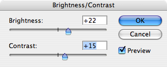
Now Mr. Sparrow seemed a bit too dark for me, so I adjusted the Brightness and Contrast. My settings were like this:

Now onto the colouring.
Duplicate your base and set it to Screen.
Paste this at Darken 20%.
Duplicate your base and drag it to the top. Set to Soft Light.
Paste this at Exclusion 79%.
Duplicate your base and drag it to the top(again). Set to Soft Light.
Paste this at Soft Light 79%.
Paste this at Soft Light 92%.
Duplicate your base, drag it to the top and Destaturate. Set to Soft Light.
Paste this at Colour Burn. Duplicate twice.
Now, this is optional, but I love to put something extra on my icons.
Paste something like this on your icon at Screen.
Then paste something else of a different colour (I suggest something neon) such as this. Set it to Screen and move it to where you can see some of the colour.
Write some text in the white section you created. I wrote, in grey, "jack" with Dyspepsia.
Then paste this at Screen. Position it over the text, but make it so you can still see some colour on another part of the icon.
Another example:

I'd love to see what you all get and what you think. [:
♥

Made with PS7, but should work with other programs.
First off, you obviously make your 100 x100base.
When you're dealing with a screen cap from a movie they can be very dull. To brighten mine up a bit, I pasted this and set it to Saturation at 35%.
This was to make the plants seem more green. So take your eraser and erase every part of the Saturation layer that is not on the plants in the background (meaning Jack and that rope). Merge layers.
Now Mr. Sparrow seemed a bit too dark for me, so I adjusted the Brightness and Contrast. My settings were like this:

Now onto the colouring.
Duplicate your base and set it to Screen.
Paste this at Darken 20%.
Duplicate your base and drag it to the top. Set to Soft Light.
Paste this at Exclusion 79%.
Duplicate your base and drag it to the top(again). Set to Soft Light.
Paste this at Soft Light 79%.
Paste this at Soft Light 92%.
Duplicate your base, drag it to the top and Destaturate. Set to Soft Light.
Paste this at Colour Burn. Duplicate twice.
Now, this is optional, but I love to put something extra on my icons.
Paste something like this on your icon at Screen.
Then paste something else of a different colour (I suggest something neon) such as this. Set it to Screen and move it to where you can see some of the colour.
Write some text in the white section you created. I wrote, in grey, "jack" with Dyspepsia.
Then paste this at Screen. Position it over the text, but make it so you can still see some colour on another part of the icon.
Another example:

I'd love to see what you all get and what you think. [:
♥