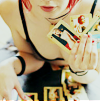
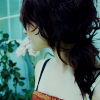
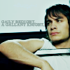
Tutorials 002 and 003: David Wright and Stock Image
Both made in PSP7, can be done with any program and are wicked simple.

to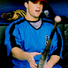
:: David Wright Tutorial ::
[ 1 ] Start just like you start every other icon. Find the picture, crop, sharpen, or whatever it is you like to do to prep.
[ 2 ] Duplicate your base twice. Set the layer closest to the base to Screen at 100%. set the second base to Soft Light at 23%
[ 3 ] Create a new fill layer with #85BFCB. Set the layer to Soft Light at 46%.
[ 4 ] Create a new fill layer with #0B2F29. Set the layer to Exclusion at 62%.
[ 5 ] Create a new fill layer with #C9B4DC. Set the layer to Colour Burn at 100%.
[ 6 ] Create a new fill layer with #D0C1AC. Set the layer to Multiply at 51%.
[ 7 ] Create a New Adjustment Layer for the Colour Balance. Set it to the following:
Shadow:
-14 (Cyan/ Red)
18 (Magenta/ Green)
-18 (Yellow/ Blue)
Midtones:
-30 (Cyan/ Red)
8 (Magenta/ Green)
-14 (Yellow/ Blue)
Highlight:
-14 (Cyan/ Red)
-23 (Magenta/ Green)
19 (Yellow/ Blue)
[ 8 ] Create a New Adjustment Layer for the Hue/ Saturation. Set the saturation to 7.
[ 9 ] Merge, add your text, brushes, ect. and your done. Simple right?
:: Other examples ::
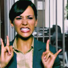
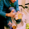

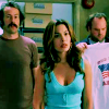
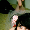
to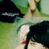
:: Siv Tutorial ::
[ 1 ] Again we start with the icon prep, so do your thing to get your base ready my babies.
[ 2 ] Duplicate your base and set it to Screen at 100%.
[ 3 ] Create a new fill layer with #CBE4EB. Set the layer to Soft Light at 100%.
[ 4 ] Create a new fill layer with #65C2D3. Set the layer to Darken at 25%.
[ 5 ] Create a new fill layer with #0A2C42. Set the layer to Exclusion at 100%.
[ 6 ] Create a new fill layer with #9DBDC3. Set the layer to Colour Burn at 56%.
[ 7 ] Duplicate your base and bring it to the top of your icon. Set it to Soft Light at 100%.
[ 8 ] And that's it. Leave it as is or add some jazzy stuff to it and just go crazy.
:: Other examples ::


to

:: David Wright Tutorial ::
[ 1 ] Start just like you start every other icon. Find the picture, crop, sharpen, or whatever it is you like to do to prep.
[ 2 ] Duplicate your base twice. Set the layer closest to the base to Screen at 100%. set the second base to Soft Light at 23%
[ 3 ] Create a new fill layer with #85BFCB. Set the layer to Soft Light at 46%.
[ 4 ] Create a new fill layer with #0B2F29. Set the layer to Exclusion at 62%.
[ 5 ] Create a new fill layer with #C9B4DC. Set the layer to Colour Burn at 100%.
[ 6 ] Create a new fill layer with #D0C1AC. Set the layer to Multiply at 51%.
[ 7 ] Create a New Adjustment Layer for the Colour Balance. Set it to the following:
Shadow:
-14 (Cyan/ Red)
18 (Magenta/ Green)
-18 (Yellow/ Blue)
Midtones:
-30 (Cyan/ Red)
8 (Magenta/ Green)
-14 (Yellow/ Blue)
Highlight:
-14 (Cyan/ Red)
-23 (Magenta/ Green)
19 (Yellow/ Blue)
[ 8 ] Create a New Adjustment Layer for the Hue/ Saturation. Set the saturation to 7.
[ 9 ] Merge, add your text, brushes, ect. and your done. Simple right?
:: Other examples ::


to

:: Siv Tutorial ::
[ 1 ] Again we start with the icon prep, so do your thing to get your base ready my babies.
[ 2 ] Duplicate your base and set it to Screen at 100%.
[ 3 ] Create a new fill layer with #CBE4EB. Set the layer to Soft Light at 100%.
[ 4 ] Create a new fill layer with #65C2D3. Set the layer to Darken at 25%.
[ 5 ] Create a new fill layer with #0A2C42. Set the layer to Exclusion at 100%.
[ 6 ] Create a new fill layer with #9DBDC3. Set the layer to Colour Burn at 56%.
[ 7 ] Duplicate your base and bring it to the top of your icon. Set it to Soft Light at 100%.
[ 8 ] And that's it. Leave it as is or add some jazzy stuff to it and just go crazy.
:: Other examples ::
