Gimp tutorial
Well,Well, I've finally made a full tutorial for Gimp, and beginners might have a bit of trouble with it, but it's pretty easy for someone who's been using Gimp for awhile. Please tell me if you're not understanding parts of the tutorial, I'd like to know what to change! Thanks! -Ruby
What we're making today
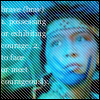
Full Icon Tutorial - Assumes Basic Knowledge of Gimp
I'm starting with this base from a pic I found off the net - www.imdb.com/title/tt0316396/photogallery/ - if you want to start on your own. I cropped the image after I resized to about 500 by 340px. so I could get more of Princess TigerLily's head, then pasted it as a new layer.

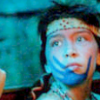
Now... a nifty trick that I learnt from many other tutorials - duplicate the layer and set the top layer to screen, and you've lightened your icon easily! I'm putting the layer's opacity to about 30 because I still want a bit of a dark icon.
.
It's a tad fuzzy, so I'm going to sharpen it (Image>Filters>Enhance>Sharpen) to about 40, then I'm going to get rid of John's hand that is peeking through the corner and annoying me so! I'm going to grab the Smudge tool and Select the bottom layer and just carefully work away at his hand. It helps me to enlarge the image (about 400%) so I can see exactly what I'm doing.

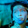
There! Now it just looks like a Shadow! Well, I've decided to play with gradients today... so get out your Gradient tool and then create a new layer over top of the screened one. I'm using the "Blue Green" gradient, and I've put it on, then set the layer to Soft Light and I rather like the full effect so I'm not going to lower the opacity.

.
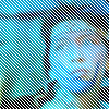
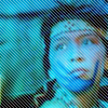
A New Layer and now... hmmmm... how about a pattern! Select the fill tool, and set it to pattern fill, I'm using one I've made myself, which can be downloaded () with a bunch of other basic patterns that I've made. Fill the new layer. I'm going to make them white... even though the pattern is in black, by colorizing it (Image>Layer>Colours>Colourize). Just pull the lighten one over to full and they'll turn white. Click Ok. Now change the opacity to bout 35 and I left it on normal. Now.. I don't really want thelines all over her face completely, so I'm gonna take out the old eraser tool, set the opacity on it to about 40, view the image at about 400% and start erasing the piece that I don't like. I took it off the lighter parts of her face and her hair. Make sure the eye's are clear.
.
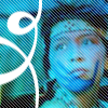
NEW LAYER! Hurrah! I'm gonna put a brush that I picked up off the net someplace and stupidly never took down the maker's name. This is it.

Now I'll put it on the new layer, and set that layer to Value.. which I'll put at 40% opacity so it won't mess with the text later.
.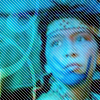
Now. New layer for a border. Pencil tool with this border I made-

Okey Dokey! Almost Done... I'm going to add my text now! Text tool will create a new layer when you write the text! I'm writing my text in Georgia ref, a font that is being used quite a bit for icons now, and in a light gray colour (#dddddd) at 8 px. My text is a definition from the dictionary, because I'm always at a loss of words for icons and I decided the other day that this would be an easy way to find words to use! here it is -
brave (brav)
1. possessing
or exhibiting
courage. 2.
to face
or meet
courageously.
I've moved my text over to the place I want it, and I'm going to change the text layer to overlay, then duplicate it and set the top layer at screen so I can read the text a bit better.

Now it's still kind of illegible, but I like it that way, so I'm done with my icon! I'm saving it as a .png so it won't mess around with the layers. You can also save a copy as .xcf so that you can alter it later if you like!
If this was too confusing in any way... or you would like clarifiying on a certain part Please tell me, as this is my first full icon tutorial. If you're looking for more tutorials - check out my website www.rubyraindrops.bravehost.com Thanks! -Ruby
What we're making today
Full Icon Tutorial - Assumes Basic Knowledge of Gimp
I'm starting with this base from a pic I found off the net - www.imdb.com/title/tt0316396/photogallery/ - if you want to start on your own. I cropped the image after I resized to about 500 by 340px. so I could get more of Princess TigerLily's head, then pasted it as a new layer.
Now... a nifty trick that I learnt from many other tutorials - duplicate the layer and set the top layer to screen, and you've lightened your icon easily! I'm putting the layer's opacity to about 30 because I still want a bit of a dark icon.
.
It's a tad fuzzy, so I'm going to sharpen it (Image>Filters>Enhance>Sharpen) to about 40, then I'm going to get rid of John's hand that is peeking through the corner and annoying me so! I'm going to grab the Smudge tool and Select the bottom layer and just carefully work away at his hand. It helps me to enlarge the image (about 400%) so I can see exactly what I'm doing.
There! Now it just looks like a Shadow! Well, I've decided to play with gradients today... so get out your Gradient tool and then create a new layer over top of the screened one. I'm using the "Blue Green" gradient, and I've put it on, then set the layer to Soft Light and I rather like the full effect so I'm not going to lower the opacity.
.
A New Layer and now... hmmmm... how about a pattern! Select the fill tool, and set it to pattern fill, I'm using one I've made myself, which can be downloaded () with a bunch of other basic patterns that I've made. Fill the new layer. I'm going to make them white... even though the pattern is in black, by colorizing it (Image>Layer>Colours>Colourize). Just pull the lighten one over to full and they'll turn white. Click Ok. Now change the opacity to bout 35 and I left it on normal. Now.. I don't really want thelines all over her face completely, so I'm gonna take out the old eraser tool, set the opacity on it to about 40, view the image at about 400% and start erasing the piece that I don't like. I took it off the lighter parts of her face and her hair. Make sure the eye's are clear.
.
NEW LAYER! Hurrah! I'm gonna put a brush that I picked up off the net someplace and stupidly never took down the maker's name. This is it.

Now I'll put it on the new layer, and set that layer to Value.. which I'll put at 40% opacity so it won't mess with the text later.
.
Now. New layer for a border. Pencil tool with this border I made-

Okey Dokey! Almost Done... I'm going to add my text now! Text tool will create a new layer when you write the text! I'm writing my text in Georgia ref, a font that is being used quite a bit for icons now, and in a light gray colour (#dddddd) at 8 px. My text is a definition from the dictionary, because I'm always at a loss of words for icons and I decided the other day that this would be an easy way to find words to use! here it is -
brave (brav)
1. possessing
or exhibiting
courage. 2.
to face
or meet
courageously.
I've moved my text over to the place I want it, and I'm going to change the text layer to overlay, then duplicate it and set the top layer at screen so I can read the text a bit better.
Now it's still kind of illegible, but I like it that way, so I'm done with my icon! I'm saving it as a .png so it won't mess around with the layers. You can also save a copy as .xcf so that you can alter it later if you like!
If this was too confusing in any way... or you would like clarifiying on a certain part Please tell me, as this is my first full icon tutorial. If you're looking for more tutorials - check out my website www.rubyraindrops.bravehost.com Thanks! -Ruby