Icon Tutorial Number Six.
My Sixth Tutorial.
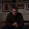
going from
to
or
.
using PSPx. c: completely translatable. comments are appreciated, and please let me know if you're snagging this icon. (please credit as well)
I'd love to see what you make as well. c:
Step One: So, to begin, snag your image, be it a cap, or a picture. Then crop it into a square. Don't resize it. D:, it just makes details hard. Then, go to Adjust>Color> Fade Correction
set at 45. Then Adjust> Smart Photo Fix put the settings to your preference. I usually make it so that it's not being sharpened at all, and increase the saturation, and drop the shadows just a tick.
You might want to do these steps on a duplicate layer of your image, just in case it doesn't turn out perfect. In which case you can drop the opacities to tone it down a bit.
I happened to like the way this base turned out.

Actually, I like it a lot. c:
Step Two: Now, make a new color layer and fill it with this
(#4ecaaa) and duplicate it once.
Set the first layer to overlay at 50% opacity, and the second to soft light at 100%.
Yes, I know. It's blue. D:
But I love that grungy effect you get.
.
Step Three: Now, this gets a little complicated. I wanted to restore the colors from earlier, maybe a little softer, but keep that grungy effect I got from using the previous step. It's a lot of work for such a little effect, but I like it. SO! I made another duplicate of the colour layer from step two and set it to Luminance. Now, I copy-merged the whole composition, and pasted it as a new layer. And deleted the third duplicate that I set to Luminance. There's no point to it now. I set this to Color (L). So, it looks like this.
. It's a little weird, so I drop the opacity to 80% giving me
. Guh. Not a huge difference from the image we got in step one, I know. D:
Step Four: Now I made a new Color balance Layer, settings as follows. [please tick preserve luminance]
Shadows : 4; 32; -19
Midtones : -10; -42; 0
Highlights : 0; 0; -15.
I set the Color balance to 70% opacity. This gives me
.
Step Five: So, I'm done with the colouring now. c: So, I resize it so I can add layers, and text. c:
First off, I add this layer
(sorry, I don't know who made it. If you do, please, let me know.) Set it to Lighten at 90%.
.
Step Six: All right, now I'm going to use the line tool (for details on how to use this, please see my other tutorial located http://community.livejournal.com/icon_tutorial/5263370.html )
So, I made a few dashes around the top of the icon with a white line set at 1.00. Then, I got the text tool out and wrote some random lyrics following the curve.
The final image looks like
.
Sorry this is rather rushed. I have a day off from school, and I'm just a little practice for icons, because I've been working too much to have the oppurtunity to work on all the caps I have stored up.
going from

to

or

.
using PSPx. c: completely translatable. comments are appreciated, and please let me know if you're snagging this icon. (please credit as well)
I'd love to see what you make as well. c:
Step One: So, to begin, snag your image, be it a cap, or a picture. Then crop it into a square. Don't resize it. D:, it just makes details hard. Then, go to Adjust>Color> Fade Correction
set at 45. Then Adjust> Smart Photo Fix put the settings to your preference. I usually make it so that it's not being sharpened at all, and increase the saturation, and drop the shadows just a tick.
You might want to do these steps on a duplicate layer of your image, just in case it doesn't turn out perfect. In which case you can drop the opacities to tone it down a bit.
I happened to like the way this base turned out.

Actually, I like it a lot. c:
Step Two: Now, make a new color layer and fill it with this

(#4ecaaa) and duplicate it once.
Set the first layer to overlay at 50% opacity, and the second to soft light at 100%.
Yes, I know. It's blue. D:
But I love that grungy effect you get.

.
Step Three: Now, this gets a little complicated. I wanted to restore the colors from earlier, maybe a little softer, but keep that grungy effect I got from using the previous step. It's a lot of work for such a little effect, but I like it. SO! I made another duplicate of the colour layer from step two and set it to Luminance. Now, I copy-merged the whole composition, and pasted it as a new layer. And deleted the third duplicate that I set to Luminance. There's no point to it now. I set this to Color (L). So, it looks like this.

. It's a little weird, so I drop the opacity to 80% giving me

. Guh. Not a huge difference from the image we got in step one, I know. D:
Step Four: Now I made a new Color balance Layer, settings as follows. [please tick preserve luminance]
Shadows : 4; 32; -19
Midtones : -10; -42; 0
Highlights : 0; 0; -15.
I set the Color balance to 70% opacity. This gives me

.
Step Five: So, I'm done with the colouring now. c: So, I resize it so I can add layers, and text. c:
First off, I add this layer

(sorry, I don't know who made it. If you do, please, let me know.) Set it to Lighten at 90%.

.
Step Six: All right, now I'm going to use the line tool (for details on how to use this, please see my other tutorial located http://community.livejournal.com/icon_tutorial/5263370.html )
So, I made a few dashes around the top of the icon with a white line set at 1.00. Then, I got the text tool out and wrote some random lyrics following the curve.
The final image looks like

.
Sorry this is rather rushed. I have a day off from school, and I'm just a little practice for icons, because I've been working too much to have the oppurtunity to work on all the caps I have stored up.