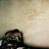
Icon Tutorial 3 - Dramatic Coloring!
From this to 
Translatable
Beginner/Intermediate
1. Crop your picture
2. Duplicate and set to screen. Sharpen this screened layer, and then desaturate it (ctrl-shift-u). Adjust the opacity.
3. Duplicate the base (not the sharpened screen layer!), drag above the screened layer, and set to soft light. This is what really makes it pop! Desaturate it.
4. Make a new layer, fill with 0A5B72, and set to Multiply. Adjust to a very low opacity.
5. Make a new hue/saturation layer and turn down the saturation as much as you like.
6. Make a new layer, fill with 0A5B72 again, and set to Exclusion. Adjust to a low opacity, then carefully erase the stuff that covers the background of the picture. We'll deal with that later.
7. Make a new layer, fill with CAE0E5, and set to Soft Light. Adjust the opacity and, once again, carefully erase the background.
8. Make a new layer, fill with 8A5A40, and set to Color Burn. Adjust the opacity to a low level and carefully erase over the foreground, aka the stuff that isn't the background.
9. Yet another layer. We're almost done, I promise! Fill with BFD8CF and set to Color Burn. Once again, erase over the foreground.
10. Make sure all the opacities are where you want them to be, and merge all the layers.
11. If you think your picture needs it, duplicate the merged layers, Sharpen once, and adjust the opacity so it's sharpened. Smooth any skin or over-sharpened areas with the blur tool set to 20%.
12. Add your text. My technique was to type in a tiny font (3 or 4 pt) with spaces between each character, and set the text layers to soft light, then duplicate them until they showed up.
13. If you have a ton of text layers, merge again.
14. Find a nice grungy texture (I used this texture by lucide_icons) and set to Overlay on about 40-50% opacity.
15. Merge your layers, do any last sharpening and smoothing, and you're done!