Supernatural Coloring; PS7
Using PS7, and Selective Coloring;
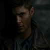
to
.
other examples:


Take cap/base, duplicate & SCREEN it.
This one, takes 3 layers of SCREEN; obviously, if too bright, don't put as much.
to
Selective Coloring;
REDS:-100, 22, 100, 0
YELLOWS:-37, 9, 26, 0
to
Color Balance
HIGHLIGHTS:-27, -10, 18
to
Selective Coloring;
REDS:-28, 0, 25, 0
YELLOWS:-15, 0, 16, 0
to
Selective Coloring;
REDS:-45, 0, 0, 0
NEUTRALS:15, -19, -21, 0
to
Now, it's time to add SHARPEN, and whatnots, like text. Up to you!
NOTE:if icon is too dull, try raising the REDS in the last made Selective Coloring layer to higher amounts, and
mess with the YELLOW & MAGENTA sections of it. If still dull, Drop down to the YELLOW and mess with the
amounts there. Also Playing with HUE/SATURATION, you can make it 'POP'! As done with the other preview
icons above.
Icons with this tutorial is used mostly in this
post.
If this tutorial works out for you, I'd love to see what you made!!
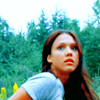
to
.
other examples:
Take cap/base, duplicate & SCREEN it.
This one, takes 3 layers of SCREEN; obviously, if too bright, don't put as much.
to
Selective Coloring;
REDS:-100, 22, 100, 0
YELLOWS:-37, 9, 26, 0
to
Color Balance
HIGHLIGHTS:-27, -10, 18
to
Selective Coloring;
REDS:-28, 0, 25, 0
YELLOWS:-15, 0, 16, 0
to
Selective Coloring;
REDS:-45, 0, 0, 0
NEUTRALS:15, -19, -21, 0
to
Now, it's time to add SHARPEN, and whatnots, like text. Up to you!
NOTE:if icon is too dull, try raising the REDS in the last made Selective Coloring layer to higher amounts, and
mess with the YELLOW & MAGENTA sections of it. If still dull, Drop down to the YELLOW and mess with the
amounts there. Also Playing with HUE/SATURATION, you can make it 'POP'! As done with the other preview
icons above.
Icons with this tutorial is used mostly in this
post.
If this tutorial works out for you, I'd love to see what you made!!