Tutorial # 8 & 9.
Icon Tutorial # 8/# 9.
Using PSPxi, completely translatable.
Making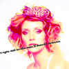
and
.
Part One.
.1// Snag your base. This is mine, taken from google image
.
.2// Now, crop away. I got this as my crop (from here on out, the images have been shruken for your convienience, waiting to resize until you're completely finished the icon is always a good idea, in case you have to do some erasing or something.)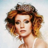
.
So, to prepare the base I use a tool that is specific to PSP, but within the step I'll tell you how to get the same results in photoshop. Firstly, go to Adjust>Colour>Fade Correction and use a setting of 45, which is the PSP default, I believe. Now, go Adjust>Smart Photo Fix. So, I usually brighten up the shadows, up the saturation, make the highlights a little darker, and do not sharpen the image.
Now, for photoshop, you must up the saturation in Hue/Saturation/Lightness tool, then go to Brightness/Contrast and find Highlight/Midtone/Shadow. c:
Anyway, the image now looks like
. :D Cute already, no?
.3// I did use 2 curves layers, but they're not neccesary. The main idea for those layers are to brighten up the image, add a little red, and play around with the blues/yellows. But again, these aren't that important to the effect.
.4// Now, we're going to use fill layers. We'll need to use three different colours.
Colour 1:

Duplicate this layer three times.
Set the first to saturation at 50% or lower.
The second at screen at 75% or lower
.
The third at exclusion at 5%
.
Colour 2:

Duplicate twice.
First at Lighten 10% Second at Soft Light at 21%
Colour 3:

At Burn 100%
.
.5// Now, make a colour balance layer, settings at
Shadows : 18;0;-38 (meaning, towards red, and towards yellow)
Midtones : 0;14;0 (meaning towards green.)
Highlights : 17;0;27 (Meaning towards red and blue)
and of course tick preserve luuminance.
Now, make two fill layers, and fill them with white.
Set the first to Soft light at 40% or lower.
And the second just makes me happy, set to multiply. c:
Then, pop some tiny text in there. c:
Fiddling with curves also makes the icon a lot better.
Part Two.
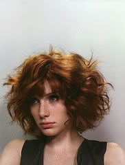
This is my base. Follow steps One, Two, And Three from the above icon on this one as well. (This is how I prep all of my icons. Srsly. c:)
.1/// Throw a Colour Balance layer on there.
Shadows : -29;0;0 Titched toward cyan.
Midtones : 0;0;40 titched toward blue
Highlights : 25;0;0 titched toward red.

I lowered the opacity on the colour balance layer. c:
.2// Now, do all of step 4 from the previous icon on this one. (I use the same steps in almost all of my icons, really. I'm so incredibly lazy, and also sick, I ate gray chicken today from mcdonalds, and then I had to go to work. It was horrible. I almost vomited on people.D: ew. gray chicken.) Exclude the lighten layer that is purple.

it should look something like this now. c: Please, play with the opacities. I used all opacities >30 for this one. It's really important in these icons that you do play with them.
.3// all that colouring you worked for?
We're getting rid of it.
Use these two colour layers.

at Colour (L) at 30%

at Exclusion at 45%
Now, create a new colour balance layer, and titch all levels to yellow.
Not all the way, to about 15 or so. (or is it -15? o_O!)

c:
.4// The end. c:
Create a new fill layer with a nice mustard.
ACTUALLY, vary it up, use which ever colours you like. Blue would be sper nice.

This is what I used. Set to Colour (L) at about 50%
Now, Duplicate that lovely mustard and set it to Multiply at about 90%, and erase the portion of the layer that covers her face, or any other part you want to make a different colour.
Not finished yet.
Create a new floodfill layer and fill it with a lighter version of the colour you used for multiply/colour layers a minute ago.
Set this to multiply. c:
Now, throw on a scratchy texture, and erase the area covering your subject. Or not, it's up to you.
(by the way, it looks uber cute in pink. c:
)
You can use the icons above so long as you comment and credit thanks. c:
And I LOVE to see people's results, and hear your variations.
Tell me if you have any issues, or if I've messed anything up. Thanks. c: Comments are love. c:
Using PSPxi, completely translatable.
Making

and

.
Part One.
.1// Snag your base. This is mine, taken from google image

.
.2// Now, crop away. I got this as my crop (from here on out, the images have been shruken for your convienience, waiting to resize until you're completely finished the icon is always a good idea, in case you have to do some erasing or something.)

.
So, to prepare the base I use a tool that is specific to PSP, but within the step I'll tell you how to get the same results in photoshop. Firstly, go to Adjust>Colour>Fade Correction and use a setting of 45, which is the PSP default, I believe. Now, go Adjust>Smart Photo Fix. So, I usually brighten up the shadows, up the saturation, make the highlights a little darker, and do not sharpen the image.
Now, for photoshop, you must up the saturation in Hue/Saturation/Lightness tool, then go to Brightness/Contrast and find Highlight/Midtone/Shadow. c:
Anyway, the image now looks like

. :D Cute already, no?
.3// I did use 2 curves layers, but they're not neccesary. The main idea for those layers are to brighten up the image, add a little red, and play around with the blues/yellows. But again, these aren't that important to the effect.
.4// Now, we're going to use fill layers. We'll need to use three different colours.
Colour 1:

Duplicate this layer three times.
Set the first to saturation at 50% or lower.

The second at screen at 75% or lower

.
The third at exclusion at 5%

.
Colour 2:

Duplicate twice.
First at Lighten 10% Second at Soft Light at 21%

Colour 3:

At Burn 100%

.
.5// Now, make a colour balance layer, settings at
Shadows : 18;0;-38 (meaning, towards red, and towards yellow)
Midtones : 0;14;0 (meaning towards green.)
Highlights : 17;0;27 (Meaning towards red and blue)
and of course tick preserve luuminance.
Now, make two fill layers, and fill them with white.
Set the first to Soft light at 40% or lower.
And the second just makes me happy, set to multiply. c:
Then, pop some tiny text in there. c:
Fiddling with curves also makes the icon a lot better.
Part Two.

This is my base. Follow steps One, Two, And Three from the above icon on this one as well. (This is how I prep all of my icons. Srsly. c:)
.1/// Throw a Colour Balance layer on there.
Shadows : -29;0;0 Titched toward cyan.
Midtones : 0;0;40 titched toward blue
Highlights : 25;0;0 titched toward red.

I lowered the opacity on the colour balance layer. c:
.2// Now, do all of step 4 from the previous icon on this one. (I use the same steps in almost all of my icons, really. I'm so incredibly lazy, and also sick, I ate gray chicken today from mcdonalds, and then I had to go to work. It was horrible. I almost vomited on people.D: ew. gray chicken.) Exclude the lighten layer that is purple.

it should look something like this now. c: Please, play with the opacities. I used all opacities >30 for this one. It's really important in these icons that you do play with them.
.3// all that colouring you worked for?
We're getting rid of it.
Use these two colour layers.

at Colour (L) at 30%


at Exclusion at 45%

Now, create a new colour balance layer, and titch all levels to yellow.
Not all the way, to about 15 or so. (or is it -15? o_O!)

c:
.4// The end. c:
Create a new fill layer with a nice mustard.
ACTUALLY, vary it up, use which ever colours you like. Blue would be sper nice.

This is what I used. Set to Colour (L) at about 50%

Now, Duplicate that lovely mustard and set it to Multiply at about 90%, and erase the portion of the layer that covers her face, or any other part you want to make a different colour.

Not finished yet.
Create a new floodfill layer and fill it with a lighter version of the colour you used for multiply/colour layers a minute ago.

Set this to multiply. c:

Now, throw on a scratchy texture, and erase the area covering your subject. Or not, it's up to you.
(by the way, it looks uber cute in pink. c:

)
You can use the icons above so long as you comment and credit thanks. c:
And I LOVE to see people's results, and hear your variations.
Tell me if you have any issues, or if I've messed anything up. Thanks. c: Comments are love. c: