GARBLED TENTH TUTORIAL
Icon Tutorial #10. (Feat. Bryce Dallas Howard.)
Made in Paint Shop Pro XI. Almost completely translatable.
Uses Curves and Colour Balance.
Going from
to
.
Aww, today I am sick, and not in school. I'm watching Titanic on cable and am bored out of my mind. So, Tutorial.
Step One> Take Your Base. Mine is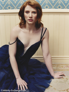
. Crop away. A crop with a lot of background is preferable. kthnx.
Step Two> Duplicate your cropped base and go to Color>Fade Correction, and use a setting between 30 and 45 depending on your image.
God she has nice shoulders.
Next go to Adjust>Smart Photo Fix. These settings will rely completely on your image, though I usually do use almost the same settings for every image. Basically, you'll want to brighten the image up a bit, then brighten the shadows quite a bit, and make the highlights a bit lighter. Also, increase the saturation, and do not sharpen the image at all.
. I'm sure you can see why this is my favorite step in PSP. For early versions of PSP, that may not have this step (I'm not sure any version of it doesn't. But what the hell.) Go to Brightness Contrast Highlight/Midtone/Shadows.
Photoshop does not have either of these steps, or at least not that I'm aware of. All I can suggest is to brighten the image and increase the saturation. : c
Step Three> Create a new Curves layer.
RGB - 101>162
RED - 120>143
BLUE - 1) 74>91 2)142>115
These settings aren't going to give you the same results on every image. So, essentially what these points are doing is :
RGB - A point towards the Upper Left hand corner making the image lighter. Depending on the image I will often also create a second point toward the lower right hand corner making the shadows darker.
RED - A point towards the Upper Left Hand corner making the image a bit redder.
BLUE, One point down into the yellow feild, and one point up into the blue feild.
Giving you.
Step Four> Create a new Color Balance Layer
Shadows = -18;0;-31
Midtones = 45;0;-24
Highlights = 8;0;27
In reality I almost never use the same settings on any image for Colour balance. It depends entirely on the image. So I would suggest just messiing around with it until you get colours you like a lot. .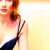
Step Five> Create two new Raster layers, filling the first with a Dark blue, and set it to exclusion at 50%, the second with a pale beige set to Color (L) at 15%.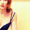
.I know it's redundant as hell, but create a new Hue/Sat/Light layer and increase saturation by about 20.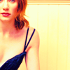
. See, it's not totally pointless, the colours are still a bit paler. Just not too much. Lolz.
Step Six> Create FIVE new raster layers. Use a supersaturated red tone on three of them. Set the first to Luminance And copy merge the image, and paste it on as a new layer. Now delete the red raster layer set to luminance, and duplicate the copymerge layer three times. Drag one of the red raster layers below these three copymerge duplicates, and set it to Saturation(L) at 60%. Set the CopyMerge layers to Multiply 15%; Screen 30%;and Soft Light 20%. Then take the last red raster layer and set it to screen 15%.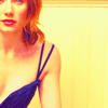
You should still have two raster layers left. Fill them with a light blue. Set the first to Soft Light 100%, and the second to Burn 100%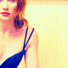
.
Step Seven> This step is pretty confusing. You'll want to make a new Channel Mixer layer, and make sure it's monochrome. Push back the CONSTANT slider until you get something like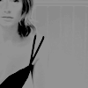
. Set this to lighten. You should get something to this effect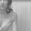
. Scary. D: COPYMERGE. COPYMERGE. PASTE AS NEW LAYER PASTE AS NEW LAYER. D:, I'm such a loser at this. Anyways. Set this to multiply at about 55%. Fiddle with all the settings on this layer, because achieving a really good effect looks good. Anyways, this should look like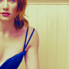
.
Now, I thought it would be nice to revive the colour in her lips, and eyes. So, I create a new raster and used a super saturated red and painted her lips. I duplicated it and set the first to Hue (L) and the second to Softlight.
Same thing for eyes, only blue, and on the eyes.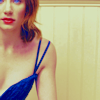
Step Eight> Duplicate the duplicate of your base that you fadecorrected. Drag this to the top. Make a second duplicate. Set the first to screen 60%, and the second to soft light 20%.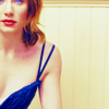
. Now grab a texture like this one by teh_indy (I THINK. I'M SORRY I'M NOT SURE. DDDDD:)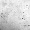
. Make three duplicates on the image, and erase the area covering the subject, but leave all other areas filled with it. Set the first duplicate to DARKEN 40%, the second to Lighten 30%, the third to Mulitply 25%. Grab a scratch texture and set it to screen, then erase all area covering subject. Giving you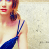
Right now it looks really really blah to me. Soo I took a round brush and painted a circle in bright pink around the subject's shoulder, gaussianed it, and set it to screen. Then I copy merged the image, and made the round pink screen layer invisible. I took the copy merge and pasted it as a new selection setting it further into the image. I duplicated this twice and desaturated the second, and blurred it. The first one I set to normal at 40% and erased all area covering the subject. Giving me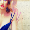
Then, I took the second(blurred and desat'd) and set it to burn. I've kind of forgotten about steps right about now, sorry. D: I'm too sick for this. Anyway, I made the round pink screen layer thing visible again, and threw in some text. Sorry if this is super garbled and horrible. D: Comments are my life, my love, and my lady. If you want to use this icon please comment and credit. <3
Made in Paint Shop Pro XI. Almost completely translatable.
Uses Curves and Colour Balance.
Going from

to

.
Aww, today I am sick, and not in school. I'm watching Titanic on cable and am bored out of my mind. So, Tutorial.
Step One> Take Your Base. Mine is

. Crop away. A crop with a lot of background is preferable. kthnx.
Step Two> Duplicate your cropped base and go to Color>Fade Correction, and use a setting between 30 and 45 depending on your image.

God she has nice shoulders.
Next go to Adjust>Smart Photo Fix. These settings will rely completely on your image, though I usually do use almost the same settings for every image. Basically, you'll want to brighten the image up a bit, then brighten the shadows quite a bit, and make the highlights a bit lighter. Also, increase the saturation, and do not sharpen the image at all.

. I'm sure you can see why this is my favorite step in PSP. For early versions of PSP, that may not have this step (I'm not sure any version of it doesn't. But what the hell.) Go to Brightness Contrast Highlight/Midtone/Shadows.
Photoshop does not have either of these steps, or at least not that I'm aware of. All I can suggest is to brighten the image and increase the saturation. : c
Step Three> Create a new Curves layer.
RGB - 101>162
RED - 120>143
BLUE - 1) 74>91 2)142>115
These settings aren't going to give you the same results on every image. So, essentially what these points are doing is :
RGB - A point towards the Upper Left hand corner making the image lighter. Depending on the image I will often also create a second point toward the lower right hand corner making the shadows darker.
RED - A point towards the Upper Left Hand corner making the image a bit redder.
BLUE, One point down into the yellow feild, and one point up into the blue feild.
Giving you.

Step Four> Create a new Color Balance Layer
Shadows = -18;0;-31
Midtones = 45;0;-24
Highlights = 8;0;27
In reality I almost never use the same settings on any image for Colour balance. It depends entirely on the image. So I would suggest just messiing around with it until you get colours you like a lot. .

Step Five> Create two new Raster layers, filling the first with a Dark blue, and set it to exclusion at 50%, the second with a pale beige set to Color (L) at 15%.

.I know it's redundant as hell, but create a new Hue/Sat/Light layer and increase saturation by about 20.

. See, it's not totally pointless, the colours are still a bit paler. Just not too much. Lolz.
Step Six> Create FIVE new raster layers. Use a supersaturated red tone on three of them. Set the first to Luminance And copy merge the image, and paste it on as a new layer. Now delete the red raster layer set to luminance, and duplicate the copymerge layer three times. Drag one of the red raster layers below these three copymerge duplicates, and set it to Saturation(L) at 60%. Set the CopyMerge layers to Multiply 15%; Screen 30%;and Soft Light 20%. Then take the last red raster layer and set it to screen 15%.

You should still have two raster layers left. Fill them with a light blue. Set the first to Soft Light 100%, and the second to Burn 100%

.
Step Seven> This step is pretty confusing. You'll want to make a new Channel Mixer layer, and make sure it's monochrome. Push back the CONSTANT slider until you get something like

. Set this to lighten. You should get something to this effect

. Scary. D: COPYMERGE. COPYMERGE. PASTE AS NEW LAYER PASTE AS NEW LAYER. D:, I'm such a loser at this. Anyways. Set this to multiply at about 55%. Fiddle with all the settings on this layer, because achieving a really good effect looks good. Anyways, this should look like

.
Now, I thought it would be nice to revive the colour in her lips, and eyes. So, I create a new raster and used a super saturated red and painted her lips. I duplicated it and set the first to Hue (L) and the second to Softlight.
Same thing for eyes, only blue, and on the eyes.

Step Eight> Duplicate the duplicate of your base that you fadecorrected. Drag this to the top. Make a second duplicate. Set the first to screen 60%, and the second to soft light 20%.

. Now grab a texture like this one by teh_indy (I THINK. I'M SORRY I'M NOT SURE. DDDDD:)

. Make three duplicates on the image, and erase the area covering the subject, but leave all other areas filled with it. Set the first duplicate to DARKEN 40%, the second to Lighten 30%, the third to Mulitply 25%. Grab a scratch texture and set it to screen, then erase all area covering subject. Giving you

Right now it looks really really blah to me. Soo I took a round brush and painted a circle in bright pink around the subject's shoulder, gaussianed it, and set it to screen. Then I copy merged the image, and made the round pink screen layer invisible. I took the copy merge and pasted it as a new selection setting it further into the image. I duplicated this twice and desaturated the second, and blurred it. The first one I set to normal at 40% and erased all area covering the subject. Giving me

Then, I took the second(blurred and desat'd) and set it to burn. I've kind of forgotten about steps right about now, sorry. D: I'm too sick for this. Anyway, I made the round pink screen layer thing visible again, and threw in some text. Sorry if this is super garbled and horrible. D: Comments are my life, my love, and my lady. If you want to use this icon please comment and credit. <3