Tutorial #3
I'm back again -- I just had a great success with an icon I was doing for a friend, so it's tutorial time :3
Turn this:
into this: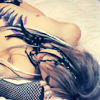
In PSCS. Not translatable [involves Selective Coloring].
For very dark images [if done properly, can be used for lighter images as well].
This is a little image-heavy.
Alright :D
1. Start off with your base image, cut/crop, but do not sharpen or screen or anything -- just get it to 100x100.

2. Now, make a new Curves layer [Layer>New Adjustment Layer>Curves] or click the little half-white/half-black circle on your Layers palette and use these settings:
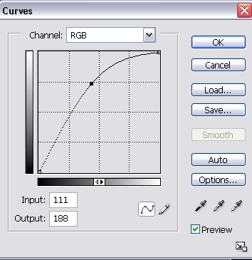
[Click a spot and then enter the numbers, or drag it to this position -- just make sure the line gradually curves like the picture].
3. Make a new Brightness/Contrast layer [Layer>New Adjustment Layer>Brightness/Contrast] or the circle button and input the settings:
Brightness: +7
Contrast: +12
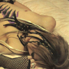
4. Now create a new Color Balance layer [the same way you've been creating the previous layers] and input these settings:
Shadows: -10 0 +9
Midtones: 0 0 +6
Highlights: -17 0 +34
[This step is mainly used because the base is very yellow-ish. If your base isn't so yellow, either fiddle with these numbers or skip this step].
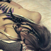
5. Merge all visible layers. [Cntrl + Shift + E].
6. Now that my icon is lightened and colored to a decent base now, it's time to add color. Make a new Hue/Saturation layer with the following settings:
0
+20
0

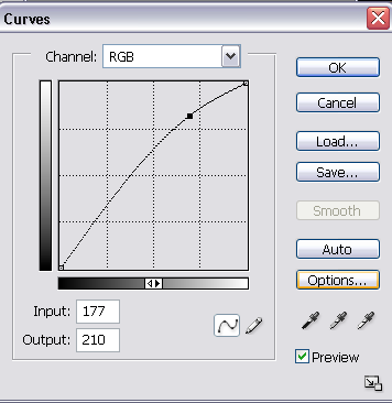
7. Now make a new Curves layer like so:
8. Next, make another Hue/Saturation layer with the following settings:
0
+19
0
9. And for the final touches, a Selective Coloring layer [and remember, these can be edited to fit your icon]:
Reds:
-100
10
60
Yellows:
-50
0
-45
Neutrals:
+3
-9
-24
-3
Blacks:
0
0
0
+15
And your finished result:

Thank you and I hope this helps :)
Feel free to show me your results if you use it :)
starfruit_icons
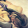
Turn this:

into this:

In PSCS. Not translatable [involves Selective Coloring].
For very dark images [if done properly, can be used for lighter images as well].
This is a little image-heavy.
Alright :D
1. Start off with your base image, cut/crop, but do not sharpen or screen or anything -- just get it to 100x100.

2. Now, make a new Curves layer [Layer>New Adjustment Layer>Curves] or click the little half-white/half-black circle on your Layers palette and use these settings:

[Click a spot and then enter the numbers, or drag it to this position -- just make sure the line gradually curves like the picture].
3. Make a new Brightness/Contrast layer [Layer>New Adjustment Layer>Brightness/Contrast] or the circle button and input the settings:
Brightness: +7
Contrast: +12

4. Now create a new Color Balance layer [the same way you've been creating the previous layers] and input these settings:
Shadows: -10 0 +9
Midtones: 0 0 +6
Highlights: -17 0 +34
[This step is mainly used because the base is very yellow-ish. If your base isn't so yellow, either fiddle with these numbers or skip this step].

5. Merge all visible layers. [Cntrl + Shift + E].
6. Now that my icon is lightened and colored to a decent base now, it's time to add color. Make a new Hue/Saturation layer with the following settings:
0
+20
0

7. Now make a new Curves layer like so:

8. Next, make another Hue/Saturation layer with the following settings:
0
+19
0

9. And for the final touches, a Selective Coloring layer [and remember, these can be edited to fit your icon]:
Reds:
-100
10
60
Yellows:
-50
0
-45
Neutrals:
+3
-9
-24
-3
Blacks:
0
0
0
+15
And your finished result:

Thank you and I hope this helps :)
Feel free to show me your results if you use it :)
starfruit_icons