(no subject)
Posted this on
iconick but its linked to my graphics forum so wasnt sure if it was allowed to link to there, so im posting the full tutorial here.
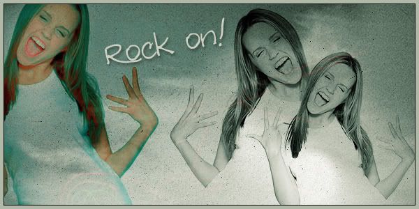
Making a banner/blend similar to this:
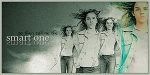
Amanda Bynes Banner/Blend Tutorial based on my Emma Watson Blend

Patterns:
I TRULY have no clue where I got them, though i found 2 of them from Scarlett's Tutorial on 300dpi.
Text: Redstar
Open a New canvas, 600x300. White background.
Find your photos. A good source is [URL=http://sweetandtalented.com]Sweet & Talented[/URL]
When choosing your photo, photoshoots with a WHITE BACKGROUND work best. This lessens the blending and actual 'hard work'.
I used a photo of Amanda Bynes. Depending on the original size of the photo, you may have to resize a little. I resized just a smidge and positioned it on my canvas.

I then set my image to DARKEN.
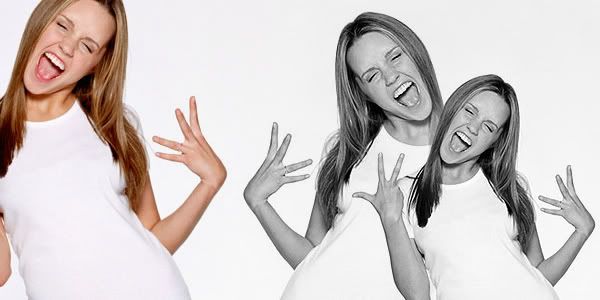
Next, duplicate your image and make it a little smaller and place it to the right of your first image. (I also flipped my image). Yes it overlaps and looks odd. Make your first image layer active and choose your eraser tool. Lower the eraser opacity to about 60% and start erasing on the MAIN image but UNDER the face/features of the TOP image. Yes it sounds confusing, but trust me, it works.
This is how it should look:

Duplicate the TOP image layer again. Shrink it a little and move it to the LEFT of your MAIN image.
I am only using 2 smaller photos this time, BUT, if you want THREE pictures, Go BACK to your MAIN image (bottom layer) and grab the eraser. Once again, erase on the MAIN IMAGE under your TOP layer.
Once you have your images positioned the way you like them, Paste the ORIGINAL UNSIZED photo on your canvas. Set to DARKEN and move to the side of your canvas. Its okay if shes cut in half, only on part of the canvas, etc. That adds character.
Now that your have your pictures positioned, time to color them.
Click on your BASE IMAGE.
If you have CS3, goto Image>Adjustments>Black & White>Normal. If you DONT have CS3 desaturate your image: Image>Adjustments>Desaturate.
Now, to sharpen the image. Edit>Sharpen.
Now to make it stand out a little.
Image>Adjustments>Brightness/contrast.
Set Brightness to 41. Contrast to 16.
Repeat the above step for the 2nd image.
Now you should have 2/3 black and white images and one color image.
Time for more confusion :)
Move the COLORED IMAGE to the BOTTOM *right above your background*
Add a new Selective Color Layer.
Settings as followed:
Reds: -100 0 0 0
Cyans: 100 0 0 0
Blues: 100 0 0 0
Neutrals: 58 0 -31 -31
Add a new Selective Color Layer.
Settings as followed:
Reds: -100 0 0 0
Cyans: 100 0 0 0
BlueS: 100 0 0 0
Neutrals: 46 0 34 -32
Add a new Selective Color Layer.
Settings as followed:
Reds: -100 0 0 0
WhiteS: 100 0 52 0
Neutrals : 61 0 -6 14
This is how it should look:
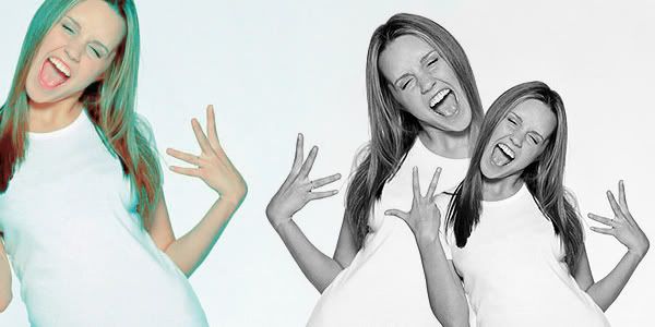
Now, activate your TOP LAYER.
Add this pattern/grain

Set to darken.
Add this pattern and set to MULTIPLY
Rasterize it. (Right click layer palette>Rasterize) Now Sharpen it.
Add this Pattern. Set to LIGHTEN.

Next, add this pattern and set to SOFTLIGHT.
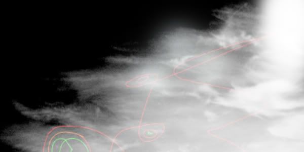
Maybe you notice some of the patterns is over the larger photo. Take your eraser still set around 60% and erase the pattern over the larger image to the side.
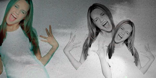
Add a new selective color layer. Make sure this is on TOP OF THE OTHER LAYERS.
Settings as followed:
Reds: -100 0 0 0
Cyans: 100 0 0 0
Blues: 100 0 0 0
Whites: 0 0 36 0
Neutrals: 17 0 12 0
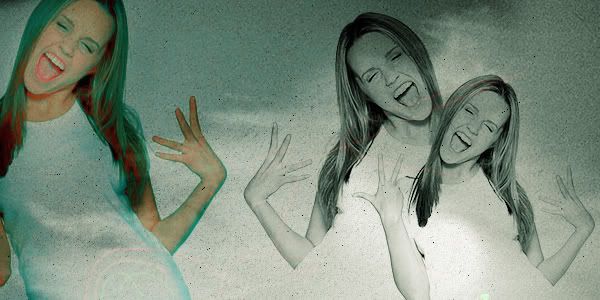
Lastly, add your text and you're finished! Top it off with a border and viola :)

iconick but its linked to my graphics forum so wasnt sure if it was allowed to link to there, so im posting the full tutorial here.
Making a banner/blend similar to this:

Amanda Bynes Banner/Blend Tutorial based on my Emma Watson Blend

Patterns:
I TRULY have no clue where I got them, though i found 2 of them from Scarlett's Tutorial on 300dpi.
Text: Redstar
Open a New canvas, 600x300. White background.
Find your photos. A good source is [URL=http://sweetandtalented.com]Sweet & Talented[/URL]
When choosing your photo, photoshoots with a WHITE BACKGROUND work best. This lessens the blending and actual 'hard work'.
I used a photo of Amanda Bynes. Depending on the original size of the photo, you may have to resize a little. I resized just a smidge and positioned it on my canvas.

I then set my image to DARKEN.
Next, duplicate your image and make it a little smaller and place it to the right of your first image. (I also flipped my image). Yes it overlaps and looks odd. Make your first image layer active and choose your eraser tool. Lower the eraser opacity to about 60% and start erasing on the MAIN image but UNDER the face/features of the TOP image. Yes it sounds confusing, but trust me, it works.
This is how it should look:

Duplicate the TOP image layer again. Shrink it a little and move it to the LEFT of your MAIN image.
I am only using 2 smaller photos this time, BUT, if you want THREE pictures, Go BACK to your MAIN image (bottom layer) and grab the eraser. Once again, erase on the MAIN IMAGE under your TOP layer.
Once you have your images positioned the way you like them, Paste the ORIGINAL UNSIZED photo on your canvas. Set to DARKEN and move to the side of your canvas. Its okay if shes cut in half, only on part of the canvas, etc. That adds character.
Now that your have your pictures positioned, time to color them.
Click on your BASE IMAGE.
If you have CS3, goto Image>Adjustments>Black & White>Normal. If you DONT have CS3 desaturate your image: Image>Adjustments>Desaturate.
Now, to sharpen the image. Edit>Sharpen.
Now to make it stand out a little.
Image>Adjustments>Brightness/contrast.
Set Brightness to 41. Contrast to 16.
Repeat the above step for the 2nd image.
Now you should have 2/3 black and white images and one color image.

Time for more confusion :)
Move the COLORED IMAGE to the BOTTOM *right above your background*
Add a new Selective Color Layer.
Settings as followed:
Reds: -100 0 0 0
Cyans: 100 0 0 0
Blues: 100 0 0 0
Neutrals: 58 0 -31 -31
Add a new Selective Color Layer.
Settings as followed:
Reds: -100 0 0 0
Cyans: 100 0 0 0
BlueS: 100 0 0 0
Neutrals: 46 0 34 -32
Add a new Selective Color Layer.
Settings as followed:
Reds: -100 0 0 0
WhiteS: 100 0 52 0
Neutrals : 61 0 -6 14
This is how it should look:

Now, activate your TOP LAYER.
Add this pattern/grain

Set to darken.
Add this pattern and set to MULTIPLY

Rasterize it. (Right click layer palette>Rasterize) Now Sharpen it.
Add this Pattern. Set to LIGHTEN.

Next, add this pattern and set to SOFTLIGHT.

Maybe you notice some of the patterns is over the larger photo. Take your eraser still set around 60% and erase the pattern over the larger image to the side.

Add a new selective color layer. Make sure this is on TOP OF THE OTHER LAYERS.
Settings as followed:
Reds: -100 0 0 0
Cyans: 100 0 0 0
Blues: 100 0 0 0
Whites: 0 0 36 0
Neutrals: 17 0 12 0

Lastly, add your text and you're finished! Top it off with a border and viola :)
