(no subject)
Program: PSP 7
Uses: Color Balance, Saturation layers
Very Beginner Friendly - But it can be used by everyone.
From this:

To this:

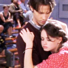
Well, we start with this base:

Since the quality is good and the lightning decent, we will duplicate the base and set it to Screen, but the opacity only at 6.
NOTE: This coloring doesn't necessarily need Screen layers unless it is a non HQ quality caps (or just greyish pictures/caps) like this:

In this case, duplicate your base twice. Set one layer to screen at 100 to make it bright. The second layer is set to Soft Light at 100 to take away the washiness. :)
It should look like this:

Generally, if the base is of good quality and nice lighting, keep the opacity lower than 15.
Now we'll add the Color Balance layer:
Color Balance is located here:

SHADOWS: -15, 8, 27
MIDTONES: 31, 20, 20
HIGHLIGHTS: 7, -5, -40
Next we'll add the three color layers:

#FEB12A - Set it to Multiply, opacity 58. NOTE: This layer can overtake or wash out a lot of icons depending on the original colors. So if 58 is too strong and, try 38, or keep playing with it until it looks right.

#577AFB - Set it to Soft Light at 71.

#AFF5E7 - Set it to Burn at 100.
Next, add a Hue/Saturation/Lightness layer. This is located here:

Saturation at 15, leave all the others at 0.
For the finish, another Color Balance layer. Only this time it will be:
Midtones -> Cyan -100. Set it at Luminance, 100 opacity.
You can go to Auto-enhance saturation (AES) and crank up the color another bit. AES is here:

For the AES:
Bias: More Colorful Strength: Strong
You can always skip this. :)
Finished result (without AES):

Finished result (with AES):

Other examples using same coloring:


Hope you liked it. :)