Making greens greener!
Hey all!
Today we'll be going from this to
and focus on making the greens pop. Okay, fine. This one focuses on the red and blues too--but not as much as the greens! :D
Sorry for being so nerotic and weird. I haven't had a House episode in two weeks and I'm going through withdrawl symptoms. XD I think I need rehab. X_X! .
STEP 1: Choose your base and crop your picture (dur) and sharpen if you want. I read somewhere that sharpening your base makes your final product grainy or overly sharpened or something. I haven't been able to see the difference so far. So, bottom line: it's up to you. XD
STEP 2: Copy your base 4 times: set the bottom 3 to screen, then the 3rd to 82% opacity; set the fourth layer to softlight 45%. Remember guys, this is going to vary depending on your original picture so make sure to change it up if things look strange.
STEP 3: Go to Layer > New Adjustment Layer > Selective colour.
Reds: -64 | -3 | +6 | 0
Yellow: 0 | 0 | -39 | 0
Green: +100 | -100 | +100 | +24
Neutral: +8 | -3 | -18 | 0
STEP 4: Make another Selective colour layer
Greens: -100 | -27 | +63 | +64
Cyan: +100 | -100 | +100 | +100
STEP 5: Copy your base, drag to top and set the blend mode to softlight 41%
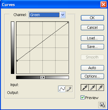
STEP 6: Go to Layer > New Adjustment Layer > Curves and punch in these settings. It's going to come out looking freaky but we're going to change the blend mode to softlight 83%


STEP 7: Go to Layer > New Adjustment Layer > colour balance
Midtones: -100 | +59 | +100
Set this layer to softlight 49%
STEP 8: Go to Layer > New Adjustment Layer > colour balance (again.)
Midtones: +8 | +12 | -32
STEP 9: Go to Layer > New Adjustment Layer > Hue/Saturation
Master: 0 | +5 | 0
Reds: 0 | +8 | 0
Yellow: 0 | -33 | 0
Greens: 0 | +5 |0
Cyan: 0 | +7 | 0
STEP 10: Merge all the layers (Ctrl+Shift+E)
And there you have it! If it comes out a bit too dark, you can fiddle with the RGB on the curves or add a screen layer.
If you have any questions, please leave a comment and I'll try my best to answer them! :)
Today we'll be going from this to

and focus on making the greens pop. Okay, fine. This one focuses on the red and blues too--but not as much as the greens! :D
Sorry for being so nerotic and weird. I haven't had a House episode in two weeks and I'm going through withdrawl symptoms. XD I think I need rehab. X_X! .
STEP 1: Choose your base and crop your picture (dur) and sharpen if you want. I read somewhere that sharpening your base makes your final product grainy or overly sharpened or something. I haven't been able to see the difference so far. So, bottom line: it's up to you. XD
STEP 2: Copy your base 4 times: set the bottom 3 to screen, then the 3rd to 82% opacity; set the fourth layer to softlight 45%. Remember guys, this is going to vary depending on your original picture so make sure to change it up if things look strange.
STEP 3: Go to Layer > New Adjustment Layer > Selective colour.
Reds: -64 | -3 | +6 | 0
Yellow: 0 | 0 | -39 | 0
Green: +100 | -100 | +100 | +24
Neutral: +8 | -3 | -18 | 0
STEP 4: Make another Selective colour layer
Greens: -100 | -27 | +63 | +64
Cyan: +100 | -100 | +100 | +100
STEP 5: Copy your base, drag to top and set the blend mode to softlight 41%
STEP 6: Go to Layer > New Adjustment Layer > Curves and punch in these settings. It's going to come out looking freaky but we're going to change the blend mode to softlight 83%


STEP 7: Go to Layer > New Adjustment Layer > colour balance
Midtones: -100 | +59 | +100
Set this layer to softlight 49%
STEP 8: Go to Layer > New Adjustment Layer > colour balance (again.)
Midtones: +8 | +12 | -32
STEP 9: Go to Layer > New Adjustment Layer > Hue/Saturation
Master: 0 | +5 | 0
Reds: 0 | +8 | 0
Yellow: 0 | -33 | 0
Greens: 0 | +5 |0
Cyan: 0 | +7 | 0
STEP 10: Merge all the layers (Ctrl+Shift+E)
And there you have it! If it comes out a bit too dark, you can fiddle with the RGB on the curves or add a screen layer.
If you have any questions, please leave a comment and I'll try my best to answer them! :)