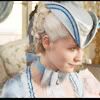
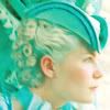
Icon Tutorial (Marie Antoinette)
Program Used: Photoshop CS2
Tranlatable?: No. It uses Selective Coloring.

to
First, select your base image and crop and resize it to 100x100. Continue by going to Image >> Adjustments >> Auto Contast. If your base is particularly low in contrast, it will automatically make the image so that the colors are clearer. This comes in handy if you're dealing with "dark-ish" caps that can't be fixed with a simple screen layer.
After you have done the "Auto Contrasting", if your base is still dark, duplicate the base layer and set it to screen. Adjust the opacity to your liking. (I did one screen layer in the beginning, then I added more screen layers when I finished the icon.)

Next, make a hue/saturation layer by going to Layer >> New Adjustment Layer >> Hue/Saturation.
Master: 0, +28, 0
I needed to make the colors stronger beforehand so that I could brighten then up further when I did selective coloring.

Now, create a New Layer and fill it with the color #faea3e. Set the layer mode to Soft Light with and opacity of 32% (or adjust the opacity to your liking. However, you may want to modify the opacity of this layer after you are finished following the whole tutorial).

Next, create a Selective Color Layer by going to Layer >> New Adjustment Layers >> Selective Color.
Reds: -100, +68, +51, 0
Yellows: -28, -12, -36, 0
Neutrals: +61, -58, -46, +45
The coloring that this produced increased the amount of blue that was in the icon, and since a yellow soft light layer was placed there before hand, it turned green-er. I also subtracted some of the yellow because I felt some of it was too extreme. Additionally, I subtly brought out the reds in order to make her face still look lively.

Then go to Layer >> New Adjustment Layer >> Hue/Saturation and input the following settings:
Master: 0, +3, 0
Reds: 0, +14, 0

There! You are finished :)
Here are some other results:


Tranlatable?: No. It uses Selective Coloring.
to
First, select your base image and crop and resize it to 100x100. Continue by going to Image >> Adjustments >> Auto Contast. If your base is particularly low in contrast, it will automatically make the image so that the colors are clearer. This comes in handy if you're dealing with "dark-ish" caps that can't be fixed with a simple screen layer.
After you have done the "Auto Contrasting", if your base is still dark, duplicate the base layer and set it to screen. Adjust the opacity to your liking. (I did one screen layer in the beginning, then I added more screen layers when I finished the icon.)
Next, make a hue/saturation layer by going to Layer >> New Adjustment Layer >> Hue/Saturation.
Master: 0, +28, 0
I needed to make the colors stronger beforehand so that I could brighten then up further when I did selective coloring.
Now, create a New Layer and fill it with the color #faea3e. Set the layer mode to Soft Light with and opacity of 32% (or adjust the opacity to your liking. However, you may want to modify the opacity of this layer after you are finished following the whole tutorial).
Next, create a Selective Color Layer by going to Layer >> New Adjustment Layers >> Selective Color.
Reds: -100, +68, +51, 0
Yellows: -28, -12, -36, 0
Neutrals: +61, -58, -46, +45
The coloring that this produced increased the amount of blue that was in the icon, and since a yellow soft light layer was placed there before hand, it turned green-er. I also subtracted some of the yellow because I felt some of it was too extreme. Additionally, I subtly brought out the reds in order to make her face still look lively.
Then go to Layer >> New Adjustment Layer >> Hue/Saturation and input the following settings:
Master: 0, +3, 0
Reds: 0, +14, 0
There! You are finished :)
Here are some other results: